Matisse – (The Grid)

Henri Matisse - Woman with Veil - 1927 - 61 x 50 cm - oil on canvas

This is a wonderful example of refining cubism.  In fact in this sophisticated painting Matisse has combined what could be viewed as conflicting considerations, the combination of cubism and flattening.

Let’s begin with what I feel is cubism at it’s best, her forehead.  Can you feel it projecting towards you?  Fantastic!  The key is the  line connecting her eye brow with her hair which creates a sense of a plane coming forward.  This when combined with the wonderful angle which reads as her veil, which we automatically interpret as being in front, is a superb example of the power of reduction.

Now to the flattening, which I feel is as important as Cezanne’s spatial planes in art.  The grid.  This is not easily explained because it is something we feel and it may take time for you to permit yourself to accept it.

Why did Matisse superimpose the grid on the figure.  I think it was time for taking the next step in the evolution of spatial planes.  In other words the presence of the figure is stronger because of the planes the grid provides.  This is far superior to traditional modelling.  Why?  We subconsciously and interpret space with planes and Matisse understood this.

I should mention that Matisse didn’t abandon modelling as we see in the shading.  The flattening is not a rejection of modelling.  It provides another level of refinement for artists, which is challenging, and Matisse has shown us a great refinement in art which will become prominent in twentieth century painting.

Mondrian – (Spatial Planes)

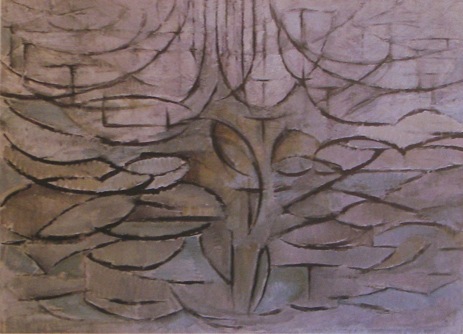
Piet Mondrian - Apple Tree in Flower - 1912 - 78 x 106 cm - oil on canvas

In this third version of the tree, Mondrian has brought spatial planes to the forefront.  This is about painting space and occupying space, and he has accomplished the challenge impressively.

Reducing the tree to a rhythm of loops, conveying it’s presence and movement is fantastic.  Mondrian then used vertical and horizontal lines, which we read as planes in space.  I feel this is a great achievement.  He has shown us how to convey a very complex consideration with just a few markings, avoiding substance.  Brilliant!   I hope you can feel the energy and space.

A great deal of consideration went into this series of paintings from 1904 to 1912 and Mondrian has taken cubism to new heights and he will continue to lead the way towards abstraction along with a few other notable artists.

Inviting the masters to influence is important to all artists.  And we see this with Mondrian taking Cezanne’s spatial planes and Cubism to a new level.

Mondrian – (Spatial Planes and Rhythm)

Piet Mondrian - Tree - 1912 - 65 x 81 cm - oil on canvas

Eight years later Mondrian is refining the challenge of spatial planes.  And he has accomplished the feeling of the tree being in space magnificently.  The was quite an accomplishment in 1912, and shows us how cubist considerations will lead Mondrian towards abstraction.

The tree is now a wonderful rhythm of curved lines and shapes or what I like to term “loops”.  Can you feel the energy and movement, not only in the tree but the surrounding space as well?

This is truly elegant, especially when we see how successfully he combined the loops with a loose or open grid, conveying the sense of the space in front of, as well as within, and behind the tree.

The grid reads as planes and Mondrian has shown how sophisticated and important spacial planes are in painting.

I’m sure he was very grateful to Cezanne

Mondrian – (Creating Space with Colour)

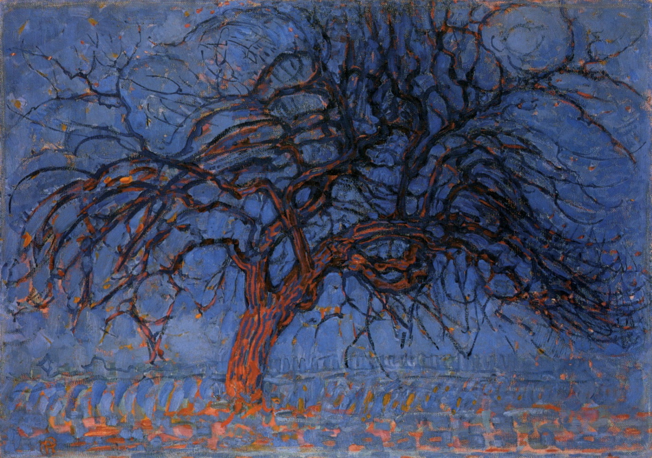
Piet Mondrian - The Red Tree - 1908-10 - 70 x 99 cm - oil on canvas

In this traditional rendering of a tree, Mondrian has not only brought colour to the forefront, he has also used colour to create the sense of space.  We immediately respond to the relationship of the blue and orange.  Our eye reads the orange as coming forward  and then continue to the receding blue.  We then connect to the rhythms in the tree and come to a beautiful pause at the top right.

By restricting his palette Mondrian has emphasised colour and used colour as spatial planes.

Combining Fauvist and Cubist considerations provided Mondrian the opportunity for experimentation and growth and he refined these superbly.

Picasso – (Spatial Planes and Influences)

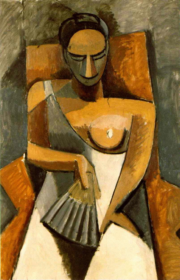
Pablo Picasso - Woman with a Fan - 1908 - 152 x 101 cm - oil on canvas

This is an excellent example of how Picasso permitted others to influence his development.  We not only see the pushing of Cezanne’s spacial planes, we also see his collaboration with Matisse on this intriguing challenge. (see my Oct.19th post) and we also see their mutual reaching for the powerful stirrings we sense in primitive art which I will discuss in future postings.

Picasso uses a spatial shift by having the figure’s shoulders on different levels.  By having the left shoulder lower and the front plane carry across her chest, provides the feeling of her right shoulder being on a different plane.  Try to feel the space more than the depth,(blurring your vision may help).  You may also feel the front of her dress come forward as well. The push and pull of the planes is superb.  We sense her dress coming forward and then her left arm coming forth. Can you feel the shift?

Picasso’s superb use of integration of the figure, the chair and the background is fantastic.  The entire composition avoids the static feel because spatial planes are closer to our reality than perspective.   I hope you can sense this.

I find it interesting that the wonderful consideration of spatial planes requires reduction to succeed.

My Work – Spatial Planes and Rhythm

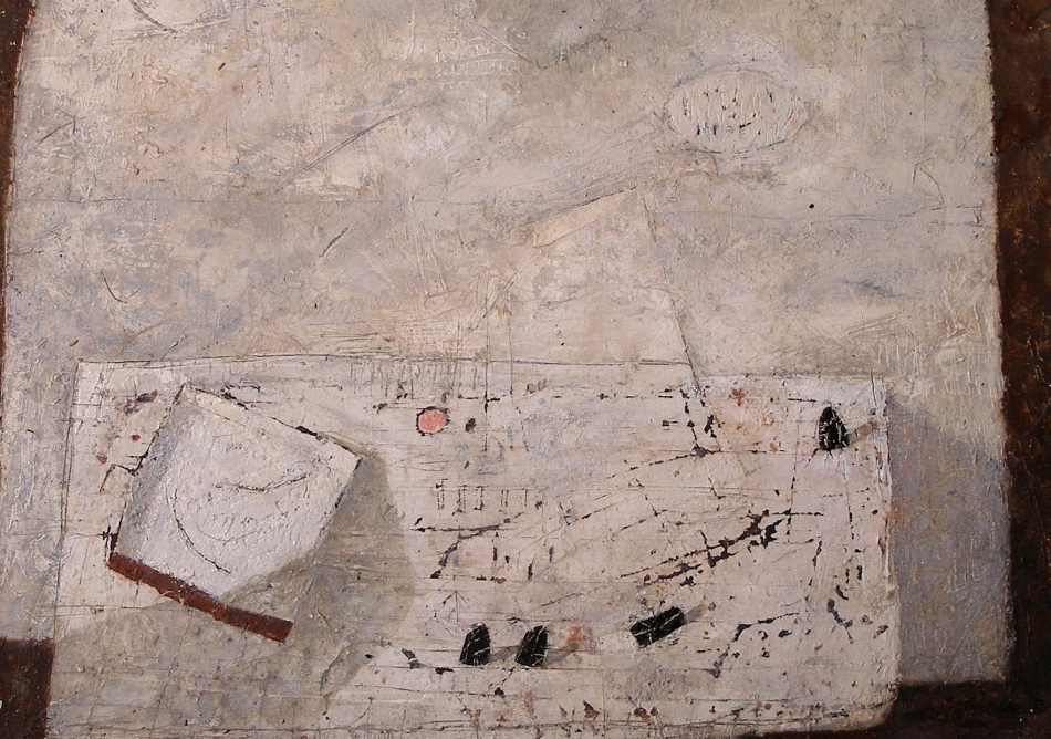
Don Farrell - Pink - 2011 - 23 x 31 cm - mixed water soluble media

This painting has the wonderful consideration of raising the table to the picture plane.  And I focused on spatial planes as well, which is very challenging.  I want the viewer to feel the space the planes present.  And I am pleased with the receding plane of the table which also could be termed as a spatial shift.  The shift represents movement (the viewer’s movement), which is more sensed than seen and provides time.  Thank you Cezanne!

Permitting these to appear while painting is important, allowing intuition to come into play.   I began with a table and wall and then let the play begins.  Thinking of shapes, rhythm and movement, rather than objects.  And of course my favourite things usually find their way into the painting, which ensures continuity in my work.

The soaking pan anchors the composition and from there we move along the bottom edge connecting to the rhythm of the black weights, leading you to the oval on the wall.  I then provided marks on the wall to return you to the pan.  Do you feel the curved movement in the pan?

I permit myself time to assess and after much scratching and repainting found myself painting a small, very satisfying pink circle, which became the final note.

There are other lyrical markings, such as arrows and what I like to call loops which are in the pan and on the wall.  There is also a very fine rhythm within the oval on the wall, echoing the arrangement of the weights.  I strive for every mark to be in harmony.

I must also mention the angle attached to the soaking pan. Can you feel it’s importance?


Influences – (Matisse on Hofmann)

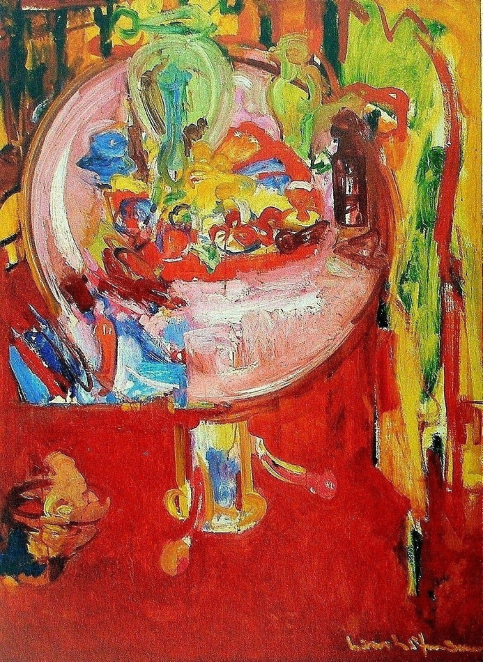
Hans Hofmann - Pink Table with Still Life and Palette - 1936 - 132 x 96 cm - oil on panel

As in my post of September 1st. on Cezanne influencing Matisse, we see the influence on Hofmann.  We should be aware of and participate in the continuity of art, which opens doors for new considerations for those who follow.

Hofmann has used the tilting up of the table top very interestingly by adding another bold  consideration, the rhythmic shape at the bottom left of the table top, which seems to be both on and in front of the table.  This is a wonderful spatial plane, and he integrated it beautifully with a vertical just below at the right of the shape, and upwards with the curve of the table top.  Another spatial plane on the table top, the pink rectangle at the bottom which seems to come forth, very impressive!  There are some planes in the red just below the table top at the right as well.  Can you feel their connection with the table?  The combination of his free gestural stokes with his structural considerations are very impressive and I love the transparency of the green vase at the right.

Hofmann was a very knowledgeable painter and a superb teacher, who was influential in the development of the Abstract Impressionist movement in New York, which was wonderfully convoluted in the 30’s.

I will be posting more on Hofmann’s development of spatial planes with colour.

Klee – (Motif and Rhythm)

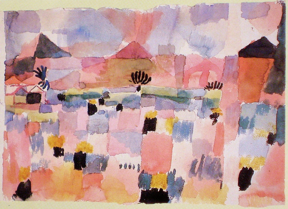
Paul Klee - Saint-Germain, near Tunis - 1914 - 22 x 32 cm - watercolour

This lovely watercolour shows us Klee’s wonderful use of the grid, which was the foundation for many of his compositions.  The grid provides an overall motif of squares or rectangles which unifies the composition, and a disciplined artist will not let the subject disrupt the rhythm.  In other words composition before information.

Klee’s grids are organic which provide the poetic feel of his compositions.  The freehand grid with it’s variety of sizes, can also convey the feeling of space, as Klee does so beautifully in this painting, particularly with the large vertical red rectangle near the bottom. Can you feel it being in front?  Klee also provides a sub motif of triangles, which conveys oblique movement and the structural elements.

The strength and rhythm of the blacks is most impressive as they ensure we will move gracefully through the composition.  Note how the black triangle on the right balances the houses.  Truly masterful!

Having the grid throughout the painting integrating the foreground, the background and the sky is works beautifully and I am very impressed with the vertical running from the bottom  to the top, next to the black triangle.  Do you feel it being another plane?

I am sure Klee listened when he painted this lyrical composition.


Klee – (Orchestration)

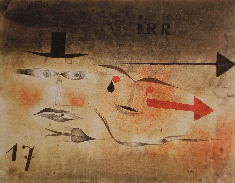
Paul Klee - Seventeen, irr - 1923 - 23 x 28 cm - watercolour and ink on paper

I love Paul Klee for his independence and his desire for “pushing it”, as he so skillfully does in this composition.  He has released himself from the rules of composition, which is very difficult for all artists.  We all unconsciously seek balance when developing a composition and Klee has as well.  The combination of tension and balance is most impressive in this very interesting painting.

Having arrows pointing out of the painting can be considered a fundamental error in composition, but not in the hands of a very intelligent artist like Klee.  He  knows that composition is orchestrated, like music, and feeling and intuition is more important than rules.  He provided himself with an interesting challenge with the thrust of the arrows and simultaneously returning us to the left beautifully with the blacks notes at the left, particularly the number seventeen. We are now engaged in his poetry.

Klee’s elegance is worth striving for!


Miro- (Integration and Pauses)

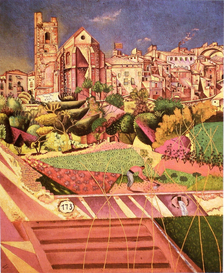
Joan Miro-Montroig,Village and Church-1919-73 x 61 cm-oil on canvas

A very complex subject and Miro shows an impressive level of sophistication.  His journey from here, towards conveying the prime in his mature work is fascinating.

I would like to focus on integration and pauses in this posting which hopefully guide you to many other delights in this impressive composition.

Lets begin with the green and red triangles near the the figure, and how the curve of the figure’s back rhythmically integrates with the red triangle. Now, permit your eye to run upward along the bottom curved edge of the red triangle, to the edge of the black tree above, continuing to the left edge of the building above.

There is another strong integrating movement just above the figure, see detail:

The strong contrast between the pink and dark green catches your eye and then takes you up to the pink straight edge leading you toward and connecting to the right edge of the church.  There are more, and remember they are not meant to be obvious.

Miro’s orchestration of pauses is also very impressive and there are several.  I’ll begin with the two ovals, the drain and the one numbered 173.  My eye then pauses on the white shape at the base of the tower.  From there I note the black windows above, particularly the circle, and because of the light value the shape  the circle occupies my eye moves and pauses on the wonderfully considered small square at the right of the painting.  As with the integration, the pauses are not meant to hold you, and compete.  They are lyrical notes as in music.

There is considerably more to the dance Miro has invited us to enjoy, like the clouds and the vines, your invited!