My Work – Staying with a Consideration

2016-10-untitled-9%e2%85%9d-x-13%c2%bd-in-for-website

Indications of a System II – 9⅝ x 13½ in (24 x 34 cm) – mixed water soluble media on paper

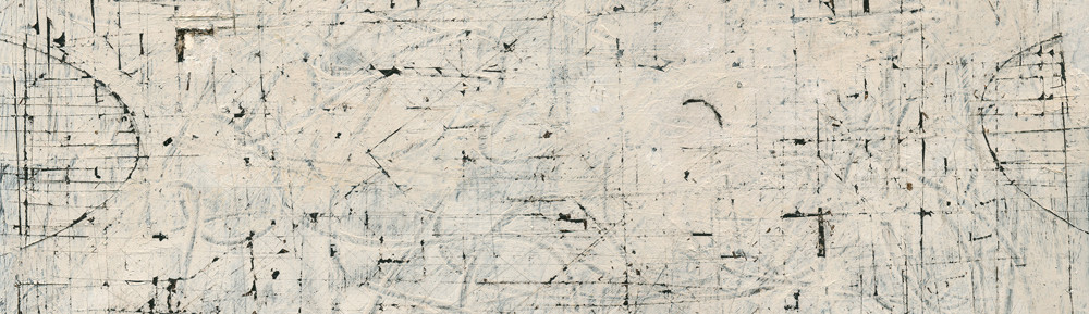
Over time I have come to realise the importance of intent when considering abstraction.  The reason being, while freely painting, numerous spontaneous avenues always arise.  By initially determining the feeling I’m striving for I control endless temptations to stray, and carry on towards my initial idea.

This painting is an excellent example of committing to an intent.  Right from the start I was after a delicate feel, and kept that in mind while working, avoiding all the other options the paint presented. While freely applying and agitating multiple layers of paint, interesting markings and shapes appear.  I continue to remove and re-agitate them numerous times until the feeling I’m after comes forth.  I’m in control because of my intent, and continue orchestrating towards what I’m striving for.  It can be elusive and tenacity or patience is necessary.

I find It’s important not to hurry.

We all should play and explore.  Eventually we make commitments and through them we find our language.  This is why it takes so long to develop and it’s worth it!

Of course I also love following interesting options as they occur, and often do, the difference here, is deciding on what I’m after before beginning.

Matisse – Colour and Pattern within Shapes

Henri Matisse - Reader on a Black Background - 1939 - 92 x 74 cm

I would like to engage further with the wonderful movement Matisse provides, both with colour and with his sophisticated use of pattern within shapes.

Let’s begin with colour.   When we focus on a colour we intuitively take in the same colour else-where in the composition.   This creates movement which Matisse orchestrates through scale and placement, like musical notes, determining lyrical engagement.

For example, when we look at the blue rectangles, we also sense the blues in the bouquet, as well as the vertical in the white rectangle at the right edge of the painting.  Do you feel the circular movement?   The little notes of blue on her shoes ensure we are not held in a tight area at the right of the composition, and instead bring us gently to the left, to engage with the wonderful movement through the warms of the figure and the small notes above and to the right.   The same goes for the other colours as well.  I should note that the temperature of the colours is also a factor in movement as we connect the orange with the red shapes Matisse provides the lyrical harmony through using shape motifs.

Another great consideration is using patterns within shapes.  In other words, not permitting the complexity of the subject to disrupt the harmonious relationships of the shapes.   In the bouquet, Matisse does this beautifully by treating it as an oval containing an arrangement of smaller ovals.   The two white oval shapes containing the pattern of yellow ovals and grey markings (which match the line drawings) are a great example of pattern within shapes.  Even the light grey areas in the bouquet with the blue markings read as ovals.

These are considerations used by many artists and Matisse did it better than anyone.

Willem de Kooning – (Spatial Planes and Time)

Willem de Kooning - The Glazier - 1940 - 137 x 112 cm - 54 x 44 in - oil on canv

In this painting Willem de Kooning conveys his superb understanding of spatial planes.  The sophistication of his considerations is very impressive, providing a sense of space without the appearance of freezing the subject matter, as we would see with traditional perspective.  If he had used representational detail and modelling, the image would appear frozen in time, in the same way a photo captures the moment. This would be fine if that was the intent, and fortunately de Kooning and many other artists wanted to delve further, and explore the possibilities of planes and time in painting.


Let’s begin with the five vertically arranged planes at the right which include the mirror behind the vase  Their positions are intentionally ambiguous in space, inviting the viewer to determine where they should be.  Note how the plane in the table cloth connects to the upper three and how the bottom right of the painting is a plane as well. We sense flatness and depth simultaneously. We feel time because it is not clear where they are in the space because de Kooning intentionally leaves that for us to determine.

I am very impressed with how de Kooning integrated the figure with the plane (the mirror) with the brown triangle, (which is another plane).  How he integrated the triangle with the figure is masterful.  The top edge connects to the left shoulder and the bottom carries across the figure to another brown triangle.  This is truly sophisticated.

The ambiguity and sense of planes at the left of the figure, from the ear down providing a feeling of movement is magnificent.  His knowledge of the considerations in early twentieth century art is very apparent, and I feel he is truly mastering time and planes in this wonderful painting, especially between the figures legs.  Ask yourself why he painted this the same colour as the pants and then you will sense a plane, emphasized by that wonderful vertical black line.  Also, there is a wonderful curve at the top of the right leg giving us another sense of a plane.

One more beautiful consideration before I leave you to engage further with this wonderful painting. There is a subtle triangular plane overlapping the brown triangle pointing towards the face. Do you feel the plane it provides? Fantastic.

Mondrian – Committing to and refining Spatial Planes

Piet Mondrian - Still Life with Ginger Jar II - 1912 - 91 x 125 cm - oil on canvas

Mondrian’s dedication to refining the consideration of spatial planes as presented by Cezanne is most impressive and it the beginning of his journey towards abstraction.  It is important to note that most abstract art has a figurative base, and I think it is fair to say Mondrian was one of the few who managed to venture beyond the figurative, which will take a few years for him to achieve.

In this painting we see the early steps of his journey by reducing and raising the subject matter towards the picture plane.  He also breaks the space into planes as well which unifies the subject matter and the space it occupies

This wonderful refinement of cubism is truly a great step in art which is still difficult for many to accept, and I think it is much closer to our reality than traditional depiction or perspective.  We don’t live in a world with perspective because we and every thing else are constantly moving through time, and in painting, spatial planes provide the viewer the ability to move around, (in their minds), in the paintings.

Mondrian, Picasso, Braque and other notable artists of the time, understood this, and journeyed through the door Cezanne presented to them, leading the way to the wonderful world of twentieth century painting.

I


Van Gogh – (Integration and parallels)

Vincent Van Gogh - Van Gogh's Chair - 1888 - 93 x 73 cm - oil on canvas

I must continue with other compositional aspects in this masterpiece by Van Gogh.   How he used line and colour, integrating the left front leg of the chair with the door is wonderful, and can you feel the floor connecting with the diagonal in the seat?   And how the pipe is in parallel harmony as well?

The vertical feel of the painting is emphasised with vertical brushstrokes in the wall and door, ensuring harmony with the  chair.

Van Gogh’s masterful integration with colour, the yellow on the door and the blue notes in the chair, is magnifiscent.

His place in art is highly deserved.


Matisse – (Motifs, Rhythm and The Reductive Process)

Henri Matisse - Zorah on the Terrace - 1912 - 116 x 100 cm - oil on canvas

In this painting Matisse shows us the importance of shape motifs and how the reductive process brings forth sophistication.

Let me begin with the rhythm we sense from his wonderful motif of ovals. The harmony of the three ovals of the fish bowl integrating with the oval forming the lower portion of the kneeling figure is truly elegant.  Another rhythm of shapes is the  arrangement of, may I term, pointed ovals.  The fish, her slippers and that wonderful orange one just below her belt.  There are more within the slippers and of course colour temperature comes into play with the warms harmonizing with her face.

This brings me to another question which I think shows us Matisse’s level of sophistication.  Why doesn’t the white and blue design of her garment continue up to her shoulders?  The reason, I feel, is if the strong pattern continued it would be competing with her face which is the focus of the composition.  Having reduced the contrast by almost blending the pattern with the background is superb.

How Matisse reduced the architecture and light to simple lines and shapes is revolutionary, and will greatly influence twentieth century art.  We respond to the colours and interpret with our senses!

Matisse has provided artists the opportunity of refining, by reducing information, (removing the superfluous), which is a fascinating pursuit.

I would also like to mention another very refined use of integration.  Go to the top right of the carpet. Can you feel a connection running through her arm to the dark rectangle shape?  Can you feel a plane coming forth?  I hope you can.

Klee – (Orchestration)

Paul Klee - Seventeen, irr - 1923 - 23 x 28 cm - watercolour and ink on paper

I love Paul Klee for his independence and his desire for “pushing it”, as he so skillfully does in this composition.  He has released himself from the rules of composition, which is very difficult for all artists.  We all unconsciously seek balance when developing a composition and Klee has as well.  The combination of tension and balance is most impressive in this very interesting painting.

Having arrows pointing out of the painting can be considered a fundamental error in composition, but not in the hands of a very intelligent artist like Klee.  He  knows that composition is orchestrated, like music, and feeling and intuition is more important than rules.  He provided himself with an interesting challenge with the thrust of the arrows and simultaneously returning us to the left beautifully with the blacks notes at the left, particularly the number seventeen. We are now engaged in his poetry.

Klee’s elegance is worth striving for!


Heron – (Colour before detail)

Patrick Heron - The White Table - 1955 - 71 x 91 cm - 28 x 36 in - oil on canvas

This gorgeous still life by British artist Patrick Heron is a superb example of reducing information to enable colour to come forth.  In other words “colour before detail”.

He has provided us with a beautiful harmony which sings.  The dance of the yellow shapes and the rhythm of pink verticals are fantastic.  Reducing the plate to red lines and using the red to take you through the composition is very sophisticated.  Heron used the grid, or rectangles, as the primary motif and the blacks are in wonderful harmony with the bright colours.  Also enjoy the subtle rhythm of the white ovals, just above the plate.  And his sensitive consideration of a row of small black shapes to the right which complement or support the blacks on the plate beautifully.

Patrick Heron was greatly influenced by Braque, Bonnard and Matisse and he credited Matisse’s painting “The Red Studio” for setting him on his mature path which was creating paintings of colour, which naturally led him to abstraction.

I think having colour as your subject is a very challenging open consideration in art, and Heron was a exceptional colourist.

Influences (Matisse on Diebenkorn)

Richard Diebenkorn - Recollections of a Visit to Leningrad - 1965 - 183 x 214 cm - 72 x 84 in - oil on canvas

A great example of a notable artist permitting influence in their work.  One could say this is a homage to Matisse.

The influence is obvious, but the painting is a Diebenkorn.  Showing the feel of another artist’s considerations and not losing yourself is very important.

The composition has strong shapes and flatness, which he did so well.  Yet the painting has depth without using perspective.  All that is needed are a couple of obliques which  accomplish this nicely.

Diebenkorn’s superb use of shapes permits colour to come forth and dance!

I must mention the rhythm of blacks taking you across the painting.  They are wonderful notes relieving the strong verticals in the painting.

Henri Matisse - Interior with Eggplants - 1911 - 212 x 246 cm - 84 x 97 in - distemper on canvas


Giacometti (Creating Space with Planes)


Alberto Giacomatti - Self Portrait - 1923 - 55 x 32 cm - 22 x 13 in - oil on canvas

This wonderful painting is a superb example of creating the feeling of depth or space with a plane.

In this painting Giacometti provided a plane, or shape, appearing in front of the face.  This is an consideration coming directly from the influence of Cezanne.

Now carefully peruse the right side (his right) of his head.  Do you see a straight line at the edge of his hair, running down through his ear to the edge of his neck down to the collar?  It then takes a right angle turn to the bottom to his chin, creating the bottom edge of the plane.  Now go back the where we began in his hair and note the angle which defines the top of the plane.  It’s subtle until we notice that wonderful vertical line in his hair on the other side of his face.

Keeping in mind that the shape is meant to be felt, rather than seen, do you see the plane in front of his face?

You may feel his face projecting through the plane, which is fine, as it is meant to be open for interpretation, as there is no right or wrong way of seeing these considerations.