My Work – Refining Composition

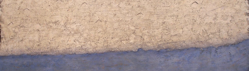
Tide – 2011 – 9½ x 13¾ in – mixed media on paper mounted on board

One of the most interesting aspects of painting is refining a composition.  I do this by working with shapes and markings which lead to unanticipated considerations.

This approach suits my temperament and I have come to trust my instincts through study.  We need a base of knowledge for growth and I feel connecting with the modern masters a great way to develop.

The subject matter of the painting “Tide” was not anticipated when I started this painting. I began with a horizontal line and what I like to term a “loop” as I quite often do.  I never tire of using shapes I have a deep connections with, as they lead me onward, something I learned from Morandi.

As I was marking the painting in search of structure and rhythmic movement, I found myself introducing a wash of blue within the loop.  This is when the rhythmic movement happened. I energized the blue wash with an arrangement of smaller loops, then introduced a circle above the horizontal line.  This immediately provided a sense of place, which I interpreted as a tidal pool.

To provide containment for the composition I introduced two slightly curved vertical lines at the left, as well as subtle horizontal lines across the top, to guide our perusal towards the circle.  The vertical line at the right also holds us within the painting. I then scratched a series of vertical lines across the bottom to complete the subtle containment.  Can you feel how your eye stays within the painting?  This wasn’t done in one step as I removed and remarked the elements a number of times until it felt right.  I enjoy this phase very much.

The same went for the smaller blue loops.  I adjusted their placement and strengths until I said “yes”, being patient with myself.

I should mention the vertical markings on the circle as it may seem odd if your thinking of the sun or moon. They are there to relate to the verticals across the bottom of the painting.  This is a good example of what I like to term, “composition before information”.

Finally I marked in another (inverted) loop below and to the right of the large loop for rhythmic support.  Can you feel the relationship and its importance?  I didn’t adjust it and I’m very pleased with its placement.

Matisse – Colour and Pattern within Shapes

Henri Matisse - Reader on a Black Background - 1939 - 92 x 74 cm

I would like to engage further with the wonderful movement Matisse provides, both with colour and with his sophisticated use of pattern within shapes.

Let’s begin with colour.   When we focus on a colour we intuitively take in the same colour else-where in the composition.   This creates movement which Matisse orchestrates through scale and placement, like musical notes, determining lyrical engagement.

For example, when we look at the blue rectangles, we also sense the blues in the bouquet, as well as the vertical in the white rectangle at the right edge of the painting.  Do you feel the circular movement?   The little notes of blue on her shoes ensure we are not held in a tight area at the right of the composition, and instead bring us gently to the left, to engage with the wonderful movement through the warms of the figure and the small notes above and to the right.   The same goes for the other colours as well.  I should note that the temperature of the colours is also a factor in movement as we connect the orange with the red shapes Matisse provides the lyrical harmony through using shape motifs.

Another great consideration is using patterns within shapes.  In other words, not permitting the complexity of the subject to disrupt the harmonious relationships of the shapes.   In the bouquet, Matisse does this beautifully by treating it as an oval containing an arrangement of smaller ovals.   The two white oval shapes containing the pattern of yellow ovals and grey markings (which match the line drawings) are a great example of pattern within shapes.  Even the light grey areas in the bouquet with the blue markings read as ovals.

These are considerations used by many artists and Matisse did it better than anyone.

Matisse – Shapes and Eye Movement

Henri Matisse - Reader on a Black Background - 1939 - 92 x 74 cm


I love the way Matisse invites us to joyfully participate with his paintings.  My long standing admiration only increases with time.

In this posting I would like to focus on his beautifully choreographed shapes and eye movement.

By reducing the shapes to simple rectangles and ovals, he is able to focus on the relationships of these shapes, and guide us lyrically throughout the painting.  We move through the shapes because of his sensitivity to the spacing and integration.  Modelling or superfluous detail would only disrupt the harmony.

My own initial eye movement begins with the white rectangle.  Then, sensing the vertical integration upwards from its left edge, my eye moves to the light shape above the figure’s reflection.  The curved edge (partial oval) then carries me towards the rectangle with the figure drawing.  I then find my eye moving through the small white vertical rectangles to the blue shapes, which in turn guide me to the vertical green shape.  This leads my eye to the beautiful arrangement of ovals.

Another integrating eye path which I found exciting begins with the small black angle on the figure’s blouse, at the right arm.  Following its upward direction leads me to another line just above her head.  I hope you then can see the connection with a subtle series of parallels guiding our perusal through the red ovals and greenery to the hand of the figure drawing above.

I must point out an alternate path from the line just above her head.  It also connects to the reflection of her hair returning us to her face, providing wonderfully subtle containment.

I would like to finish with the orange oval feel of the figure’s legs.  If Matisse stayed within the lines, the lyrical harmony with her face would have been weakened.

There is so much more such as colour and pattern within shapes. I may do another post.


My Work – Movement – (The Reductive Process)

Direction VI - 2008 - 49 x 97 in (124 x 246 cm) - mixed media on canvas

This painting has a special place for me as it represents how wonderful it can be when a composition succeeds through the reductive process.

The seed of the painting is to convey movement as purely as possible without any superfluous markings or information.  This can be very challenging, for it is not simplification just through omission and reduction.  It is striving to have the viewer connect and participate at the primal level.  Arranging and rearranging the markings until I respond is genuinely exhilarating. and It always seems to be a circuitous route..

Those small dancing angles are an invitation to engage and they may represent anything the viewer wishes.  The colours and textures are open as well, and it is my hope the painting invites a different response with every visit.

I should mention a very important structural consideration.  Note how the bottom edge of the light area curves upward at the right.  To support this movement I provided a parallel line just above.  This is very important for the composition and is meant to be felt more than seen.

I would like to share another detail which I feel is the finishing touch to the painting.  When my eye comes to where the blue intrudes slightly into the light texture, gently holding me briefly, I smile. (see detail)   The best notes appear when we are responding to the painting.

We artists put ourselves through a great deal to arrive where we initially intended, and to be truthful that place can be elusive. 


My Work – Working with Shapes and Spatial Planes

Blue Table - 2012 - 10 x 12½ in (24.7 x 32 cm) - mixed water soluble media

I find it interesting how restriction can lead to new considerations, such as becoming involved with spatial planes as we see in my painting  “Blue Table”.  Presenting a harmony with planes and shapes can be quite elusive and I love the challenge. They always seem fresh to me because they are not predetermined, except for the primary shapes, which intentionally read as a still life.  I then play with the shapes and planes until I begin to respond to their relationships and I must say they are not meant to be apparent.  I wish the viewer to “feel” rather than see them.

Let me begin with the shapes which provide the lyrical unity of the composition.  To ensure this, I used an arrangement of rectangles and triangles, conveying harmonious relationships.   I actually adjusted their sizes, colours, values and locations several times until my sense of harmony was satisfied.  I enjoy this immensely, and working  and reworking water soluble media permits endless play.

Now to the planes which providing the sense of space.  They are both shapes and edges of shapes which connect or integrate elements in the painting.  For instance. the left side of the table integrating with the edge of a plane above, which then takes your perusal to the cool rectangle above the orange stripe.  You then take in the yellow triangle.  Can you feel the yellow triangle sitting on a vertical plane which seems to come forth?  The feeling of space is also felt where the top edge of the table shifts, merging the table and the wall as well as providing the sense of movement.  The small box is also sitting on a plane, and I love that small angle below the rhythm of black dots and how it comes forth.

I mustn’t finish without pointing out how the blue triangles provide a base for the composition and I’m very pleased with the triangles at the top corners as well.  I then provided a curve within the soaking pan which leads you towards the box through the four dots, which were rearranged a number of times.  There is another relationship providing an important rhythmic support for the prominent black sides of the soaking pan.  It’s the long parallel rectangle adjacent to the blue triangle to the right.  This came forth during the process.  I am grateful for having the patience to allow a composition to evolve, no matter how many revisions are required.

I hope you enjoy finding other subtle notes, such as the little black line at the top of the blue triangle at the left .  Can you feel it’s impact?