Matisse – Shapes and Eye Movement

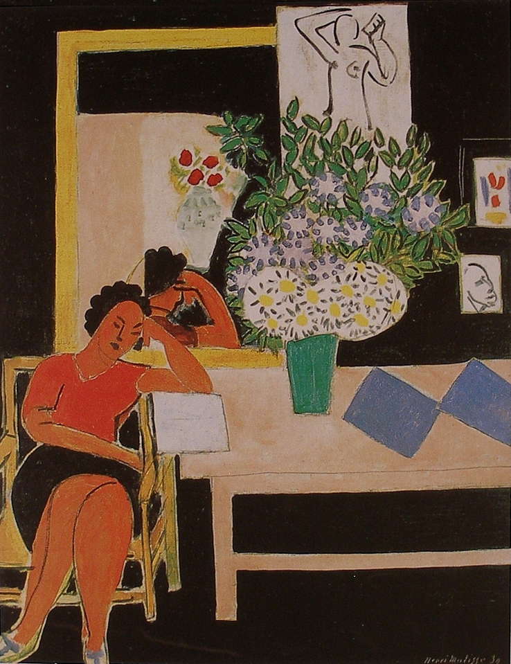
Henri Matisse - Reader on a Black Background - 1939 - 92 x 74 cm


I love the way Matisse invites us to joyfully participate with his paintings.  My long standing admiration only increases with time.

In this posting I would like to focus on his beautifully choreographed shapes and eye movement.

By reducing the shapes to simple rectangles and ovals, he is able to focus on the relationships of these shapes, and guide us lyrically throughout the painting.  We move through the shapes because of his sensitivity to the spacing and integration.  Modelling or superfluous detail would only disrupt the harmony.

My own initial eye movement begins with the white rectangle.  Then, sensing the vertical integration upwards from its left edge, my eye moves to the light shape above the figure’s reflection.  The curved edge (partial oval) then carries me towards the rectangle with the figure drawing.  I then find my eye moving through the small white vertical rectangles to the blue shapes, which in turn guide me to the vertical green shape.  This leads my eye to the beautiful arrangement of ovals.

Another integrating eye path which I found exciting begins with the small black angle on the figure’s blouse, at the right arm.  Following its upward direction leads me to another line just above her head.  I hope you then can see the connection with a subtle series of parallels guiding our perusal through the red ovals and greenery to the hand of the figure drawing above.

I must point out an alternate path from the line just above her head.  It also connects to the reflection of her hair returning us to her face, providing wonderfully subtle containment.

I would like to finish with the orange oval feel of the figure’s legs.  If Matisse stayed within the lines, the lyrical harmony with her face would have been weakened.

There is so much more such as colour and pattern within shapes. I may do another post.


Klee – Reduction and Integration

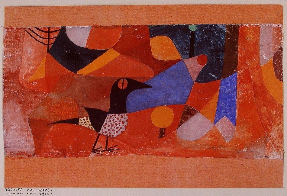
Paul Klee - Forest Bird - 1920 - 14 x 22 cm - watercolour on chalk undercoat over gauze on paper


Klee is one of the great masters of colour and composition, as this gorgeous painting conveys.  I marvel at his sophistication and will do my best to convey his colour temperature ratio and rhythmic integrations.

Colour temperature ratio is the relationship of warm and cool.  We can see it in the influence of the cool blues on the warm orange and red shapes.  The blues poetically energize the warms without competing, creating lyrical variations that are music for the eye.

The black shapes are beautifully balanced and supported by the dark grayish shapes as well as three smaller brown shapes.  Can you feel the relationship of the bird’s gaze with the brown shape at the right edge of the painting and how the other two brown shapes return you to the bird? It’s wonderful.

The sensitive parallels provide a structural rhythm that is more felt than seen. One great example is the relationship of the bird’s front leg, the black line in its eye, the brown line under the orange circle and the black line leading to that magnificent green circle.  The other leg has parallel support as well.

The background shapes run into each other in a number of places, integrating the painting beautifully.   The bottom of the foreground shape of the bird’s neck connects to the edge of the blue shape beautifully.  Klee masterfully provides exceptions to the integrations such as the closed shapes of the circles and where the orange touches the blue just above the bird’s beak.  We sense the variation.

Klee used the consideration of pattern within shapes on the bird.  To hold the viewer just perfectly.

I think how Klee sensitively provides the feeling of the forest is magnificent and I absolutely love that green circle which is beyond explaining.

My Work – Shape Motifs, Reduction, Rhythm and Spatial Considerations

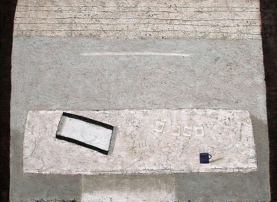
Blue Cup VI - 37 x 50 in - mixed media on canvas

This composition with my blue cup is a great example of reducing composition to an arrangement of shapes.  This seemingly basic approach opens the door to wonderful spatial ad rhythmic considerations.  The most important aspect of painting is the viewer’s engagement with how things relate, and one of the best ways to accomplish this is working with shape motifs.

This painting could be described as an arrangement of rectangles supported with a sub motif of ovals and a triangle.  The challenge is orchestrating them, which usually calls for considerable reworking, until I “feel” their relationships.  I become excited when this begins to happen and will stay with it no matter how many adjustments or refinements my sense of rhythm and harmony commands. I never tire of the process.

The primary relationship in this painting is between the cup and the rectangular pan.  The distance, or space, between has an energy which is embraced by the table top and supported by the rhythmic arrangement of the small white sketches.

Now to the very important play with lines and markings on the table.  I felt the ovals and half ovals needed rhythmic support.  Can you see the curved lines and feel their influence with the ovals?

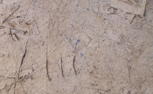
The four lines (detail) between the cup and the pan were instinctively placed to support the four sketches. The triangle below was instinctively placed for a counter movement toward the sketches. There is also a small angle (detail) at the right which guides your eye back towards the sketches. 

The balance of the painting supports the rectangle motif with the lines at the top harmonizing with the horizontals of the table, especially the front edge.

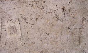
A very important connection is a small line on the wall, just above the left edge of the soaking pan.  It carries you upward towards the strong white line carved into the painting.  I spent considerable time determining the placement, weight and length to harmonize its relationship with the cup and pan.  I also used the same consideration with the right edge of the cup and the edge of the white sketch above.

Striving to ensure every mark and shape have harmonious relationships and avoiding competition is the key.

If the shapes were not simple their relationships would not be felt as strongly.


Ben Nicholson – (Influences)

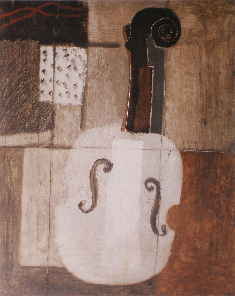
Ben Nicholson - Still Life (Violin) - 1932 - 30 x 24 in - oil and gesso on board

 This painting is an excellent example on how artists allow recent influences to show in their development.  Nicholson engaged with Cubism as a means to refine and personalize his awareness of this major development in contemporary painting, and used it to provide a solid foundation for his journey towards abstraction.  Here, like Picasso and Braque, he uses the picture plane while simultaneously shifting our view to provide the sense of space.

The lines of the grid are both in front and behind the violin, conveying the feeling of space.   I love the repeating rhythm of a series of vertical rectangles and how their dance gently contains my perusal.  Can you feel how the white one is nearer and the others recede? You are meant to sense this dance rather than see the harmony they provide in the composition.  The two verticals patterned with dots is open to interpretation ( I think of the act of playing the instrument and the rhythmic lines at the upper left is the sound of the music.)

The wonderful “shifting of space” in the body of the violin, the positioning of the F-holes and showing us the side view of the neck and scroll not only shows Nicholson’s understanding of cubism, it also shows us his restraint and refinement of this great consideration in twentieth century painting.

Nicholson – Rhythm, Time, Space and Colour

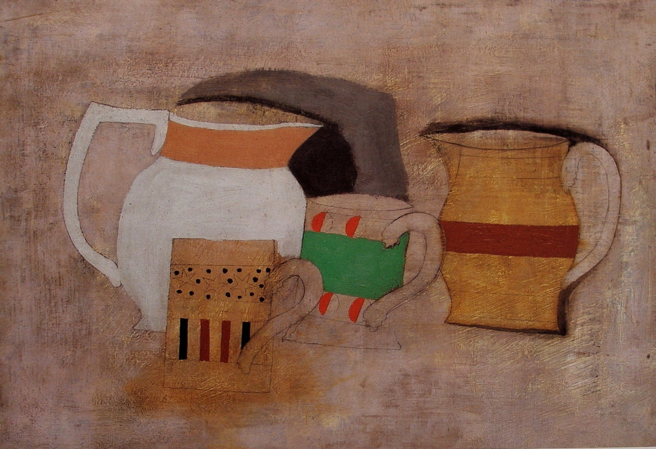
Ben Nicholson - Still Life with Jugs and Mugs -1929 - 38 x 56 cm - oil and pencil on canvas

This, what may seam to be a simple painting is really very sophisticated, and Nicholson was successfully developing his approach to the wonderful spatial considerations being refined in the twentieth century.

He has subtly provided us a sense of movement (our movement) by altering our position in space when we view the mugs from above and from a level position simultaneously.  You are meant to sense it more than to see it, and the sophistication of his elegant simplicity is wonderful.

I love how he also provides us with the sense of space by rendering the mug handles in front of the mugs.  This has stayed with me for years and I hope you can you feel and appreciate it.  The handles also provide a lovely rhythm, integrating the two mugs with the jug at the right.  Nicholson also provided other beautiful rhythms with the vertical bands on lower mug and the horizontal bands of colour on the pictures and the mug in the centre, which obviously brings us to the focus with strong use of colour.  I feel the strong white shape balances with the strong combination of the green and reds and their combined power is on the verge of dominating.  This is a great example of colour ratio, or in other words not having the colour compete or dominate the wonderful subtle considerations in the rest of the composition.

It is a joy to engage with Nicholson’s wonderful journey towards becoming a true master.

Bonnard – (Providing Structure, Rhythm and Harmony)

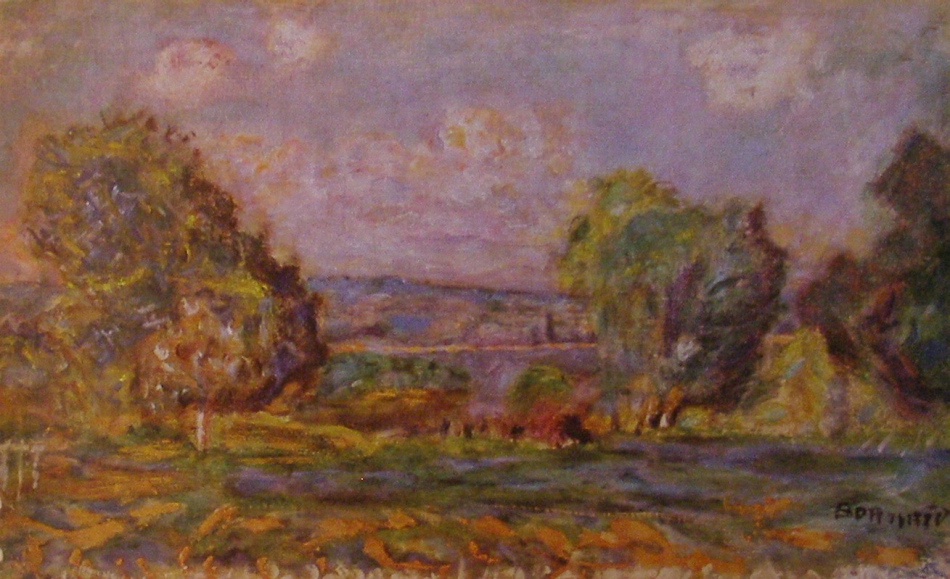
Pierre Bonnard - Landscape Near Vernon - 1915 - 38 x 56 cm - oil

This landscape by Bonnard is a superb example of how a master, whether instinctively or intentionally, provides structure when developing a composition. I say this because a good artists will not permit their formulas to overrule their intuition.

There is a wonderful horizontal rectangle formed by a small white vertical at it’s left and a small bright green tree providing the right vertical,  the top is formed by a roadway running behind the tree.  When you see it and feel it’s impact on the composition, I hope you will appreciate the sophistication.  And remember the viewer does not have to see it, a master is very aware of the power of suggestion and knows we connect to shapes subconsiously.

The tree shapes are magnificent.  Try to feel the movement provided by the parallels of their shapes, particularly that wonderful squarish shape at the right edge and how it supports the other two trees.

I must also mention the harmonious movement in the sky.  There is a square like indentation in the tree at the right edge, which provides the sense of a parallel movement with the other trees and the placement of the cloud above creates the same movement in the blue sky.  I hope you can feel it as well as the wonderful integration of the other clouds with the trees.

There is another beautifully assessed rhythm leading us into the composition from the left.  The harmonious relationship of the three white verticals and the white vertical which forms the left edge of that marvelous rectangle.

Bonnard was a great master painter.


Cezanne – (Rhythm, Parallels and Integration)

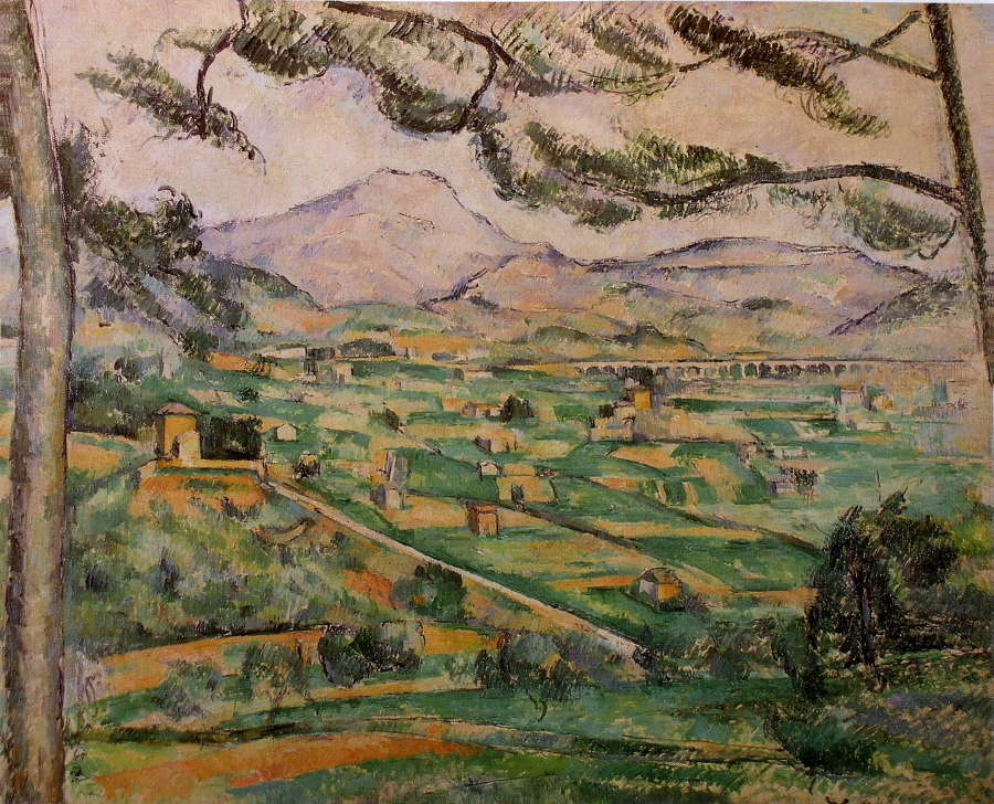
Paul Cezanne - The Great Pine (Mont Sainte-Victoire) - 1886 - 60 x 73 - oil on canvas

Cezanne did a number of paintings of Mont Sainte – Victoire which is fortunate for us as we can see the consistencies in his compositions.  These paintings show us that repeating and refining is a strength in art.

We see the same considerations in this composition as the last post.  It takes time and a great deal of effort to develop a masterful composition and good artists will continue to refine the endless possibilities.  I think the first composition in a series, whether figurative or abstract, is an opening to infinite refinements   We see this in the work of most masters, no matter what their discipline.

I don’t know which of these paintings was first, no matter, what is important is we see the same rhythms and integrations.  What matters is each painting required its own refinements which are assessed differently to suit each composition.  In other words has it’s own voice.  One key difference are the angles we see in the branches, paralleling the road and other lines in the fields.  Wonderful integration providing oblique movement leading into the composition from the bottom right and great structure.  I also love the sophistication of how that black rectangle provides the focus.  Also, note the green line coming up from the tree towards the black rectangle is fantastic!  Do you see the triangle it creates reinforcing the importance of the rectangle?

There is also a harmonious rhythmic line running across the bottom, supporting the rhythm of the branches. I must also point out the parallel lines in the mountain directing us towards the black rectangle.

What a painter!


Van Gogh (Shape Motifs, Integration and Rhythm)

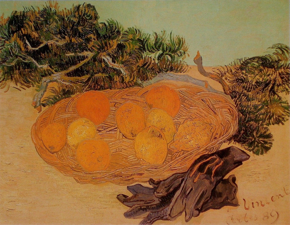
Vincent Van Gogh - Still Life of Oranges and Lemons with Blue Gloves - 1889 - 48 x 62 cm -oil on canvas

One of the primary considerations in composition is shapes, and the awareness of not  disrupting  the shapes with detail and modelling.  This can be quite elusive as most painters want to convey their attention to detail, which unfortunately can muddle the foundation of a composition.  And when artists put information before harmony and rhythm, they may sense disappointment with the results.  Van Gogh has shown us how beautifully this can be avoided in this wonderful still life.

The composition is comprised of four “oval” shapes on two flat horizontal shapes.  He did not clutter the foreground and background with superfluous detail.

How Van Gogh harmonized the fruit with the shape of the basket is masterfully painted.  If you blur your eyes you can feel the shape!  He was also very careful with the darker shapes as well, not only with their shapes, but also with very sophisticated integration.

We see this with the branch connecting with the left of the basket, the finger of the glove, and branches at the right.  Note how the branch at the right pointing upword integrates with the dark oval at the top left, and how the gloves connect to the the one at the right.  Your eye follows the top glove then rhythmically connects to the bottom of the branch at the right.

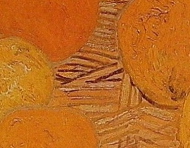
There is an integrating rhythm in this painting that always excites me for it’s sophistication.  The three stripes on the glove not only integrate with the basket with colour but also with a beautiful note in the basket, the small dark lines connecting an orange and a lemon. (see detail)

This is very sophisticated!  And there is more for you to discover. Enjoy!


Matisse – (Motifs, Rhythm and The Reductive Process)

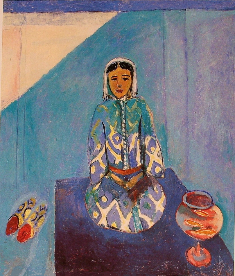
Henri Matisse - Zorah on the Terrace - 1912 - 116 x 100 cm - oil on canvas

In this painting Matisse shows us the importance of shape motifs and how the reductive process brings forth sophistication.

Let me begin with the rhythm we sense from his wonderful motif of ovals. The harmony of the three ovals of the fish bowl integrating with the oval forming the lower portion of the kneeling figure is truly elegant.  Another rhythm of shapes is the  arrangement of, may I term, pointed ovals.  The fish, her slippers and that wonderful orange one just below her belt.  There are more within the slippers and of course colour temperature comes into play with the warms harmonizing with her face.

This brings me to another question which I think shows us Matisse’s level of sophistication.  Why doesn’t the white and blue design of her garment continue up to her shoulders?  The reason, I feel, is if the strong pattern continued it would be competing with her face which is the focus of the composition.  Having reduced the contrast by almost blending the pattern with the background is superb.

How Matisse reduced the architecture and light to simple lines and shapes is revolutionary, and will greatly influence twentieth century art.  We respond to the colours and interpret with our senses!

Matisse has provided artists the opportunity of refining, by reducing information, (removing the superfluous), which is a fascinating pursuit.

I would also like to mention another very refined use of integration.  Go to the top right of the carpet. Can you feel a connection running through her arm to the dark rectangle shape?  Can you feel a plane coming forth?  I hope you can.

Bonnard – (Temperature)

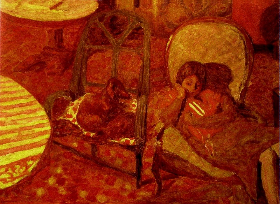
Pierre Bonnard - The Vigil - 1921 - 96 x 125 cm - 38 x 51 in - oil on canvas

One terrific way to provide unity and harmony is to restrict your palette, so your composition will have either a cool or warm feeling.

Bonnard does this in this delightful warm painting, and the viewer immediately responds to the temperature.  We are then directed through the painting by very interesting considerations and I’m sure Bonnard is intentionally pushing our sense of harmony.

The strength of the striped half oval at the left is dominating almost to the point of disharmony and his solutions are very impressive. The two yellow stripes on the baby’s blanket. (she seems to be comforting a baby)   We can’t help moving from the semi circle to the yellow cushion on the chair, and then to those two marvelous stripes.  Do you feel their strength and how they balance the composition?  They also direct us to the yellow partial oval at the upper left, which has a wonderful dark line taking us back to the striped tablecloth.  Brilliant!

I should also point out the dark shapes at the left which hold us in the composition as well as the wonderful oval motif.  Also note the the darkish shape with subtle stripes (very important) between the chairs, connecting the dog’s gaze with the mother and her baby.

We stay with the dog’s vigil, which of course is what Bonnard wants the us to enjoy.  The sophistication of the composition permits this.