My Work, Shape Motifs and Eye Movement


 Seven Markers - 19¼ x 27⅝ in (49 x 70.3 cm) - mixed on paper

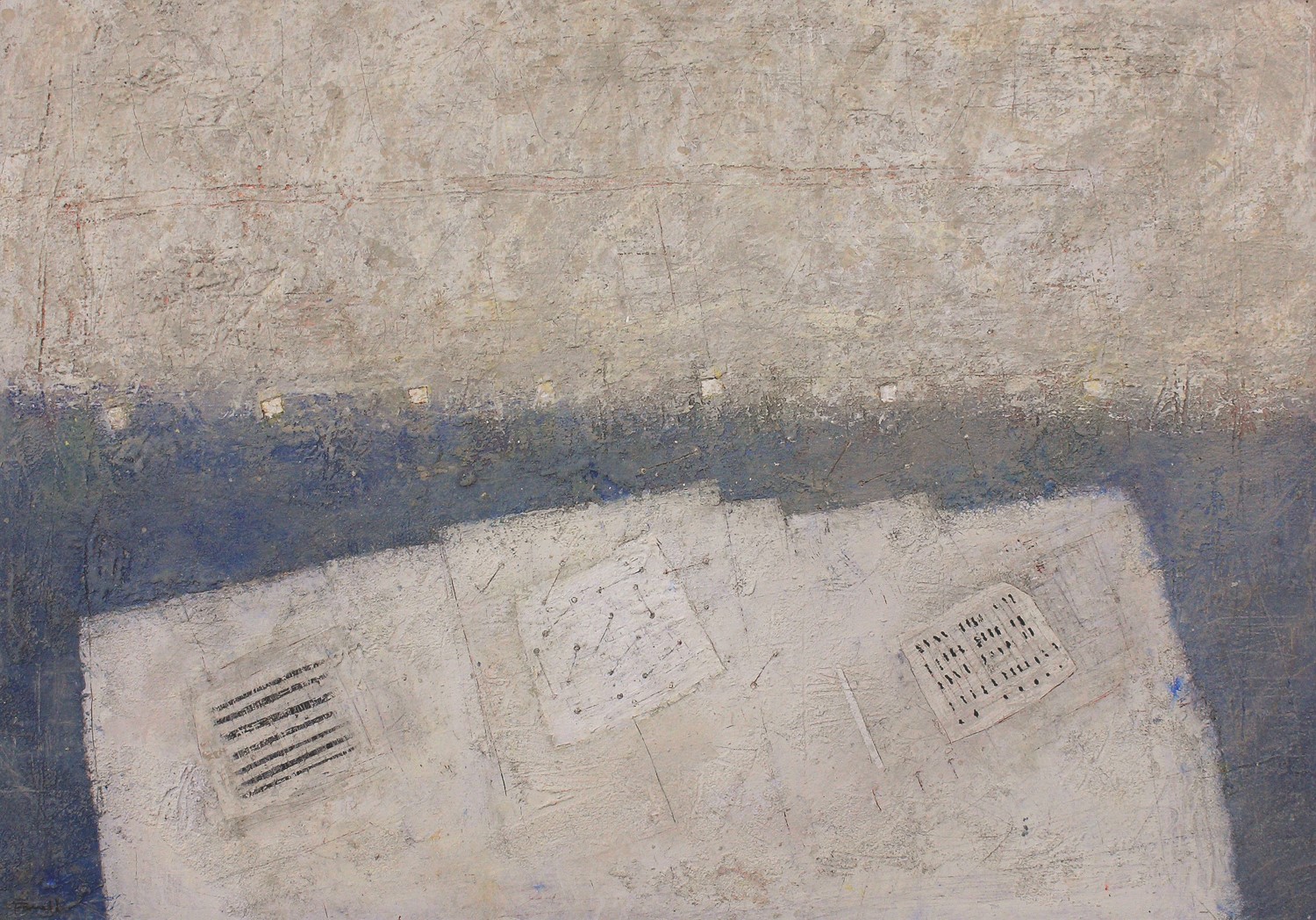
Seven Markers – 19¼ x 27⅝ in (49 x 70.3 cm) – mixed on paper

This recent painting is a great example of working with shape motifs and spatial planes.  I always have them in mind when developing a painting, as they prevent unnecessary or unintended diversions.  I am also aware that by restricting myself I may limit my exploring or responding to the multitude of options the painting will offer.  This is the wonderful dance that never becomes routine and the shape motifs usually win out.

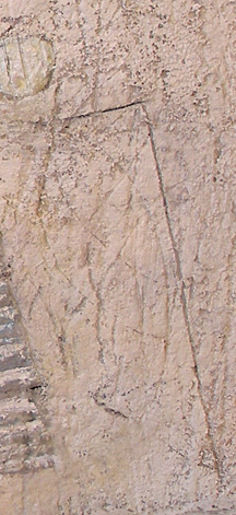
In this painting the rectangle motif is primary and their arrangement almost immediately conveys the sense of a still life.  I then create the sense of space by introducing spacial planes with the irregularity along the top of the table, providing the feeling of coming forward and receding.  The table top has also been raised to the picture plane creating the strongest plane. The three squares on the table are open to interpretation providing visual movement and focus.  The lines on the centre square can be read as being above, creating movement in space, gently leading small squares above.

The seven small squares above the table are in harmony with the squares on the table  I also introduced a subtle horizontal above which strengthens the  motif and supports the horizontal arrangement of the small squares.

Now to the very important rhythmic markings.

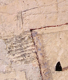
I’ll begin with the square on the right on where the markings have a vertical feel.  I integrate this vertical feeling with a white line to the left and a parallel line connecting to the middle square.  This introduces a rhythm and provides a relationship including the edges of all three squares.

The horizontal stripes in the left square guide you to the centre square, bringing you to the dancing lines which in turn leads you towards the seven markers.

The process requires many adjustments and revisions and by keeping the shape motifs in mind, prevents me from venturing off to unwarranted directions.  It’s the motif that determines the quality of the composition.

Additionally you may have noticed that beautiful cobalt blue mark.  An accidental drip which sings.

My Work – Staying with a Consideration

2016-10-untitled-9%e2%85%9d-x-13%c2%bd-in-for-website

Indications of a System II – 9⅝ x 13½ in (24 x 34 cm) – mixed water soluble media on paper

Over time I have come to realise the importance of intent when considering abstraction.  The reason being, while freely painting, numerous spontaneous avenues always arise.  By initially determining the feeling I’m striving for I control endless temptations to stray, and carry on towards my initial idea.

This painting is an excellent example of committing to an intent.  Right from the start I was after a delicate feel, and kept that in mind while working, avoiding all the other options the paint presented. While freely applying and agitating multiple layers of paint, interesting markings and shapes appear.  I continue to remove and re-agitate them numerous times until the feeling I’m after comes forth.  I’m in control because of my intent, and continue orchestrating towards what I’m striving for.  It can be elusive and tenacity or patience is necessary.

I find It’s important not to hurry.

We all should play and explore.  Eventually we make commitments and through them we find our language.  This is why it takes so long to develop and it’s worth it!

Of course I also love following interesting options as they occur, and often do, the difference here, is deciding on what I’m after before beginning.

My Work – Responding to Composition

Weights-and-Sketches-9½-x-12¾-in-mixed-on-paper

Weights-and-Sketches-9½-x-12¾-in-mixed-on-paper

I began this still life by building up layers of mixed media to establish a textured surface which invites marking and scoring.  I then marked in the table top quickly and gouged the heavy line spanning the wall and turning upwards at the right.

OLYMPUS DIGITAL CAMERA

detail one

I next determined the shape of the table cloth to provide an entry from the bottom edge of the painting.  Then, once on the table, changing it’s direction to harmonize with both ends of the table top.  I decided to have this direction emphasized with a series of parallel edges and lines, and these in turn determined the placement of the sketches and soaking pan.  The rhythm continues with a spatial plane (see detail one) to the right of the table finishing with the edge of the wall.

I used the same considerations horizontally as well, but with some “shifting” to convey the feeling of occupying space, especially along the top edge of the table.  I’m very pleased with the downward shift of the stripes adjacent to the soaking pan and the angle just above (see detail two).  I feel a sense of energy there.

OLYMPUS DIGITAL CAMERA

detail two

 The wall above invited the two rectangles and the circle.  I played with their placements until I was satisfied with how they supported the items on the table.  I especially like how the delicate circle offers a gentle place to pause away from the focus of the weights and soaking pan.

The top of the painting felt a little vacant,  prompting the arrow, introducing the finishing touch for the rhythmic parallels below.

The black edge of the soaking pan then needed rhythmic support, resulting in the appearance of the black weights.  I readjusted their placements until they felt right.  The triangular feel of the lower weight in the pan was determined to relate to the shape in the sketch at the left providing the finishing touch for the composition.

I’m always open to where the composition will guide my considerations.

William Scott – Integration with Line and Shapes (Shape Motifs)

William Scott – Still Life – 1955 – 61 x 91 cm (24 x 36 in) – oil on canvas

 William Scott paintings resonate with me and I often visit his work.

This wonderful still life is a splendid example of how sophisticated the reductive process can be.. Any other markings or additional subject matter would be superfluous.

The composition is an exquisite orchestration of rectangles which provide the rhythmic structure. Their arrangement is splendidly supported by a sub-motif of ovals, which include the pears and the two “Cezanne-like” ovals in the glass.

The rectangles are energized by three slightly leaning vertical lines, as well as the left edge of the warm rectangle at the right, and the right edges of both the plate and glass. These “oblique parallels” rhythmically connect the background with the subject matter. The vertical edges of the table and the warm shape at the left support the upright stems and the glass beautifully.

The connection of the glass with the warm shape above is matched with the integration of the pear at the left with the other warm shape. This is a great example of rhythmic integration

Another beautiful consideration is the relationship of the curved side of the glass with the curved edge of the right most pear. Also note how the horizontal stem at the left provides lateral movement supporting the curves of the plate, the glass and the other pears. The structural impact of the angled edge of the left pear magnificently ensures the connection with the glass.

I feel how Scott avoided overlapping the pears is fantastic, as this would have disrupted the rhythm of their placement, which brings me to another wonderful consideration of not indicating cast shadows on three of the pears. This is a superb example of not permitting literal information to interfere with the composition. Yet another wonderful consideration is the Cezanne-like shifting of the table top, which enhances the feeling of space.

I would like to finish with Scott’s sensitively assessed focus of the painting with the beautiful green oval embracing the stem of the vertical pear at the right. When your perusal arrives, you find yourself gracefully being held, which is a fantastic example of orchestrating composition.

Cy Twombly – Abstract Painting’s Invitation to All

Cy Twombly – Cold Stream, Rome – 200 x 252 cm (79 x 99 in) – oil based house paint and wax crayon on canvas

One of the most fascinating considerations in art is painting the intangible and this wonderful painting by Cy Twombly conveys this magnificently.  He has presented the act of doing, inviting us to participate with our own imaginations.  This is the greatest power of abstraction and I will accept his invitation and proceed with my interpretation of this intriguing painting.

I immediately engaged with the very core of abstraction, the act of marking, which we have been doing for a long time and continue to do so today.  Twombly’s swirls prompted me to consider how our desire for rhythm played a prominent role in the development of writing. We see this common thread in the symbols from diverse cultures. And we do not have to be able to read the markings to appreciate the desire for rhythmic movement through the symbols or characters.

Twombly’s natural movement of the swirls represents the gestural root of writing.  The composing of symbols so they flow and come to represent language is our greatest achievement.  His painting provided me an uncluttered gateway to thinking how all those who’s acts of doing became the foundation of culture and civilization.

I will always look forward to Twombly’s intriguing invitations..

 ________________________________________________________________________________

On another level, engaging with Twombly’s exquisite composition is a joyful dance, feeling immediate and delightful.   How he contained the wonderful swirls is masterful.  I found myself being elegantly guided through the painting feeling the rhythmic emphasis.  Arriving at his beautifully considered focus in the third row up from the bottom where the swirls are a little tighter and more layered than the rest of the painting was a joy.

I loved how he anchored the composition at the bottom right corner with a line creating a structural triangle. Magnificent.


Mark Rothko – Integration with Parallels and Shapes

Mark Rothko – Untitled – 1938 – 50 x 37 in – oil on canvas


The best way to appreciate an artist’s mature work is to be as familiar as possible with their earlier work.   In this painting from 1938 we see not only how varied the journey can be, but also how accomplished Rothko’s command of composition is.

We feel the couple’s relationship very strongly through his marvellous use of distortion. His integration of the couple with shapes and parallels is wonderful.

I’ll begin with how the rectangles of the structure behind are repeated in the woman’s hat and the collar of her dress.  The integration ensures she is well connected with the structure, conveying a feeling of strength and stability.

Next, the couple are beautifully integrated with each other with a series of parallels.  Let’s begin with the angle of the man’s left arm at the shoulder.   If you follow the angle downward, your eye will connect with the angle of the black shadow on the woman.  The under side of his arm also reinforces this angle.  Other parallels appear in his vest and the collar of his jacket.  The parallel positioning of their forward-stepping feet and their shadows bolster the rhythmic connection.

Value is most important for ensuring the importance of the movement.  If you blur your eyes, the strength becomes more apparent.  I should note the small parallels in the structure behind as well.  Rothko was very thorough and these considerations are meant to be more felt than seen.

There is another series of short parallels, leading us in another direction, which provides more subtle integrations of the figures.  They occur from their right feet up to the man’s right shoulder to the angle of the woman’s hat.

I haven’t forgotten the horizontal and vertical integrations and will let you discover how Rothko used them to integrate the couple with the background.

His thoroughness is wonderful.

To finish may I divert your attention to the fabulous spatial plane in the lower portion of the woman’s dress.  Can you feel how the vertical rectangular shape just above her forward step comes forth?   I love it.

My Work – Refining Composition

Tide – 2011 – 9½ x 13¾ in – mixed media on paper mounted on board

One of the most interesting aspects of painting is refining a composition.  I do this by working with shapes and markings which lead to unanticipated considerations.

This approach suits my temperament and I have come to trust my instincts through study.  We need a base of knowledge for growth and I feel connecting with the modern masters a great way to develop.

The subject matter of the painting “Tide” was not anticipated when I started this painting. I began with a horizontal line and what I like to term a “loop” as I quite often do.  I never tire of using shapes I have a deep connections with, as they lead me onward, something I learned from Morandi.

As I was marking the painting in search of structure and rhythmic movement, I found myself introducing a wash of blue within the loop.  This is when the rhythmic movement happened. I energized the blue wash with an arrangement of smaller loops, then introduced a circle above the horizontal line.  This immediately provided a sense of place, which I interpreted as a tidal pool.

To provide containment for the composition I introduced two slightly curved vertical lines at the left, as well as subtle horizontal lines across the top, to guide our perusal towards the circle.  The vertical line at the right also holds us within the painting. I then scratched a series of vertical lines across the bottom to complete the subtle containment.  Can you feel how your eye stays within the painting?  This wasn’t done in one step as I removed and remarked the elements a number of times until it felt right.  I enjoy this phase very much.

The same went for the smaller blue loops.  I adjusted their placement and strengths until I said “yes”, being patient with myself.

I should mention the vertical markings on the circle as it may seem odd if your thinking of the sun or moon. They are there to relate to the verticals across the bottom of the painting.  This is a good example of what I like to term, “composition before information”.

Finally I marked in another (inverted) loop below and to the right of the large loop for rhythmic support.  Can you feel the relationship and its importance?  I didn’t adjust it and I’m very pleased with its placement.

Matisse – Colour and Pattern within Shapes

Henri Matisse - Reader on a Black Background - 1939 - 92 x 74 cm

I would like to engage further with the wonderful movement Matisse provides, both with colour and with his sophisticated use of pattern within shapes.

Let’s begin with colour.   When we focus on a colour we intuitively take in the same colour else-where in the composition.   This creates movement which Matisse orchestrates through scale and placement, like musical notes, determining lyrical engagement.

For example, when we look at the blue rectangles, we also sense the blues in the bouquet, as well as the vertical in the white rectangle at the right edge of the painting.  Do you feel the circular movement?   The little notes of blue on her shoes ensure we are not held in a tight area at the right of the composition, and instead bring us gently to the left, to engage with the wonderful movement through the warms of the figure and the small notes above and to the right.   The same goes for the other colours as well.  I should note that the temperature of the colours is also a factor in movement as we connect the orange with the red shapes Matisse provides the lyrical harmony through using shape motifs.

Another great consideration is using patterns within shapes.  In other words, not permitting the complexity of the subject to disrupt the harmonious relationships of the shapes.   In the bouquet, Matisse does this beautifully by treating it as an oval containing an arrangement of smaller ovals.   The two white oval shapes containing the pattern of yellow ovals and grey markings (which match the line drawings) are a great example of pattern within shapes.  Even the light grey areas in the bouquet with the blue markings read as ovals.

These are considerations used by many artists and Matisse did it better than anyone.

Matisse – Shapes and Eye Movement

Henri Matisse - Reader on a Black Background - 1939 - 92 x 74 cm


I love the way Matisse invites us to joyfully participate with his paintings.  My long standing admiration only increases with time.

In this posting I would like to focus on his beautifully choreographed shapes and eye movement.

By reducing the shapes to simple rectangles and ovals, he is able to focus on the relationships of these shapes, and guide us lyrically throughout the painting.  We move through the shapes because of his sensitivity to the spacing and integration.  Modelling or superfluous detail would only disrupt the harmony.

My own initial eye movement begins with the white rectangle.  Then, sensing the vertical integration upwards from its left edge, my eye moves to the light shape above the figure’s reflection.  The curved edge (partial oval) then carries me towards the rectangle with the figure drawing.  I then find my eye moving through the small white vertical rectangles to the blue shapes, which in turn guide me to the vertical green shape.  This leads my eye to the beautiful arrangement of ovals.

Another integrating eye path which I found exciting begins with the small black angle on the figure’s blouse, at the right arm.  Following its upward direction leads me to another line just above her head.  I hope you then can see the connection with a subtle series of parallels guiding our perusal through the red ovals and greenery to the hand of the figure drawing above.

I must point out an alternate path from the line just above her head.  It also connects to the reflection of her hair returning us to her face, providing wonderfully subtle containment.

I would like to finish with the orange oval feel of the figure’s legs.  If Matisse stayed within the lines, the lyrical harmony with her face would have been weakened.

There is so much more such as colour and pattern within shapes. I may do another post.


Klee – Reduction and Integration

Paul Klee - Forest Bird - 1920 - 14 x 22 cm - watercolour on chalk undercoat over gauze on paper


Klee is one of the great masters of colour and composition, as this gorgeous painting conveys.  I marvel at his sophistication and will do my best to convey his colour temperature ratio and rhythmic integrations.

Colour temperature ratio is the relationship of warm and cool.  We can see it in the influence of the cool blues on the warm orange and red shapes.  The blues poetically energize the warms without competing, creating lyrical variations that are music for the eye.

The black shapes are beautifully balanced and supported by the dark grayish shapes as well as three smaller brown shapes.  Can you feel the relationship of the bird’s gaze with the brown shape at the right edge of the painting and how the other two brown shapes return you to the bird? It’s wonderful.

The sensitive parallels provide a structural rhythm that is more felt than seen. One great example is the relationship of the bird’s front leg, the black line in its eye, the brown line under the orange circle and the black line leading to that magnificent green circle.  The other leg has parallel support as well.

The background shapes run into each other in a number of places, integrating the painting beautifully.   The bottom of the foreground shape of the bird’s neck connects to the edge of the blue shape beautifully.  Klee masterfully provides exceptions to the integrations such as the closed shapes of the circles and where the orange touches the blue just above the bird’s beak.  We sense the variation.

Klee used the consideration of pattern within shapes on the bird.  To hold the viewer just perfectly.

I think how Klee sensitively provides the feeling of the forest is magnificent and I absolutely love that green circle which is beyond explaining.