Cy Twombly – Abstract Painting’s Invitation to All

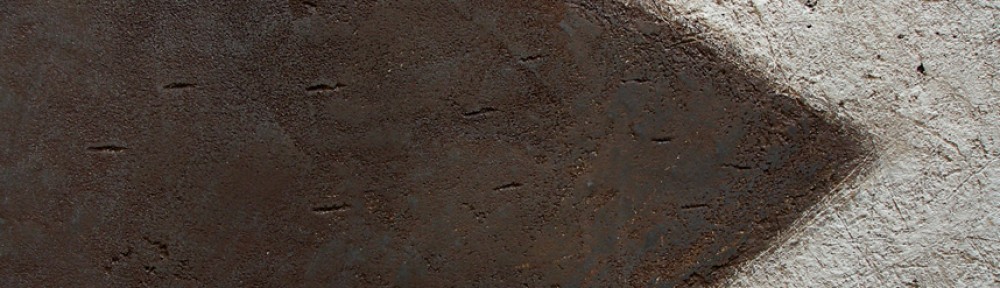
Cy Twombly – Cold Stream, Rome – 200 x 252 cm (79 x 99 in) – oil based house paint and wax crayon on canvas

One of the most fascinating considerations in art is painting the intangible and this wonderful painting by Cy Twombly conveys this magnificently.  He has presented the act of doing, inviting us to participate with our own imaginations.  This is the greatest power of abstraction and I will accept his invitation and proceed with my interpretation of this intriguing painting.

I immediately engaged with the very core of abstraction, the act of marking, which we have been doing for a long time and continue to do so today.  Twombly’s swirls prompted me to consider how our desire for rhythm played a prominent role in the development of writing. We see this common thread in the symbols from diverse cultures. And we do not have to be able to read the markings to appreciate the desire for rhythmic movement through the symbols or characters.

Twombly’s natural movement of the swirls represents the gestural root of writing.  The composing of symbols so they flow and come to represent language is our greatest achievement.  His painting provided me an uncluttered gateway to thinking how all those who’s acts of doing became the foundation of culture and civilization.

I will always look forward to Twombly’s intriguing invitations..

 ________________________________________________________________________________

On another level, engaging with Twombly’s exquisite composition is a joyful dance, feeling immediate and delightful.   How he contained the wonderful swirls is masterful.  I found myself being elegantly guided through the painting feeling the rhythmic emphasis.  Arriving at his beautifully considered focus in the third row up from the bottom where the swirls are a little tighter and more layered than the rest of the painting was a joy.

I loved how he anchored the composition at the bottom right corner with a line creating a structural triangle. Magnificent.


Mark Rothko – Integration with Parallels and Shapes

Mark Rothko – Untitled – 1938 – 50 x 37 in – oil on canvas


The best way to appreciate an artist’s mature work is to be as familiar as possible with their earlier work.   In this painting from 1938 we see not only how varied the journey can be, but also how accomplished Rothko’s command of composition is.

We feel the couple’s relationship very strongly through his marvellous use of distortion. His integration of the couple with shapes and parallels is wonderful.

I’ll begin with how the rectangles of the structure behind are repeated in the woman’s hat and the collar of her dress.  The integration ensures she is well connected with the structure, conveying a feeling of strength and stability.

Next, the couple are beautifully integrated with each other with a series of parallels.  Let’s begin with the angle of the man’s left arm at the shoulder.   If you follow the angle downward, your eye will connect with the angle of the black shadow on the woman.  The under side of his arm also reinforces this angle.  Other parallels appear in his vest and the collar of his jacket.  The parallel positioning of their forward-stepping feet and their shadows bolster the rhythmic connection.

Value is most important for ensuring the importance of the movement.  If you blur your eyes, the strength becomes more apparent.  I should note the small parallels in the structure behind as well.  Rothko was very thorough and these considerations are meant to be more felt than seen.

There is another series of short parallels, leading us in another direction, which provides more subtle integrations of the figures.  They occur from their right feet up to the man’s right shoulder to the angle of the woman’s hat.

I haven’t forgotten the horizontal and vertical integrations and will let you discover how Rothko used them to integrate the couple with the background.

His thoroughness is wonderful.

To finish may I divert your attention to the fabulous spatial plane in the lower portion of the woman’s dress.  Can you feel how the vertical rectangular shape just above her forward step comes forth?   I love it.

My Work – Refining Composition

Tide – 2011 – 9½ x 13¾ in – mixed media on paper mounted on board

One of the most interesting aspects of painting is refining a composition.  I do this by working with shapes and markings which lead to unanticipated considerations.

This approach suits my temperament and I have come to trust my instincts through study.  We need a base of knowledge for growth and I feel connecting with the modern masters a great way to develop.

The subject matter of the painting “Tide” was not anticipated when I started this painting. I began with a horizontal line and what I like to term a “loop” as I quite often do.  I never tire of using shapes I have a deep connections with, as they lead me onward, something I learned from Morandi.

As I was marking the painting in search of structure and rhythmic movement, I found myself introducing a wash of blue within the loop.  This is when the rhythmic movement happened. I energized the blue wash with an arrangement of smaller loops, then introduced a circle above the horizontal line.  This immediately provided a sense of place, which I interpreted as a tidal pool.

To provide containment for the composition I introduced two slightly curved vertical lines at the left, as well as subtle horizontal lines across the top, to guide our perusal towards the circle.  The vertical line at the right also holds us within the painting. I then scratched a series of vertical lines across the bottom to complete the subtle containment.  Can you feel how your eye stays within the painting?  This wasn’t done in one step as I removed and remarked the elements a number of times until it felt right.  I enjoy this phase very much.

The same went for the smaller blue loops.  I adjusted their placement and strengths until I said “yes”, being patient with myself.

I should mention the vertical markings on the circle as it may seem odd if your thinking of the sun or moon. They are there to relate to the verticals across the bottom of the painting.  This is a good example of what I like to term, “composition before information”.

Finally I marked in another (inverted) loop below and to the right of the large loop for rhythmic support.  Can you feel the relationship and its importance?  I didn’t adjust it and I’m very pleased with its placement.

Klee – Reduction and Integration

Paul Klee - Forest Bird - 1920 - 14 x 22 cm - watercolour on chalk undercoat over gauze on paper


Klee is one of the great masters of colour and composition, as this gorgeous painting conveys.  I marvel at his sophistication and will do my best to convey his colour temperature ratio and rhythmic integrations.

Colour temperature ratio is the relationship of warm and cool.  We can see it in the influence of the cool blues on the warm orange and red shapes.  The blues poetically energize the warms without competing, creating lyrical variations that are music for the eye.

The black shapes are beautifully balanced and supported by the dark grayish shapes as well as three smaller brown shapes.  Can you feel the relationship of the bird’s gaze with the brown shape at the right edge of the painting and how the other two brown shapes return you to the bird? It’s wonderful.

The sensitive parallels provide a structural rhythm that is more felt than seen. One great example is the relationship of the bird’s front leg, the black line in its eye, the brown line under the orange circle and the black line leading to that magnificent green circle.  The other leg has parallel support as well.

The background shapes run into each other in a number of places, integrating the painting beautifully.   The bottom of the foreground shape of the bird’s neck connects to the edge of the blue shape beautifully.  Klee masterfully provides exceptions to the integrations such as the closed shapes of the circles and where the orange touches the blue just above the bird’s beak.  We sense the variation.

Klee used the consideration of pattern within shapes on the bird.  To hold the viewer just perfectly.

I think how Klee sensitively provides the feeling of the forest is magnificent and I absolutely love that green circle which is beyond explaining.

Giacometti – Shape Motifs, Spatial Planes and Integration

Alberto Giacometti - The Artist's Mother - 1937 - 24 x 20 in - oil on canvas

Giacometti was a master of composition.  In this painting he demonstrates this with how he merged his mother with her surroundings.  I will do my best to explain some of his superb considerations.

One of the best ways to convey a sense of space is to frame the subject, which Giacometti does beautifully.  We are looking through a large rectangle which seems to be suspended in front of the figure.  Can you feel the space?  We then engage with the arrangement of rectangles which make up the structural elements of the wall behind.

A good entry point to how Giacometti uses these supporting rectangles is with the horizontal black line running across her chest forming the tops of a series of vertical rectangles.  These rectangles relate to another series of verticals on the wall behind.  If you look closely you will also see how they connect or integrate with the figure, especially with the vertical rectangle integrating with the light ones on her shoulder and below.  If you blur your eyes the integration is very strong.

Note how the lines of the wall support the figure, especially at the shoulders and that wonderful angle at the top of her head.  The lines extending from her shoulders, stabilizing her, is magnificent integration.

There are some wonderfully subtle rectangles which are actually spatial planes.  We have the feel of one in front her upper left arm with its top being the line extending from her shoulder (see detail)  It is not initially apparent, but becomes strong when you become aware of it.  There is another just below.  I should also point out the dark vertical rectangle just above and how it provides a very sensitive support for the figure.  Remember the intention is they are meant to be felt more than seen.

                  Her face is very complex with some wonderful cubist planes. (see detail)   The most noticeable are the white shapes in her hair above her forehead with the sensitive lines connecting and extending the planes onto her forehead.  I love the vertical one in front of her neck and mouth leading up to her nostrils, connecting to a thin line leading to the left forming the top of another plane.  The vertical also continues upward connecting to the vertical above, solidifying the figure with the background.  At the risk of over explaining this wonderful integration, reverse the direction from the top.  Your eye will connect to the light vertical leading down to her hands.

I marvel at the quality of the horizontal forming the bottom of her hair behind, then, at the right connecting to vertical shapes which create the feel of planes in front.

I mustn’t neglect how he relieved the strong vertical and horizontal structure with a very sensitive oblique rhythm of parallels.  Let’s return to the white plane in her hair pointing up towards the right. Just below to the right is another small plane paralleling the direction.  When you go to the left of her head you will find other markings echoing the movement.  And a most important light one below her collar.  We may not notice the oblique movement but we will certainly feel it.

Once you train your eye to notice the complexity you come to appreciate the sophistication of his considerations.

My Work – Movement – (The Reductive Process)

Direction VI - 2008 - 49 x 97 in (124 x 246 cm) - mixed media on canvas

This painting has a special place for me as it represents how wonderful it can be when a composition succeeds through the reductive process.

The seed of the painting is to convey movement as purely as possible without any superfluous markings or information.  This can be very challenging, for it is not simplification just through omission and reduction.  It is striving to have the viewer connect and participate at the primal level.  Arranging and rearranging the markings until I respond is genuinely exhilarating. and It always seems to be a circuitous route..

Those small dancing angles are an invitation to engage and they may represent anything the viewer wishes.  The colours and textures are open as well, and it is my hope the painting invites a different response with every visit.

I should mention a very important structural consideration.  Note how the bottom edge of the light area curves upward at the right.  To support this movement I provided a parallel line just above.  This is very important for the composition and is meant to be felt more than seen.

I would like to share another detail which I feel is the finishing touch to the painting.  When my eye comes to where the blue intrudes slightly into the light texture, gently holding me briefly, I smile. (see detail)   The best notes appear when we are responding to the painting.

We artists put ourselves through a great deal to arrive where we initially intended, and to be truthful that place can be elusive. 


Morandi – (Sophistication Through Reduction)

Georgio Morandi – Still Life – 25 x 30 cm – oil on canvas

Morandi’s contemplative paintings speak to me and I quite often find myself visiting them for the appreciation of his mastery of the reductive process.

In this Still Life he arranged three items directly in front of each other creating a beautiful arrangement of shapes and lines.  How he integrated the three with the table and background is absolutely gorgeous.

 I love the elegant structure of the shapes, especially the relationship of the top of the spout with the rhythmic movement of the three marks at the right. The horizontal dark line holds them beautifully. (see detail image)   I hope you can feel the relationships.

Two of the marks (above the dark line) and the top of the goblet seem to float, connecting our gaze to that sensitive horizontal shadow in the goblet’s top, and leading us to the oval top of the spout.  We are then gently brought down to the wonderful dark structure.  I mustn’t neglect another sensitive movement, leading our eye down the spout to the bottom edge of the ochre shape on the goblet.  This in turn takes us to that magnificent small curved mark engaging us with the movements above.

The top of the goblet seems to be floating, energizing the painting brilliantly. Reducing the subject matter to an arrangement of shapes supports this consideration masterfully.  The blending or integration of the objects with the background and table is visual poetry at it’s best.

Note how we seem to be both level with the goblet and slightly above it at the same time.  I’m sure this is an homage to Cézanne.

The painting is an exquisite arrangement of shapes and lines revealing a level of sophistication and visual poetry I admire greatly.


My Work – Working with Shapes and Spatial Planes

Blue Table - 2012 - 10 x 12½ in (24.7 x 32 cm) - mixed water soluble media

I find it interesting how restriction can lead to new considerations, such as becoming involved with spatial planes as we see in my painting  “Blue Table”.  Presenting a harmony with planes and shapes can be quite elusive and I love the challenge. They always seem fresh to me because they are not predetermined, except for the primary shapes, which intentionally read as a still life.  I then play with the shapes and planes until I begin to respond to their relationships and I must say they are not meant to be apparent.  I wish the viewer to “feel” rather than see them.

Let me begin with the shapes which provide the lyrical unity of the composition.  To ensure this, I used an arrangement of rectangles and triangles, conveying harmonious relationships.   I actually adjusted their sizes, colours, values and locations several times until my sense of harmony was satisfied.  I enjoy this immensely, and working  and reworking water soluble media permits endless play.

Now to the planes which providing the sense of space.  They are both shapes and edges of shapes which connect or integrate elements in the painting.  For instance. the left side of the table integrating with the edge of a plane above, which then takes your perusal to the cool rectangle above the orange stripe.  You then take in the yellow triangle.  Can you feel the yellow triangle sitting on a vertical plane which seems to come forth?  The feeling of space is also felt where the top edge of the table shifts, merging the table and the wall as well as providing the sense of movement.  The small box is also sitting on a plane, and I love that small angle below the rhythm of black dots and how it comes forth.

I mustn’t finish without pointing out how the blue triangles provide a base for the composition and I’m very pleased with the triangles at the top corners as well.  I then provided a curve within the soaking pan which leads you towards the box through the four dots, which were rearranged a number of times.  There is another relationship providing an important rhythmic support for the prominent black sides of the soaking pan.  It’s the long parallel rectangle adjacent to the blue triangle to the right.  This came forth during the process.  I am grateful for having the patience to allow a composition to evolve, no matter how many revisions are required.

I hope you enjoy finding other subtle notes, such as the little black line at the top of the blue triangle at the left .  Can you feel it’s impact?

Giacometti – Composition (Integration)

Giacometti – Self Portrait – 1921 – 32 x 28 in – oil on canvas

Giacometti’s command of composition is absolutely marvellous in this superb painting.
I will focus on his wonderful integration of the figure with the other elements in the composition.  Let’s begin with how your eye is taken across the painting from the seat of the chair, along the bottom of his jacket, to the bottom of his right leg, then you are guided up to the verticals behind.  Another beautiful integration is how the curve at the bottom of his pant leg rhythmically connects to the curved element to the left, which in turn, guides you up to his hand. I love it!  Also take note how the bottom of his trousers connects to the lower edge of his other leg and how the bottom of his pant leg then integrates with the chair leg.  I was and still am taken with how he integrated the other chair leg (between his legs) with his pant leg.  Can you feel how the angle in the chair runs into his pants creating a small blue triangle?  (see detail)

detail

This very impressive small dark blue triangle provides a sense of overlapping. The top edge of this gorgeous little triangle also parallels a dark line above which in turn integrates with the edge of his palette.  Can you feel the movement and shapes?  There is also another sense of an angle at the bottom of the dark line (creating another plane) which parallels the angle in the chair leg.  There is more.  That dark line also connects to a subtle purple line which carries downward into his leg, creating another wonderfully subtle triangle.

Note the line just to the left of his pocket and how this guides you up to the front of his neck and how his chin and his collar connect to the horizontals behind.  Just one more, it’s how he leads you upwards through his arm from the opening in his jacket.

There is more for you to engage with, and I hope you enjoy this wonderful early composition by this twentieth century master.  I am impressed with how Giacometti permitted to show Cézanne’s influence.


Max Beckmann – (Integration and Structure)

Max Beckmann - Quappi with White Fur - 1937 - 109 x 64 cm - oil on canvas

Max Beckman’s paintings are very strong in many ways and in this painting we will look at his superbly considered compositional structure.

I am first drawn to the two wonderful half ovals.  The table, which has been raised to the picture plane, and the other behind the figure at the left of the painting.  I love how they support the figure and am very impressed with his integration of the black line entering the composition at the bottom left, with the table and how we are guided to the little Pekingese, which in turn integrates with the bottom edge of the larger half oval.

Now to his wonderful integration of the figure, her bouquet and the flowers above her left shoulder.  Can you feel your eye moving up from her right leg to her bouquet and then to the the left edge of the flowers and how this unites the figure and the background?  There is another sophisticated one leading from the dog to the bottom of the bouquet to a line taking you to the flowers above her shoulder.  It really is superb and it also supports her embrace of the dog.

There are other connections to find and enjoy especially how he supported her head with the two vertical lines above.  Note how they curl towards her, supprting the curve of her cheek. They are a very important compositional consideration because she is now beautifully connected to the top of the painting!