My Work – Responding to Composition

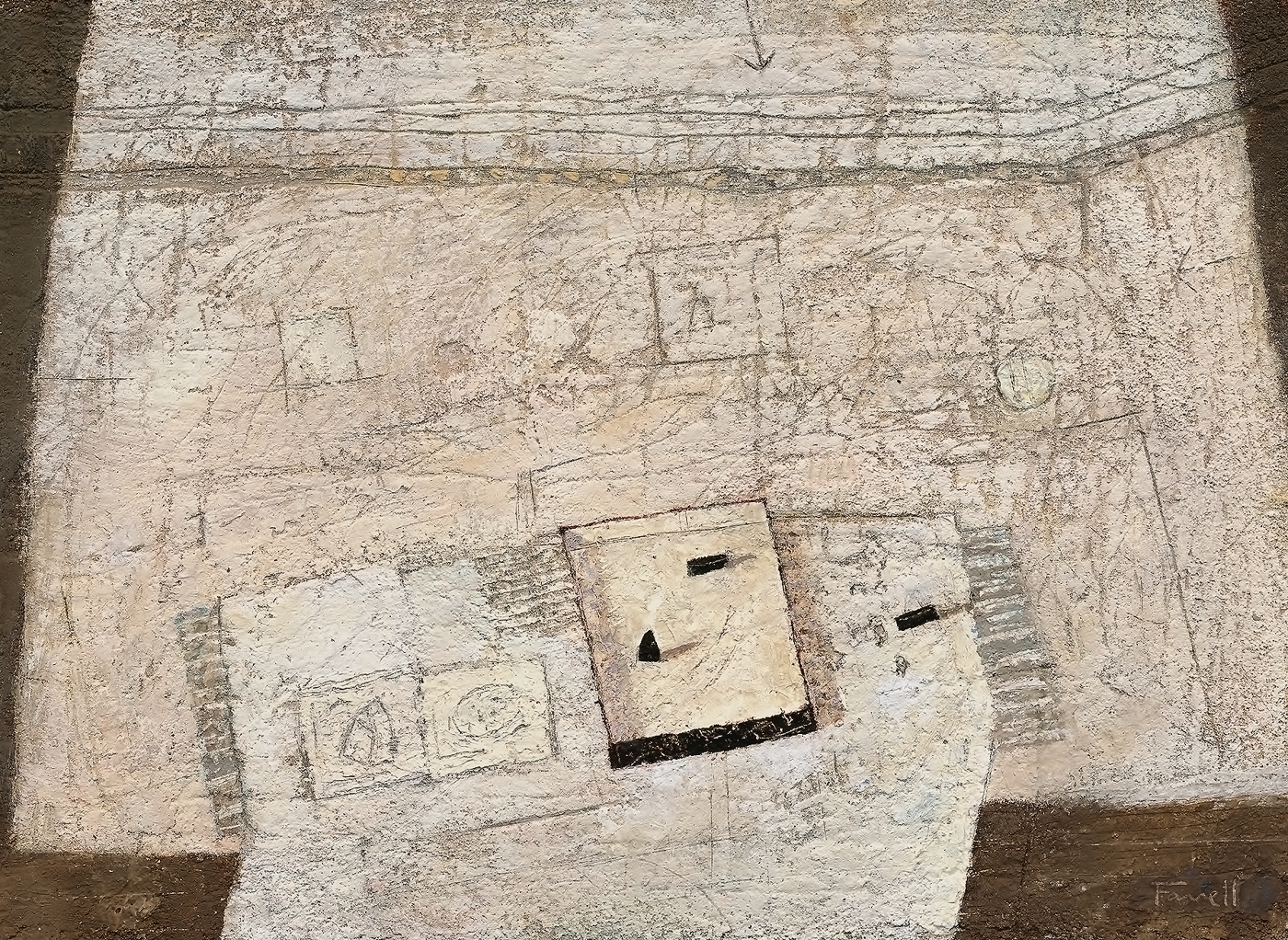
Weights-and-Sketches-9½-x-12¾-in-mixed-on-paper

Weights-and-Sketches-9½-x-12¾-in-mixed-on-paper

I began this still life by building up layers of mixed media to establish a textured surface which invites marking and scoring.  I then marked in the table top quickly and gouged the heavy line spanning the wall and turning upwards at the right.

OLYMPUS DIGITAL CAMERA

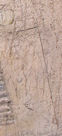
detail one

I next determined the shape of the table cloth to provide an entry from the bottom edge of the painting.  Then, once on the table, changing it’s direction to harmonize with both ends of the table top.  I decided to have this direction emphasized with a series of parallel edges and lines, and these in turn determined the placement of the sketches and soaking pan.  The rhythm continues with a spatial plane (see detail one) to the right of the table finishing with the edge of the wall.

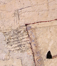
I used the same considerations horizontally as well, but with some “shifting” to convey the feeling of occupying space, especially along the top edge of the table.  I’m very pleased with the downward shift of the stripes adjacent to the soaking pan and the angle just above (see detail two).  I feel a sense of energy there.

OLYMPUS DIGITAL CAMERA

detail two

 The wall above invited the two rectangles and the circle.  I played with their placements until I was satisfied with how they supported the items on the table.  I especially like how the delicate circle offers a gentle place to pause away from the focus of the weights and soaking pan.

The top of the painting felt a little vacant,  prompting the arrow, introducing the finishing touch for the rhythmic parallels below.

The black edge of the soaking pan then needed rhythmic support, resulting in the appearance of the black weights.  I readjusted their placements until they felt right.  The triangular feel of the lower weight in the pan was determined to relate to the shape in the sketch at the left providing the finishing touch for the composition.

I’m always open to where the composition will guide my considerations.

Diebenkorn – (Integration, Rhythm, Pulls and Pauses)

Richard Diebenkorn - Girl with Flowered Background - 1962 - 103 x 52 cm - oil on canvas

How Diebenkorn integrated the figure with the Matisse like rhythm of the background is beautifully considered.  Let’s begin with the horizontal black shape at the left of the painting and how it sweeps up and integrates with the blue shadow, through the red shape, then with her hair.  The sweep also connects to the delightfully assessed black shape above her right shoulder, which brings the eye to the blue stripe on her blouse, very impressive.  We then automatically follow the red stripe which not only integrates with her hair, but when you follow it down from her right shoulder you will eventually connect to the stem of the small flower above her left shoulder, which then joins with a white shape connecting us to the horizontal division of the painting.  Very sophisticated.

There are two wonderful pulls permitting us to leave the focus of her hair and move through the painting.  I’m referring to the beautifully balanced black shape at the bottom and the other one at the right edge of the painting.  Remember, these are meant to be felt more than noticed and pulls relate through closeness in either value or colour.

The centres of the flowers provide a beautiful subtle horizontal rhythm supporting the division in the composition and gently relieving us from the strength of her black hair.  Do you find your gaze moving to the dots when you focus on her?  As I said these considerations are not meant to be obvious.  They are invitations to a visual dance.

I must also mention the fantastic blue shadow which Diebenkorn painted as a shape.  We see a master permitting preceding masters to influence his work.  We can all join this great tradition, whether we paint or love to engage through cultivated study.


Diebenkorn – (Pulls, Pauses and Integration)

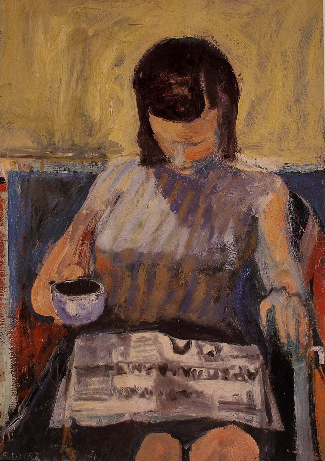
Richard Diebenkorn - Woman with Newspaper - 122 x 86 cm - oil on canvas

This painting by Diebenkorn has an excellent example of what I like to term a pull, which is a shape, value or colour pulling the viewer from the focus of the composition.  Master artists are very aware of the viewer’s perusal, and how to guide the eye away from the focus without competing.  This is not easily accomplished and it takes time before you find what works for you.

Diebenkorn masterfully takes us from the focus of the girl’s head to the black coffee, which is beautifully supported with the similar values below.  I hope you can feel the pull as it should not be obvious.  If it’s too strong we would have competition which in Diebenkorn’s hands, has been superbly avoided.

This is orchestration and good artists resist formula. The continuity, or style, comes from knowledge combined with intuition and of course experience.

Now there is a great pause(which is not as strong as a pull) on the newspaper in the shape of a “U”, gently taking you from the coffee.  Can you see the path?  He guides us from her hair, to the cup, to the “U”, (where you pause), and then back to her head.  There are other avenues to guide us as well, which I hope you enjoy discovering and appreciating.

I must also mention how the figure is beautifully integrated with the background at her left shoulder.  Do you see how the white shape curls up to connect to her hair?  And I love that black line leading in and forming her knuckles.  Great integration.  What a painter!


Hopper – (Rhythmic Pull, Integration and Shapes)

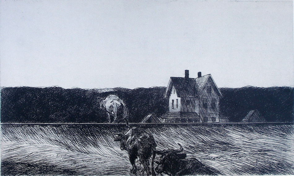
Edward Hopper - American Landscape - 1920 - 7.5 x 12.5 in - etching

This wonderful etching is a superb example of how important the knowledge of  composition is in all forms of expression.

Hopper’s exquisite use of rhythm is one of the best examples I know of.  The three cows rhythmically lead us into the landscape to a wonderful light patch, just above the cow crossing the tracks.  This beautiful consideration takes us beyond the cows to the powerful shape of the trees and beyond.

There is also a superb integration of the centre cow with a small triangle structure just beyond the tracks.  Can you see how the back of the cow’s neck connects to the triangle and then how you harmoniously read the other triangle at the right of the house?  Another sensitive relationship is between the cow on the tracks and the sunlit side of the house.  They harmonize in value and size beautifully.

The foundation of three horizontal rectangles in this composition is a great example of reducing to a few shapes.  The power of shape motifs is very important and master artists are very aware of how superfluous detail can weaken a composition.

Great composition does not need to rely on size or detail.

Klimt (Shapes, Rhythm and Structure)

Gustav Klimt -Apple Tree II - 1916 - 80 x 80 cm - oil on canvas

Gustav Klimt was a master of shapes and structure and as we see in this late painting, he was a great master of the reductive process.

We see this is his late painting Apple Tree II, a wonderful example of the power of shapes.  We respond to the beautiful shape of the tree, then we take in the dance of the circles , particularly the wonderful pauses of the red circles, in fact, note how one red circle is actually the focus.  The rhythm of the trees on the horizon is wonderful and I hope you feel the dance.

Appreciating that information for the sake of information can disrupt a composition is very important. Shape and pattern within the shape, works much better, as we see in the tree and the triangle shape of the foreground.

There is very sophisticated structural consideration in this painting, which I feel is one of the finest I have ever had the pleasure of engaging with.

It’s the vertical at the bottom right, which not only provides a lovely visual support for the trunk, but also provides one of the best spatial planes I have ever seen!  Do you see the horizontal at the top of the vertical line, forming a right angle and how the feeling of a spatial plane comes forth?  Magnificent!


Mondrian – (Creating Space with Colour)

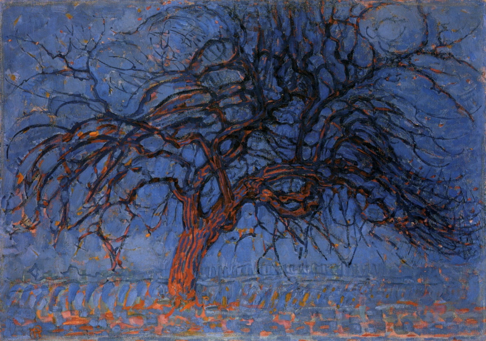
Piet Mondrian - The Red Tree - 1908-10 - 70 x 99 cm - oil on canvas

In this traditional rendering of a tree, Mondrian has not only brought colour to the forefront, he has also used colour to create the sense of space.  We immediately respond to the relationship of the blue and orange.  Our eye reads the orange as coming forward  and then continue to the receding blue.  We then connect to the rhythms in the tree and come to a beautiful pause at the top right.

By restricting his palette Mondrian has emphasised colour and used colour as spatial planes.

Combining Fauvist and Cubist considerations provided Mondrian the opportunity for experimentation and growth and he refined these superbly.

Miro- (Integration and Pauses)

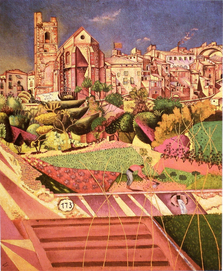
Joan Miro-Montroig,Village and Church-1919-73 x 61 cm-oil on canvas

A very complex subject and Miro shows an impressive level of sophistication.  His journey from here, towards conveying the prime in his mature work is fascinating.

I would like to focus on integration and pauses in this posting which hopefully guide you to many other delights in this impressive composition.

Lets begin with the green and red triangles near the the figure, and how the curve of the figure’s back rhythmically integrates with the red triangle. Now, permit your eye to run upward along the bottom curved edge of the red triangle, to the edge of the black tree above, continuing to the left edge of the building above.

There is another strong integrating movement just above the figure, see detail:

The strong contrast between the pink and dark green catches your eye and then takes you up to the pink straight edge leading you toward and connecting to the right edge of the church.  There are more, and remember they are not meant to be obvious.

Miro’s orchestration of pauses is also very impressive and there are several.  I’ll begin with the two ovals, the drain and the one numbered 173.  My eye then pauses on the white shape at the base of the tower.  From there I note the black windows above, particularly the circle, and because of the light value the shape  the circle occupies my eye moves and pauses on the wonderfully considered small square at the right of the painting.  As with the integration, the pauses are not meant to hold you, and compete.  They are lyrical notes as in music.

There is considerably more to the dance Miro has invited us to enjoy, like the clouds and the vines, your invited!

de Kooning – (Integration with Line and Indicating Time)

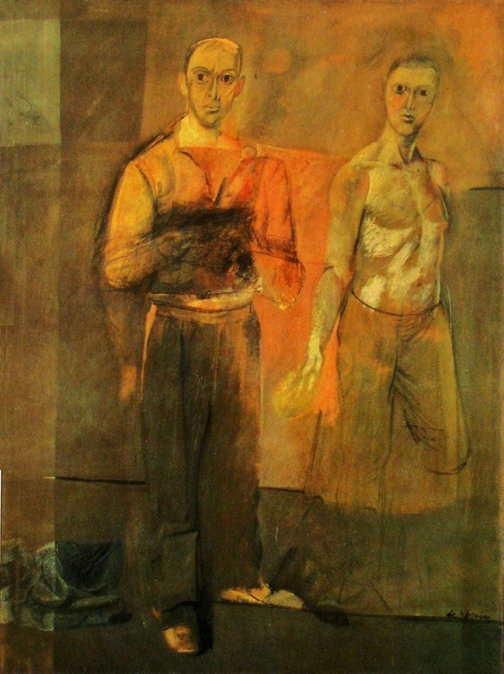
Willem de Kooning - Two Men Standing - 1938 -155 x 122 cm - 61 x 48 in - oil on canvas

De Kooning’s use of line for emphasizing the structure of the composition is very impressive. The horizontal line at the right edge of the painting, near the figure’s shoulder superbly balances the composition. Without that line we would have difficulty moving away from the dominant figure.  It provides not only a pull, it also completes a wonderful horizontal integrating division of the composition.

Another beauty is the line under the shoe which not only supports the figure it is also provides rhythmic support for the line above at knee level.  There is another which shows us how sensitive and the thoroughness of de Kooning’s considerations.  It’s the faint line in the orange area, connecting the men at their elbows.

De kooning was also working at conveying time in this painting as we see in the right arms of both figures.  We see two positions of the arm in the dominant figure and at the hand of the other man.  And I think this explains the dark rectangle in front of the indistinguishable hands of the dominant figure.  There are basically two methods for conveying time.  One by inviting the viewer to move (not physically, but in their mind) and the other is to indicate the movement of the subject which de Kooning used here.  Both are very challenging.

I also would like to mention how the shoes are actually a pull, bringing us to the bottom.  And a fantastic pause.  The light mark at the left end of the line at knee level.  It’s influence on  the composition is superb!

I think his choice of not completing the legs of the man at the right is interesting and leaves us with an open consideration for discussion.


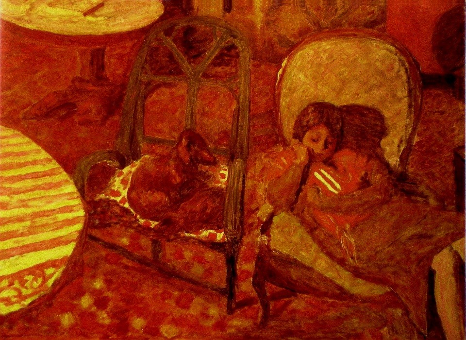
Bonnard – (Temperature)

Pierre Bonnard - The Vigil - 1921 - 96 x 125 cm - 38 x 51 in - oil on canvas

One terrific way to provide unity and harmony is to restrict your palette, so your composition will have either a cool or warm feeling.

Bonnard does this in this delightful warm painting, and the viewer immediately responds to the temperature.  We are then directed through the painting by very interesting considerations and I’m sure Bonnard is intentionally pushing our sense of harmony.

The strength of the striped half oval at the left is dominating almost to the point of disharmony and his solutions are very impressive. The two yellow stripes on the baby’s blanket. (she seems to be comforting a baby)   We can’t help moving from the semi circle to the yellow cushion on the chair, and then to those two marvelous stripes.  Do you feel their strength and how they balance the composition?  They also direct us to the yellow partial oval at the upper left, which has a wonderful dark line taking us back to the striped tablecloth.  Brilliant!

I should also point out the dark shapes at the left which hold us in the composition as well as the wonderful oval motif.  Also note the the darkish shape with subtle stripes (very important) between the chairs, connecting the dog’s gaze with the mother and her baby.

We stay with the dog’s vigil, which of course is what Bonnard wants the us to enjoy.  The sophistication of the composition permits this.


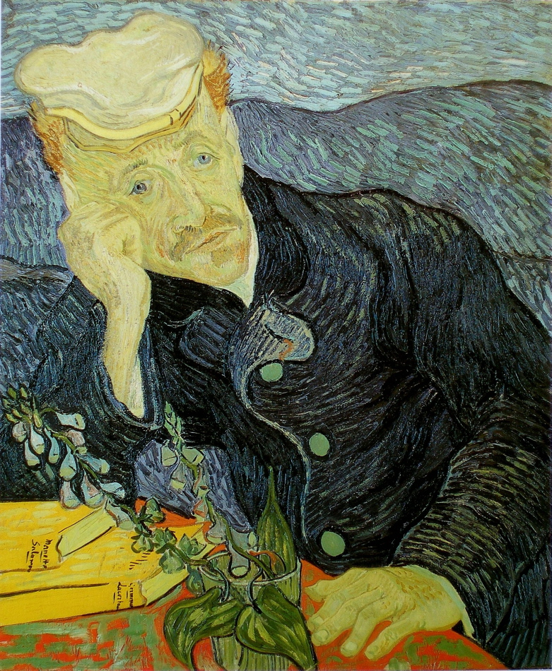
Van Gogh – (Parallels, Rhythm and Integration)

Vincent van Gogh - Portrait of Doctor Paul Gachet - 1890 - 66 x 57 cm - 26 x 22.5 in - oil on canvas

Continuing from the last post, I would now like to turn your attention to Van Gogh’s wonderful brushstrokes and how they provide rhythmic movement for your eye, as well as very sensitive integration.  The strokes connect the background and Paul Gashet’s coat with harmonious movement as well as form.  How Van Gogh integrated the blues to read as one shape at first glance is masterful.

Those books are fantastic!  The yellow provides a fantastic pull and the pages are part of a rhythm of parallels which provide an oblique movement.  Subconsciously, or not, your eye will move in the direction of the pages and the lower left arm.  Also note how the plant is parallel to the upper left arm, another movement.

Two more impressive considerations are the vertical leaf projecting from the glass, providing subtle structure for the composition.  And those wonderful yellow strokes just above the line, running towards his ear, pull me briefly and gently from his Gashet’s gaze.  Does your perusal pause there briefly?

These considerations are all the more impressive as Van Gogh worked quickly, he was truly a great painter!