Klee – (Shape Motifs)

Paul Klee - Hammamet with Mosque - 1914 - 21 x 28 cm - watercolour

This early watercolour by Paul Klee is a great example of how to provide space and depth with flat shapes and pattern within the shapes.

We automatically read space when we recognize the subject and adding details for the sake of information would only disrupt the freshness of this delightful painting.  Klee’s use of oblique lines, (which form triangles), rhythmically take us through the foreground. The sophistication comes from limiting detail to within a few shapes, and having it read almost as pattern.

The mosque is vertically integrated with the foreground and the sky beautifully.  And having the shapes in the sky continue the motif of the foreground and structures is superb.


Van Gogh – (Pulls, Harmony and Integration)

Vincent van Gogh - The Street Menders - 1889 - 71 x 93 cm - 28 x 37 in - oil on canvas

Van Gogh’s considerations for the viewer are absolutely superb.  He orchestrates your eye movement across the composition beautifully.

Lets begin with a question.  Why is the lower portion of the tree at the right a darker value the the rest of the tree?  The answer is Van Gogh has provided a pull for the focus.  In other words when you look at the primary figure you eye wants move to the dark trunk because it is in harmony with the figure.

The two dark figures are also pulls and provide a second pause in the harmony of the three dak values.

Another harmony is three red notes.  The window, the red beside the dark tree trunk and the worker’s hat.

I love how Van Gogh used doorways and the red window to integrate the figures.  Can you feel the vertical connections?

There is an integration which excited me which I hope you will appreciate.  There is a angled black line in the tree to the right of the two workers at the centre of the painting (see detail below)

The Street Menders - detail

The line is in harmony with the right side of the figure at the left.  This excites me because I can feel Van Gogh assessing the composition.  And I think this is a exceptional integration.

The title is interesting because the street workers are barely noticeable.  Why?  Because Van Gogh did not want information to disrupt his chosen harmony.

Chagall – (Parallel Rhythm, Integration and Motifs)

Marc Chagall - The Poet - 1911 - 197 x 146 cm - 78 x 57 in - oil on canvas

To continue let’s go to the bottle and how it is supported by a rhythm of parallels.  From left to right we have the poet’s right leg, his forearms, a line on his chest, the edge of a red triangle, a small gray rectangle, a small red triangle, and the curtain.  There are a couple other subtle ones as well.

Another series of parallels which is very closely related, are his left leg and the small spatial angle beside it.  The rhythm continues with a very subtle plane in the grayish area, then the edge of the red table, which integrates with blue on his forearm.  Please note the horizontal integrating his arm to the table.  Chagall’s compositional assessments are very sophisticated and most impressive.

Note how his inverted the head is integrated with the background.  There is an edge which connects to the chin and then runs to the right into the curtain.  Can you feel how it supports the head?

We could say the composition has a triangle motif supported by ovals, circles and rectangles.  Take the hand holding the glass.  It is a partial oval, and harmonizes with the head and other ovals above.

My last observation.  Note how the cat is in space.  I say this because of the spatial plane, or the background overlapping the cat. Do you feel it?

I could go on.  Chagall is wonderful!

Chagall (Integration and Spatial Planes)

Marc Chagall - The Fiddler - 1911 - 95 x 69 cm - 37 x 27 in - oil on canvas

Chagall not only understood spatial planes, he masterfully shows us the playful side of this wonderful consideration.

Let’s begin with the line that creates the triangle at the top right.  Do you feel the light blue and the red in front of the triangle?  This is wonderful and sophisticated play.

There are also a couple of right angles creating other minor planes.  One is at the chimney and the other is below, pointing at the fiddler’s head.  I hope you can feel the planes they provide.

Now to the edge of the roof at the front of the house and how it is integrated with the above background shape at the top and to the fiddler’s coat.  I love his coat.  Chagall made the coat a rhythmic shape, rather than disrupting the composition with depiction.  Very impressive!

Ask yourself why is the boy’s right leg white?  His left leg is parallel and supporting the angle of the roof and fiddler’s coat.

I’ll finish with that little tree at the left and how it is harmony.  There are more notes and I hope you enjoy discovering them.

Remember this is knowledge and poetry, not formula, and Chagall was a true master of twentieth century painting.


Influences (Cezanne on Morandi)

Georgio Morandi - Landscape - 1940 - 48 x 53 cm - 19 x 21 in - oil on canvas

This is a great example of how a notable painter permits himself to absorb the considerations of other artists without loosing his own unique approach.   We can feel the influence of Cezanne but this painting is a Morandi.

The sense of volume and space is wonderful.   He achieves this with shapes and values, as well as colour.  I will focus on shapes and integration.

The painting is held together by a large shape in the central area, which integrates the buildings and the foliage beautifully.  (It may help if you blur your vision slightly.)

The roof line of the building at the left defines the top of the shape.  It’s right edge runs down through the other building, continuing to it’s bottom edge, which parallels the top of the shape.  Remember the shapes are not meant to be obvious.

Morandi also has provided a wonderful spatial plane at the bottom right.  This is created by the vertical trunk of a tree and a dark horizontal line to the right.  Can you see the rectangle?  The rectangle not only provides structure but is also a plane which seems to come forth.

I also would like to point out the two parallel branches on the tree.  They parallel the roof line above.  Superb parallel rhythm and structure!

Morandi understood Cezanne.


Bonnard (Integration, Rhythm and Motifs)

Pierre Bonnard - After the Meal - 1925 - 117 x 114 cm - 46 x 45 in - oil on canvas

While perusing this painting I remember asking myself.  Why is the wine bottle shape  off kilter?  And thanks to considering composition before subject, I realized the bottle shape had to be adjusted to harmonize (rhythm) and support the figure leaning over the table.

I continued to let Bonnard lead me through his poetic composition.  I love how he integrated the figure with the dark vertical connecting with the blue line in her sweater.  Then how your eye is carried down the edge of the tablecloth to her shoes. Note how the stripes on her skirt parallel the edge of the table, another rhythm.

Another beautiful integration is the dark horizontal which connects to her head.  Then you are taken along the blue line to the other figure at the left.

This figure is a superb example of his sophisticated use of motifs.  She is actually occupies a rectangle and is actually a rhythm of rectangles herself.   It may help if you blur your vision.

The rectangle motif is dominant and is supported by a sub motif of ovals

Also note how the bottom of the smaller figure’s dress integrates with the table top.

There are many other beautiful notes to enjoy such as his sophisticated use of colour.

Let me finish with the bottles.  Do you feel how the dark vertical supports them in size and value?


Integration and pulls

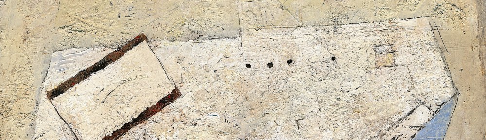
Don Farrell - Box, Bottle and Bag - 1999 - 23 x 32 cm - 9 x 12.5 in - egg tempera on paper

One of my favourite shapes is the oval, which is clearly indicated in this painting.

Let me begin with the shape which may be read as a shelf.   In reality the shelf does not exist and in my mind it is a shape, (half an oval).  I prefer to work from memory or with my mind.

Now let your eye run along the front of the shelf from left to the right.  Your eye movement will connect to that vertical triangle and then to the line which embraces the shelf.  I’m very fond of that line. Do you sense the oval?

Do you see the shape created with the line and feel how it gently holds you?

Now there is a need to have you engage with the rest of the composition, and I have used pulls to accomplish this.   The small white oval, is the primary pull.  The striped rectangle is the other one, which could be considered stronger than the white oval.  I eventually came to like the competition, and felt the rectangle supported the the items on the shelf nicely.

There are other markings which I like to call pauses for your eye, and every one is assessed when orchestrating the the composition.

Integration can be accomplished in many ways.  Take the horizontal line near the top and how it turns upward at the right.  The angle is in harmony (parallel) with the shadows on the shelf.  This is very important as parallels provide movement which energize the painting, and they are meant to be sensed rather than seen.

Permit me mention something other than a pull or integration.

There is one other line, which is to the right of the white pull and pointing to where the horizontal line turns up.  Feel how it contains your eye movement and how it impacts with the rest of the painting.

I hope you can see that I am composing and not following a formula.

The intuitive coupled with knowledge is the key.


Diebenkorn (Shape Motifs and Integration)

Richard Diebenkorn - Large Still Life - 1966 - 164 x 178 cm - 64 x 70 in - oil on canvas

This painting has a great example of integration.  Diebenkorn provides a very sensitive integration, where the vertical line on the table connects to the circle in the blue area.  Note how the circle also integrates with a white rectangle on the table.  I’m delighted with how he guides me through the composition.

This brings us to shape motifs, which I feel Diebenkorn had mastered.  The primary motif of this composition is the rectangle supported by circular sub motifs.  By using three rectangles he quickly engages the whole area with the viewer.  If you don’t see them you will feel them for we take in shapes before subject matter.

He integrates the circles in the blue rectangle beautifully, with the shapes of the cup’s top and it’s shadow.

I love the pull in this painting, which is the ink bottle.  I feel it’s just right.  The viewer is pulled to the lower part of the painting then returns to the focal area.  I say the area, for he has left for us to decide if the cup, the circle, or the red dot, is the focus.  This level of sophistication is what we artists should strive for.

Remember there are no rules or formula other than knowledge and level of consideration as Diebenkorn has conveyed beautifully.

Picasso (Integration)

Pablo Picasso - Acrobat with a Ball - 1905 - 147 x 95 cm - 58 x 37 in - oil on canvas

This early painting by Picasso has excellent integration.

I will begin with the most obvious, the left side of the acrobat on the ball, and how she connects to the leg of the other acrobat.  Your eye movement will continue from one to the other.

Now for a beautiful rhythmic integration which begins at the sitting figure’s head.  The movement follows his spine, then your eye connects to the blanket.  This is very impressive when you realize this also integrates (rhythmically) with the other figure’s left side.

Now to the line the white horse is standing on.  I love this connection with the sitting figure’s right shoulder.  I still remember how excited I was when I first noticed it many years ago.

The sight line continues to the left of the painting and now we see how the large figure is integrated with the background.

Other great examples are how the large figure’s right hand connects to the edge of the blanket, and how his left arm integrates with his shorts.

Other ways to integrate are with shapes, colour or values.  Picasso used all three.  The ball and the heads (shape, value and colour) integrate the warmth on the large figure’s left leg with the small red figure.  And that wonderful red dot in the acrobat’s hair.


Bonnard (Integration and Pulls)

Pierre Bonnard - The Red Tablecloth - 1910 - 81 x 84 cm - 32 x33 in - oil on canvas

Integration or “knitting the composition together” is primary in composition and Bonnard was a master.

There are many ways to integrate and one is through shape motifs as I talked about in yesterday’s post.

Another way is by providing connections with sight lines or eye paths.

In this painting the strongest one is the vertical line running from the top down through her hand to the oval in the bowl.  Just to the right is a beautifully done subtle vertical above her right shoulder, which connects to a vertical in her blouse, then runs down the handle of the coffee pot.  It then continues down to the napkin.  Note on the next stripe how the shadow on the napkin permits your eye to continue through the napkin.

There is a superb pull for the dog, the dark shape at the figure’s left shoulder.   I find this exciting as I can feel Bonnard’s consideration, of knowing the dark value of the dog would dominate the composition without that pull.

What is a pull?  A pull is something that takes the viewer away from a strong element or the focus in a composition and Bonnard did it so well.

Also, note how the dog’s neck is integrated with a stripe on the table cloth.

Remember the poetic side of painting, which is, you are not meant to see, but rather to feel these considerations.

A last note.  The red vertical at the right.  Is it in front of the table top?

This shows us the level of sophistication of Bonnard’s work, and the connection to Cezanne and many other painters of the period, such as Matisse, Braque and Picasso.