Mondrian – (Spatial Planes)

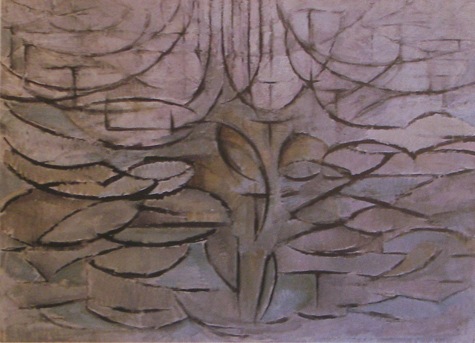
Piet Mondrian - Apple Tree in Flower - 1912 - 78 x 106 cm - oil on canvas

In this third version of the tree, Mondrian has brought spatial planes to the forefront.  This is about painting space and occupying space, and he has accomplished the challenge impressively.

Reducing the tree to a rhythm of loops, conveying it’s presence and movement is fantastic.  Mondrian then used vertical and horizontal lines, which we read as planes in space.  I feel this is a great achievement.  He has shown us how to convey a very complex consideration with just a few markings, avoiding substance.  Brilliant!   I hope you can feel the energy and space.

A great deal of consideration went into this series of paintings from 1904 to 1912 and Mondrian has taken cubism to new heights and he will continue to lead the way towards abstraction along with a few other notable artists.

Inviting the masters to influence is important to all artists.  And we see this with Mondrian taking Cezanne’s spatial planes and Cubism to a new level.

Mondrian – (Creating Space with Colour)

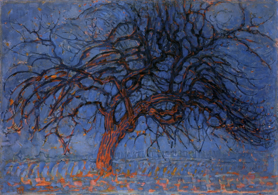
Piet Mondrian - The Red Tree - 1908-10 - 70 x 99 cm - oil on canvas

In this traditional rendering of a tree, Mondrian has not only brought colour to the forefront, he has also used colour to create the sense of space.  We immediately respond to the relationship of the blue and orange.  Our eye reads the orange as coming forward  and then continue to the receding blue.  We then connect to the rhythms in the tree and come to a beautiful pause at the top right.

By restricting his palette Mondrian has emphasised colour and used colour as spatial planes.

Combining Fauvist and Cubist considerations provided Mondrian the opportunity for experimentation and growth and he refined these superbly.

My Work – Spatial Planes and Rhythm

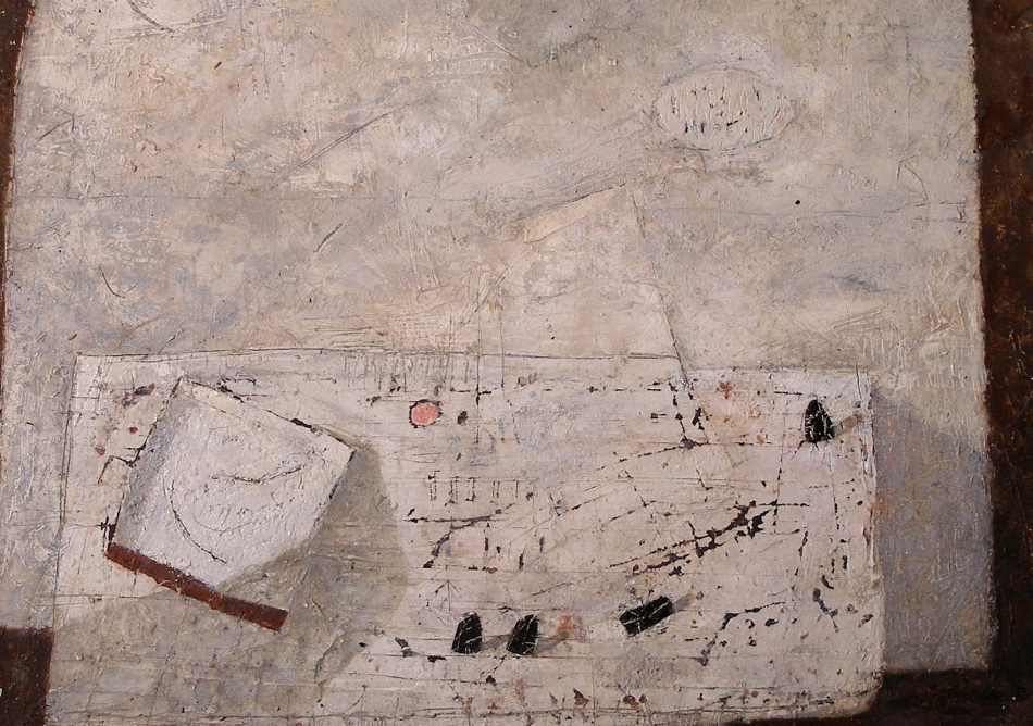
Don Farrell - Pink - 2011 - 23 x 31 cm - mixed water soluble media

This painting has the wonderful consideration of raising the table to the picture plane.  And I focused on spatial planes as well, which is very challenging.  I want the viewer to feel the space the planes present.  And I am pleased with the receding plane of the table which also could be termed as a spatial shift.  The shift represents movement (the viewer’s movement), which is more sensed than seen and provides time.  Thank you Cezanne!

Permitting these to appear while painting is important, allowing intuition to come into play.   I began with a table and wall and then let the play begins.  Thinking of shapes, rhythm and movement, rather than objects.  And of course my favourite things usually find their way into the painting, which ensures continuity in my work.

The soaking pan anchors the composition and from there we move along the bottom edge connecting to the rhythm of the black weights, leading you to the oval on the wall.  I then provided marks on the wall to return you to the pan.  Do you feel the curved movement in the pan?

I permit myself time to assess and after much scratching and repainting found myself painting a small, very satisfying pink circle, which became the final note.

There are other lyrical markings, such as arrows and what I like to call loops which are in the pan and on the wall.  There is also a very fine rhythm within the oval on the wall, echoing the arrangement of the weights.  I strive for every mark to be in harmony.

I must also mention the angle attached to the soaking pan. Can you feel it’s importance?


Influences – (Matisse on Hofmann)

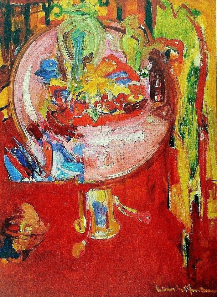
Hans Hofmann - Pink Table with Still Life and Palette - 1936 - 132 x 96 cm - oil on panel

As in my post of September 1st. on Cezanne influencing Matisse, we see the influence on Hofmann.  We should be aware of and participate in the continuity of art, which opens doors for new considerations for those who follow.

Hofmann has used the tilting up of the table top very interestingly by adding another bold  consideration, the rhythmic shape at the bottom left of the table top, which seems to be both on and in front of the table.  This is a wonderful spatial plane, and he integrated it beautifully with a vertical just below at the right of the shape, and upwards with the curve of the table top.  Another spatial plane on the table top, the pink rectangle at the bottom which seems to come forth, very impressive!  There are some planes in the red just below the table top at the right as well.  Can you feel their connection with the table?  The combination of his free gestural stokes with his structural considerations are very impressive and I love the transparency of the green vase at the right.

Hofmann was a very knowledgeable painter and a superb teacher, who was influential in the development of the Abstract Impressionist movement in New York, which was wonderfully convoluted in the 30’s.

I will be posting more on Hofmann’s development of spatial planes with colour.

Klee – (Motif and Rhythm)

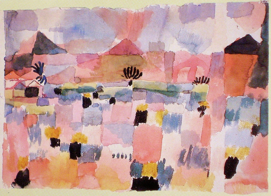
Paul Klee - Saint-Germain, near Tunis - 1914 - 22 x 32 cm - watercolour

This lovely watercolour shows us Klee’s wonderful use of the grid, which was the foundation for many of his compositions.  The grid provides an overall motif of squares or rectangles which unifies the composition, and a disciplined artist will not let the subject disrupt the rhythm.  In other words composition before information.

Klee’s grids are organic which provide the poetic feel of his compositions.  The freehand grid with it’s variety of sizes, can also convey the feeling of space, as Klee does so beautifully in this painting, particularly with the large vertical red rectangle near the bottom. Can you feel it being in front?  Klee also provides a sub motif of triangles, which conveys oblique movement and the structural elements.

The strength and rhythm of the blacks is most impressive as they ensure we will move gracefully through the composition.  Note how the black triangle on the right balances the houses.  Truly masterful!

Having the grid throughout the painting integrating the foreground, the background and the sky is works beautifully and I am very impressed with the vertical running from the bottom  to the top, next to the black triangle.  Do you feel it being another plane?

I am sure Klee listened when he painted this lyrical composition.


de Kooning – (Integration with Line and Indicating Time)

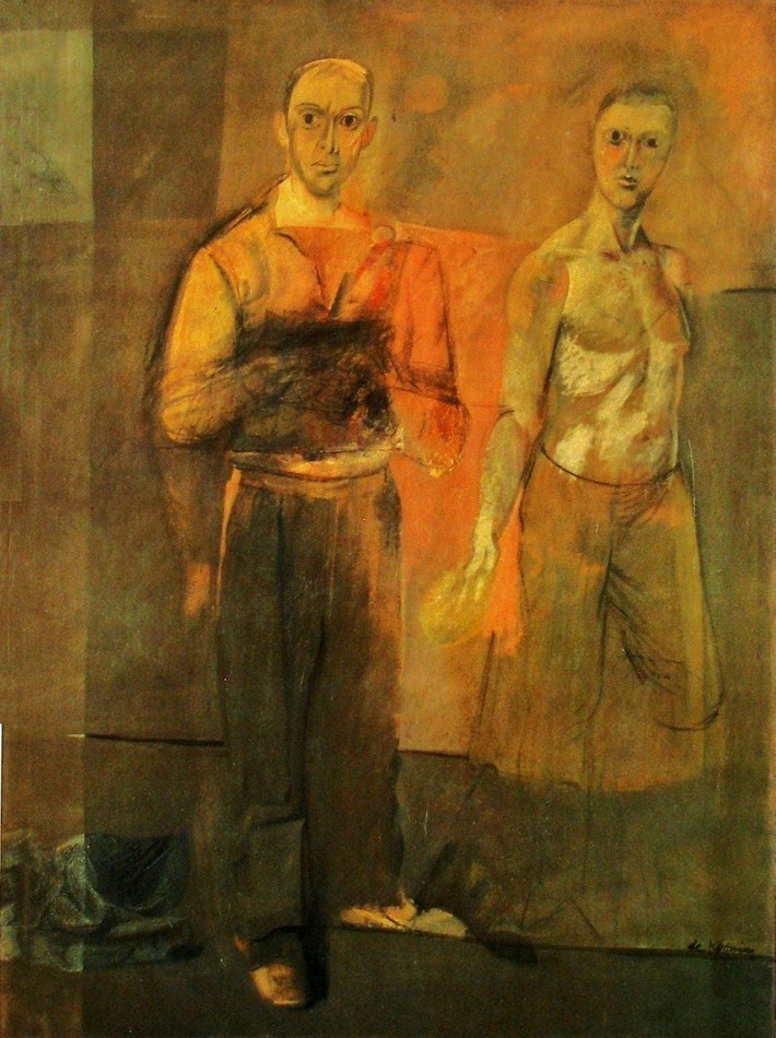
Willem de Kooning - Two Men Standing - 1938 -155 x 122 cm - 61 x 48 in - oil on canvas

De Kooning’s use of line for emphasizing the structure of the composition is very impressive. The horizontal line at the right edge of the painting, near the figure’s shoulder superbly balances the composition. Without that line we would have difficulty moving away from the dominant figure.  It provides not only a pull, it also completes a wonderful horizontal integrating division of the composition.

Another beauty is the line under the shoe which not only supports the figure it is also provides rhythmic support for the line above at knee level.  There is another which shows us how sensitive and the thoroughness of de Kooning’s considerations.  It’s the faint line in the orange area, connecting the men at their elbows.

De kooning was also working at conveying time in this painting as we see in the right arms of both figures.  We see two positions of the arm in the dominant figure and at the hand of the other man.  And I think this explains the dark rectangle in front of the indistinguishable hands of the dominant figure.  There are basically two methods for conveying time.  One by inviting the viewer to move (not physically, but in their mind) and the other is to indicate the movement of the subject which de Kooning used here.  Both are very challenging.

I also would like to mention how the shoes are actually a pull, bringing us to the bottom.  And a fantastic pause.  The light mark at the left end of the line at knee level.  It’s influence on  the composition is superb!

I think his choice of not completing the legs of the man at the right is interesting and leaves us with an open consideration for discussion.


Matisse – (Integration with lines and shapes)

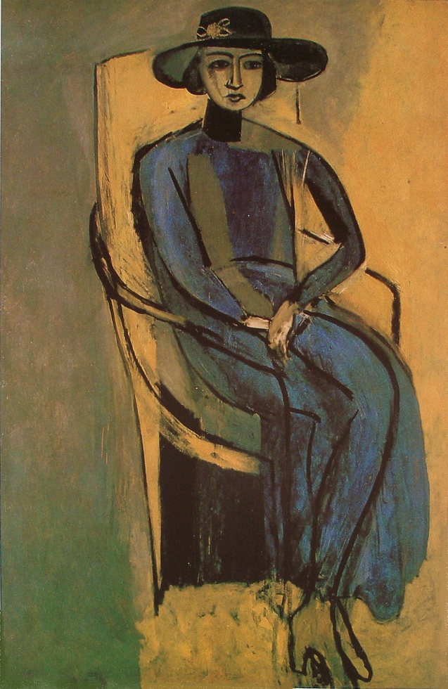
Henri Matisse - Portrait of Greta Prozer - 147 x 93 cm - oil on canvas

In this delightfully reduced and and rhythmically distorted painting, Matisse has integrated the subject with line and shapes elegantly.

I love the rhythm of lines and how they integrate with the figure.  Lets begin with the line at the top of the chair taking your eye across the rim of her hat, which then loops down to a  vertical black line indicating the chair back at her left.  Which then connects to a faint line that attaches to the left arm of the chair.  The vertical front of the chair arm then integrates beautifully with her leg, taking us to the bottom of her dress.  Matisse then provides us with lines leading us back to the top of the chair.  This is just one of a few rhythmic paths for us to engage with.

There are a number of very interesting considerations in this painting.  One that stands out is her shoes.  Why do they blend with the background?  The reason is Matisse wants your eye to move along the bottom of her dress or under the black shape.  If he hadn’t blended them, they would be competing with these rhythmic lines, returning you to her eyes, and she is now gracefully floating.

Rhythm needs harmonious structure and Matisse has balanced them masterfully with a motif of rectangles holding the composition together beautifully.  We first have the strong black one at the bottom under the chair, then another on her chest and a fantastic one under her chin. (They just need to have the sense of being rectangles.)    How they hold the composition together is most impressive and I often think of this painting when I am working.

Two other great considerations in this painting are distortion and reduction, which comes to the forefront when an artist is thinking composition before information.

Ask yourself why?  I will talk about this in future posts,


My Work – Rhythm and Harmony

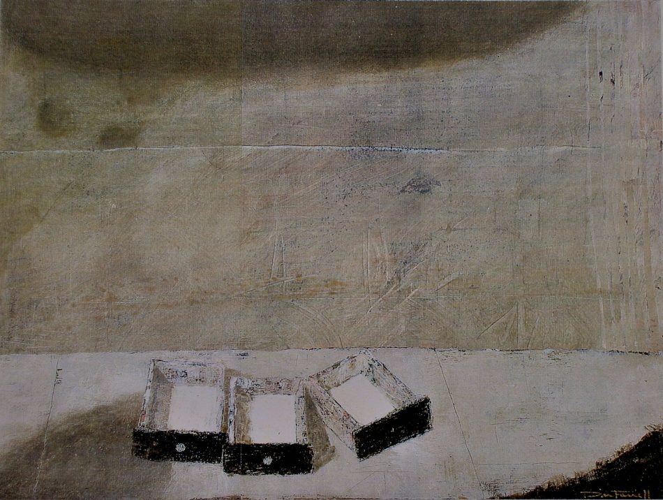
Don Farrell - Three Drawers - 1999 - 33 x 45 cm - 13 x 17.5 in - water soluble media

The arrangement of the drawers is the key for the rest of the composition.  I decided to supported the sweeping movement of the drawer faces with a curve in the table front at the bottom right, which felt very rhythmic.  And to complete the harmony I provided a shadow at the top, echoing the movement of the drawers.  Do you feel the rhythm?

I was pleased, but there was a problem with the viewers eye leaving the composition at the right.  The stripes provided a solution, not only for containment but also a lovely pause (the small black marks in the stripes) appeared.

I was now pleased with the movement to the right, and instinctively knew the need to return the viewer to the left.  After several attempts I finally arrived at a solution that not only balanced the composition, but also rhythmically integrated the drawers and the background.  I added those two dark circular shadows at the upper left and then provided a harmony by painting knobs on just two of the drawers.

I should also mention that the angle of the drawer, at the right, determined the location of the two shadows.  Do you feel the connection?

I then painted the horizontal white line to support the table and a cast shadow at the bottom left which provides a lead into the painting.

I also assessed all the smudges, scratches and markings throughout the composition for indications of disharmony, which usually requires a few visits.

I find it is much more interesting to permit the composition to lead me rather than to force the preconceived detail to dictate.

Mondrian – (Integration and Rhythm)

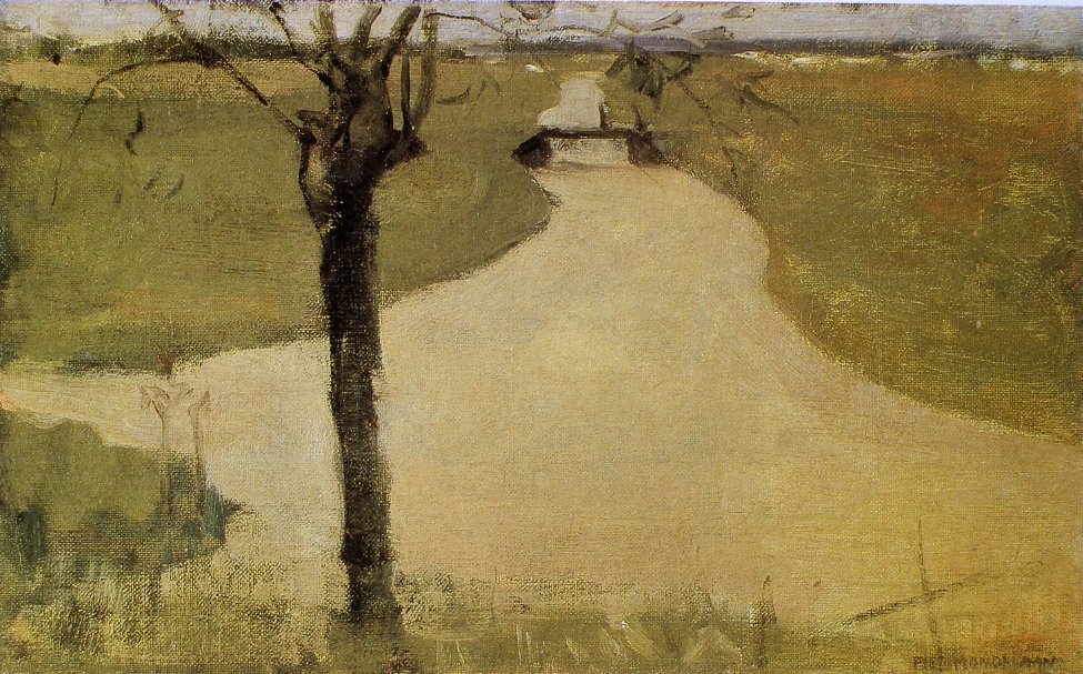
Piet Mondrian - Tree on the Kalfje - 1902 - 23 5 x 37.5 cm - oil on canvas

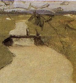
This small painting by Mondrian shows us how an excellent artist considers the composition even when quickly done.  Can you feel the connection between the tree and the bridge?  This is superb integration.  Another very sensitive integration is provided when your eye follows the river bank from the right of the painting, then connecting to a delicate branch which embraces the bridge, (see detail).

This painting also has a consideration which has stayed with me for years, that wonderful cross at the bottom right.  Why is it there?  It actually is a structural element, providing an oblique movement when you sense the parallel with the pruned branch.  It also completes the integrating eye paths by directing your eye back up to the river bank.  And on top of that the vertical of the cross is part of a rhythm of the tree trunk and the two sensitive verticals to the left.

The painting was probably done quickly, which is all the more impressive.  A composition does not have to be complex to be great, and this is a fantastic composition.

May I also mention another branch at the left which bends down, providing containment.


Miro – (Rhythm and Structure)

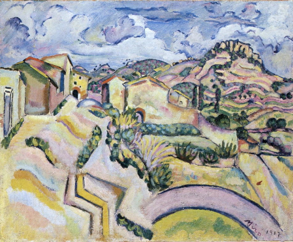
Joan Miro - Landscape - 1917 - oil on canvas

I’m sure Miro was thinking of Cezanne in this rhythmic landscape.  I love Miro’s wonderful rhythms and how sensitively he balanced movement with sophisticated structural support.

The rhythm of arches is primary, beginning with the large one, we then find them continuing up through the composition.  There are several, and I would like to focus on a few which integrate the sky with the foreground.

My favourite is the movement provided by the arch in the sky and the arch of the hill below.  Another two beauties are just below the yellow building with the black windows and the one at the right which connects to a wonderfully sensitive vertical which continues down through a wall.

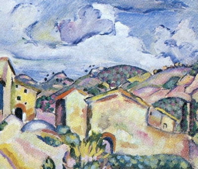
Staying with the detail, l would Iike to mention the integration of the roofs at the right with the hill above, which brings us to another rhythm, those wonderful black dots just above the hills.  They are in harmony with the little black windows in the yellow house, which is the focus of the composition.

Let us return to the full composition and the sensitive structural support for the rythmic movement of the arches, the two zig-zags at the bottom.  Miro uses them to vertically take us towards the focus.  The strong right angle next to the yellow zig-zag  is the most important structural element, beautifully stabilizing the composition.  And I hope you can feel how important the sensitive vertical I mentioned is to the composition.

Miro has invited us to partake in a visual poem!