My Work – Movement – (The Reductive Process)

Direction VI - 2008 - 49 x 97 in (124 x 246 cm) - mixed media on canvas

This painting has a special place for me as it represents how wonderful it can be when a composition succeeds through the reductive process.

The seed of the painting is to convey movement as purely as possible without any superfluous markings or information.  This can be very challenging, for it is not simplification just through omission and reduction.  It is striving to have the viewer connect and participate at the primal level.  Arranging and rearranging the markings until I respond is genuinely exhilarating. and It always seems to be a circuitous route..

Those small dancing angles are an invitation to engage and they may represent anything the viewer wishes.  The colours and textures are open as well, and it is my hope the painting invites a different response with every visit.

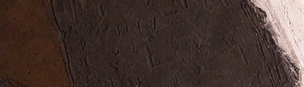
I should mention a very important structural consideration.  Note how the bottom edge of the light area curves upward at the right.  To support this movement I provided a parallel line just above.  This is very important for the composition and is meant to be felt more than seen.

I would like to share another detail which I feel is the finishing touch to the painting.  When my eye comes to where the blue intrudes slightly into the light texture, gently holding me briefly, I smile. (see detail)   
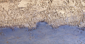
The best notes appear when we are responding to the painting.

We artists put ourselves through a great deal to arrive where we initially intended, and to be truthful that place can be elusive. 


Ben Nicholson – (Influences)

Ben Nicholson - Still Life (Violin) - 1932 - 30 x 24 in - oil and gesso on board

 This painting is an excellent example on how artists allow recent influences to show in their development.  Nicholson engaged with Cubism as a means to refine and personalize his awareness of this major development in contemporary painting, and used it to provide a solid foundation for his journey towards abstraction.  Here, like Picasso and Braque, he uses the picture plane while simultaneously shifting our view to provide the sense of space.

The lines of the grid are both in front and behind the violin, conveying the feeling of space.   I love the repeating rhythm of a series of vertical rectangles and how their dance gently contains my perusal.  Can you feel how the white one is nearer and the others recede? You are meant to sense this dance rather than see the harmony they provide in the composition.  The two verticals patterned with dots is open to interpretation ( I think of the act of playing the instrument and the rhythmic lines at the upper left is the sound of the music.)

The wonderful “shifting of space” in the body of the violin, the positioning of the F-holes and showing us the side view of the neck and scroll not only shows Nicholson’s understanding of cubism, it also shows us his restraint and refinement of this great consideration in twentieth century painting.

My Work – Repeating Shapes for Rhythm and Balance

Rough Wall - 2013 - 9¾ x 13 in - mixed water soluble media

This recent still life is an excellent example of using shapes for continuity or rhythm in a composition.  Repeating shape motifs organize my considerations, permitting me to search for an interesting arrangement within the context of my chosen shapes -(rectangles, half ovals and triangles).  I begin with the basic rectangle of the table.  The rest of the composition is not predetermined, but rather develops through playfully scratching in the paint, then removing and rearranging the shapes until I respond to their relationships.

Next I playfully marked in two parallels which define the edges of the tablecloth.  Can you feel how your eye moves up and to the right along the angle determined by the edges?  I also played with the half oval shapes of the chair and the place mat, adjusting their relative positions and sizes until I found myself marking three rhythmic half ovals on the wall above.  I then refined the shapes which were formed by the tablecloth painting them blue to represent the table.  There is a very important triangle at the bottom (on the tablecloth) which leads you  towards the boxes and a playful small one just below the boxes.  I also indicated a partial triangle above on the wall.  I am now responding to the painting and continued to orchestrate with various markings to enhance the viewer’s participation

I love spatial planes which also can be read as shapes.  There are two in the painting, which I marked in just after the half ovals.  One is the sense of a rectangle protruding above the top edge of the table and the other on the wall, which appears the come forth.  I like the sense of depth they provide and their relationship with the shapes of the boxes and the blue cup.


My Work – Working with Shapes and Spatial Planes

Blue Table - 2012 - 10 x 12½ in (24.7 x 32 cm) - mixed water soluble media

I find it interesting how restriction can lead to new considerations, such as becoming involved with spatial planes as we see in my painting  “Blue Table”.  Presenting a harmony with planes and shapes can be quite elusive and I love the challenge. They always seem fresh to me because they are not predetermined, except for the primary shapes, which intentionally read as a still life.  I then play with the shapes and planes until I begin to respond to their relationships and I must say they are not meant to be apparent.  I wish the viewer to “feel” rather than see them.

Let me begin with the shapes which provide the lyrical unity of the composition.  To ensure this, I used an arrangement of rectangles and triangles, conveying harmonious relationships.   I actually adjusted their sizes, colours, values and locations several times until my sense of harmony was satisfied.  I enjoy this immensely, and working  and reworking water soluble media permits endless play.

Now to the planes which providing the sense of space.  They are both shapes and edges of shapes which connect or integrate elements in the painting.  For instance. the left side of the table integrating with the edge of a plane above, which then takes your perusal to the cool rectangle above the orange stripe.  You then take in the yellow triangle.  Can you feel the yellow triangle sitting on a vertical plane which seems to come forth?  The feeling of space is also felt where the top edge of the table shifts, merging the table and the wall as well as providing the sense of movement.  The small box is also sitting on a plane, and I love that small angle below the rhythm of black dots and how it comes forth.

I mustn’t finish without pointing out how the blue triangles provide a base for the composition and I’m very pleased with the triangles at the top corners as well.  I then provided a curve within the soaking pan which leads you towards the box through the four dots, which were rearranged a number of times.  There is another relationship providing an important rhythmic support for the prominent black sides of the soaking pan.  It’s the long parallel rectangle adjacent to the blue triangle to the right.  This came forth during the process.  I am grateful for having the patience to allow a composition to evolve, no matter how many revisions are required.

I hope you enjoy finding other subtle notes, such as the little black line at the top of the blue triangle at the left .  Can you feel it’s impact?

Giacometti – Composition (Integration)

Giacometti – Self Portrait – 1921 – 32 x 28 in – oil on canvas

Giacometti’s command of composition is absolutely marvellous in this superb painting.
I will focus on his wonderful integration of the figure with the other elements in the composition.  Let’s begin with how your eye is taken across the painting from the seat of the chair, along the bottom of his jacket, to the bottom of his right leg, then you are guided up to the verticals behind.  Another beautiful integration is how the curve at the bottom of his pant leg rhythmically connects to the curved element to the left, which in turn, guides you up to his hand. I love it!  Also take note how the bottom of his trousers connects to the lower edge of his other leg and how the bottom of his pant leg then integrates with the chair leg.  I was and still am taken with how he integrated the other chair leg (between his legs) with his pant leg.  Can you feel how the angle in the chair runs into his pants creating a small blue triangle?  (see detail)

detail

This very impressive small dark blue triangle provides a sense of overlapping. The top edge of this gorgeous little triangle also parallels a dark line above which in turn integrates with the edge of his palette.  Can you feel the movement and shapes?  There is also another sense of an angle at the bottom of the dark line (creating another plane) which parallels the angle in the chair leg.  There is more.  That dark line also connects to a subtle purple line which carries downward into his leg, creating another wonderfully subtle triangle.

Note the line just to the left of his pocket and how this guides you up to the front of his neck and how his chin and his collar connect to the horizontals behind.  Just one more, it’s how he leads you upwards through his arm from the opening in his jacket.

There is more for you to engage with, and I hope you enjoy this wonderful early composition by this twentieth century master.  I am impressed with how Giacometti permitted to show Cézanne’s influence.


Influences – (Cezanne on Matisse)

Henri Matisse - First Orange Still Life - 1899 - 56 x 73 cm - oil on canvas

Permitting the work of notable artists to show in your development has a great tradition, and can lead to a commitment or direction.  The key is being aware of the difference between influence and copying.

The above development level painting by Matisse is a good example of having too many considerations .  We have difficulty moving gracefully through the painting because he is more focused on information (what he sees), rather than adjusting for the sake of composition.


Henri Matisse - Still Life with Oranges II - 1899 - 47 x 55 cm - oil on canvas

In this painting, done in the same year, Matisse is permitting Cezanne’s considerations of  reduced modelling by allowing shapes and colour to come forth.  He has become aware of the power of shapes and colour and how to use them to create harmony in composition.  We see this in the fruit, the cup and the pitcher as well as the large shapes in the background.  How he chose where not to use shadows is impressive because he is freeing himself from depiction.  He reduced the fruit on the table to coloured circles because through studying Cezanne, he realized that modelling would only disrupt the rhythm of the circles and unnecessarily clutter the painting, as we see in  “First Orange Still Life” above.

He did not copy, as he flattened the fruit more than Cezanne had done.  We see the influence as well as the next step towards what we see as a Matisse.

Showing influence and acknowledging it is a great way to develop.

Nicholson – Rhythm, Time, Space and Colour

Ben Nicholson - Still Life with Jugs and Mugs -1929 - 38 x 56 cm - oil and pencil on canvas

This, what may seam to be a simple painting is really very sophisticated, and Nicholson was successfully developing his approach to the wonderful spatial considerations being refined in the twentieth century.

He has subtly provided us a sense of movement (our movement) by altering our position in space when we view the mugs from above and from a level position simultaneously.  You are meant to sense it more than to see it, and the sophistication of his elegant simplicity is wonderful.

I love how he also provides us with the sense of space by rendering the mug handles in front of the mugs.  This has stayed with me for years and I hope you can you feel and appreciate it.  The handles also provide a lovely rhythm, integrating the two mugs with the jug at the right.  Nicholson also provided other beautiful rhythms with the vertical bands on lower mug and the horizontal bands of colour on the pictures and the mug in the centre, which obviously brings us to the focus with strong use of colour.  I feel the strong white shape balances with the strong combination of the green and reds and their combined power is on the verge of dominating.  This is a great example of colour ratio, or in other words not having the colour compete or dominate the wonderful subtle considerations in the rest of the composition.

It is a joy to engage with Nicholson’s wonderful journey towards becoming a true master.

Diebenkorn – (Integration, Rhythm, Pulls and Pauses)

Richard Diebenkorn - Girl with Flowered Background - 1962 - 103 x 52 cm - oil on canvas

How Diebenkorn integrated the figure with the Matisse like rhythm of the background is beautifully considered.  Let’s begin with the horizontal black shape at the left of the painting and how it sweeps up and integrates with the blue shadow, through the red shape, then with her hair.  The sweep also connects to the delightfully assessed black shape above her right shoulder, which brings the eye to the blue stripe on her blouse, very impressive.  We then automatically follow the red stripe which not only integrates with her hair, but when you follow it down from her right shoulder you will eventually connect to the stem of the small flower above her left shoulder, which then joins with a white shape connecting us to the horizontal division of the painting.  Very sophisticated.

There are two wonderful pulls permitting us to leave the focus of her hair and move through the painting.  I’m referring to the beautifully balanced black shape at the bottom and the other one at the right edge of the painting.  Remember, these are meant to be felt more than noticed and pulls relate through closeness in either value or colour.

The centres of the flowers provide a beautiful subtle horizontal rhythm supporting the division in the composition and gently relieving us from the strength of her black hair.  Do you find your gaze moving to the dots when you focus on her?  As I said these considerations are not meant to be obvious.  They are invitations to a visual dance.

I must also mention the fantastic blue shadow which Diebenkorn painted as a shape.  We see a master permitting preceding masters to influence his work.  We can all join this great tradition, whether we paint or love to engage through cultivated study.


Hopper – (Rhythmic Pull, Integration and Shapes)

Edward Hopper - American Landscape - 1920 - 7.5 x 12.5 in - etching

This wonderful etching is a superb example of how important the knowledge of  composition is in all forms of expression.

Hopper’s exquisite use of rhythm is one of the best examples I know of.  The three cows rhythmically lead us into the landscape to a wonderful light patch, just above the cow crossing the tracks.  This beautiful consideration takes us beyond the cows to the powerful shape of the trees and beyond.

There is also a superb integration of the centre cow with a small triangle structure just beyond the tracks.  Can you see how the back of the cow’s neck connects to the triangle and then how you harmoniously read the other triangle at the right of the house?  Another sensitive relationship is between the cow on the tracks and the sunlit side of the house.  They harmonize in value and size beautifully.

The foundation of three horizontal rectangles in this composition is a great example of reducing to a few shapes.  The power of shape motifs is very important and master artists are very aware of how superfluous detail can weaken a composition.

Great composition does not need to rely on size or detail.

Mondrian – (Integration and Rhythmic Shape Motifs)

Piet Mondrian - Farm at Duivendrcht - 1907 - 87 x 109 cm - oil on canvas

This beautifully rendered painting by Mondrian is a superb example of sophisticated  integration.  We see this in how he poetically harmonized the trees with the house.  Let’s begin with the tree at the left and the subtle parallel of the lower branch with the roof line.  The relationship provided is a form of integration and can also be considered harmony and structure as well.  Now to the next tree and how it blends with the roof line.  The third tree from the left also parallels the roof line, then connects to the chimney.  The fourth tree follows the roof at the right and then continues up to form a triangle shape with the large tree leaning in from the right. This triangle form echoes the triangle shapes of the house, providing a beautiful rhythm, or triangle motif. We then continue with the rhytms of the earlier trees with the large branch going to the right in this large tree.  The group of trees at the right form a large shape which provides a counter movement paralleling the right sides of the triangle shapes in the house.  There are more waiting to be discovered.

I would like to mention the birds, which Mondrian used as a refinement to the composition.  Note how they extend, or integrate with, the large shape of the trees, guiding you down to the left tree.  And how two of the birds integrate with the large branch of the large tree at the right, and how that little bird at the right of the trees connects to the tree below.  If the bird was further from the trees  the connection would dissipate.  The location of the bird would also integrate work elsewhere, the key is the distance between the chosen branch and the bird.

A master painter is very aware of the importance of every mark and how it relates to the composition.

I would like to take you to the water at the bottom right of the painting and why he choose not to show the reflection of the sky.  The reason being it would compete with the focus of the painting by drawing us down to the bottom.  This is an excellent example of composition before information!


Another note:

It’s good to be aware that the movement towards abstraction came through figurative painters, as we see in Picasso, Matisse, Mondrian, Nicholson and many others in this period of great change in painting.