Influences (Cezanne on Morandi)

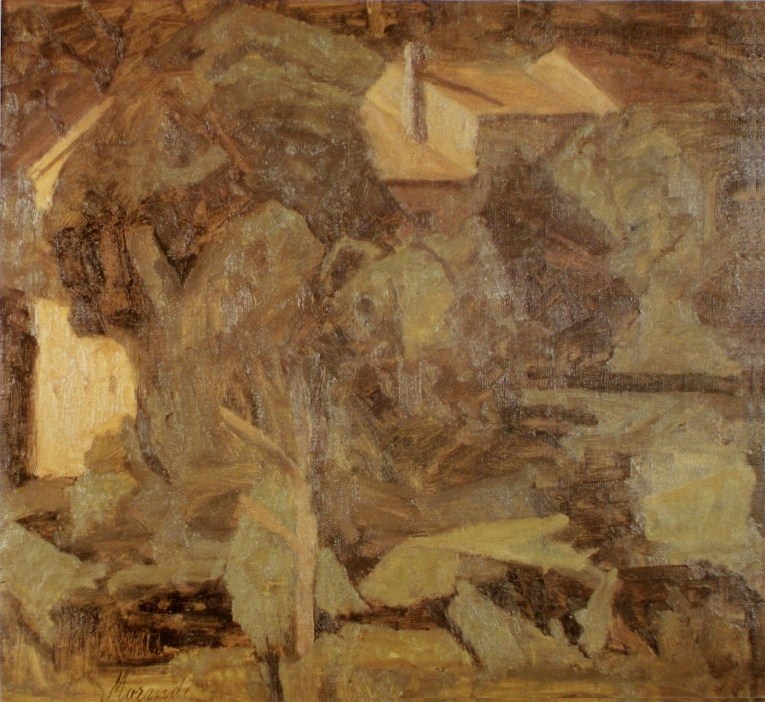
Georgio Morandi - Landscape - 1940 - 48 x 53 cm - 19 x 21 in - oil on canvas

This is a great example of how a notable painter permits himself to absorb the considerations of other artists without loosing his own unique approach.   We can feel the influence of Cezanne but this painting is a Morandi.

The sense of volume and space is wonderful.   He achieves this with shapes and values, as well as colour.  I will focus on shapes and integration.

The painting is held together by a large shape in the central area, which integrates the buildings and the foliage beautifully.  (It may help if you blur your vision slightly.)

The roof line of the building at the left defines the top of the shape.  It’s right edge runs down through the other building, continuing to it’s bottom edge, which parallels the top of the shape.  Remember the shapes are not meant to be obvious.

Morandi also has provided a wonderful spatial plane at the bottom right.  This is created by the vertical trunk of a tree and a dark horizontal line to the right.  Can you see the rectangle?  The rectangle not only provides structure but is also a plane which seems to come forth.

I also would like to point out the two parallel branches on the tree.  They parallel the roof line above.  Superb parallel rhythm and structure!

Morandi understood Cezanne.


Picasso (Parallels)

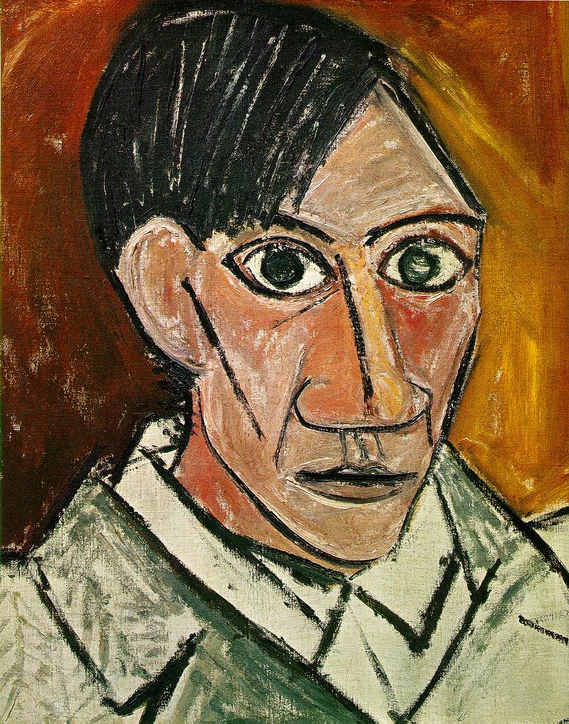
Pablo Picasso - Self Portrait - 1907 - 54 x 46 cm - 21 x 18 in - oil on canvas

This early painting by Picasso shows his developing interest in primitivism and cubism.

In this posting I will focus on how he conveys movement and space with parallels which Cezanne used so well.

First the black line defining the left of his face and the parallel line adjacent to his right nostril.  Do you sense the space between the lines and how your eye movement is directed?

The other movement is the line on defining his forehead and the parallel line on his right cheek.  Do you feel the space between them?

When you concentrate on the two directional shifts, can you feel the shift in space?   They are powerful when you become aware of them.  He is occupying space!

This is the seed of cubism, which is an unfortunate term for this fantastic way of conveying space.

We also see Picasso’s interest in primitivism, which, I think is a greatly misunderstood consideration.  And this reaching for the prime will have a major impact on twentieth century art.

Bonnard (Integration, Rhythm and Motifs)

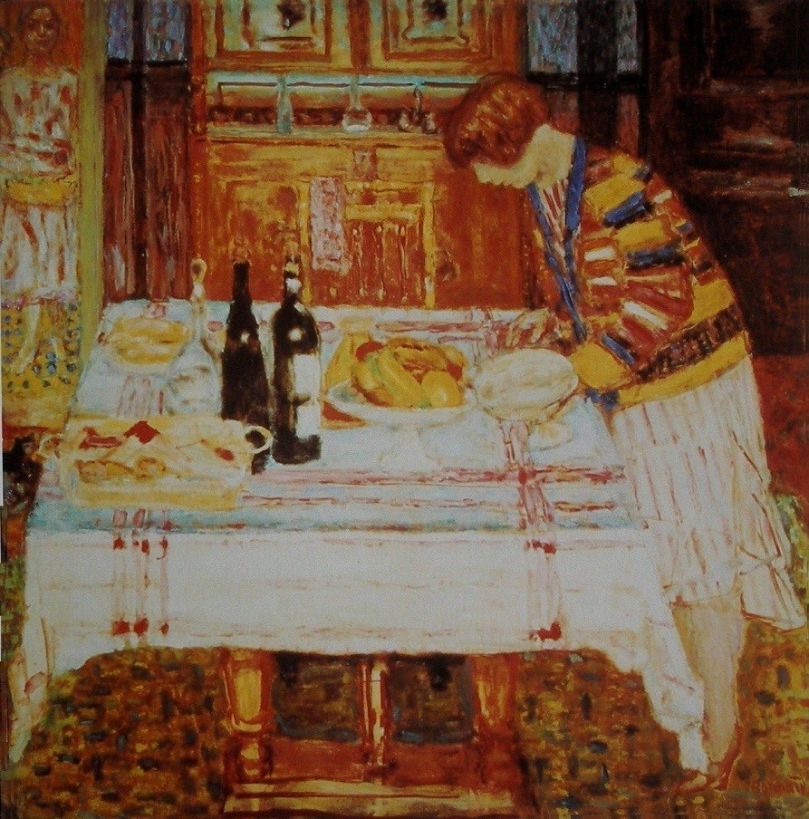
Pierre Bonnard - After the Meal - 1925 - 117 x 114 cm - 46 x 45 in - oil on canvas

While perusing this painting I remember asking myself.  Why is the wine bottle shape  off kilter?  And thanks to considering composition before subject, I realized the bottle shape had to be adjusted to harmonize (rhythm) and support the figure leaning over the table.

I continued to let Bonnard lead me through his poetic composition.  I love how he integrated the figure with the dark vertical connecting with the blue line in her sweater.  Then how your eye is carried down the edge of the tablecloth to her shoes. Note how the stripes on her skirt parallel the edge of the table, another rhythm.

Another beautiful integration is the dark horizontal which connects to her head.  Then you are taken along the blue line to the other figure at the left.

This figure is a superb example of his sophisticated use of motifs.  She is actually occupies a rectangle and is actually a rhythm of rectangles herself.   It may help if you blur your vision.

The rectangle motif is dominant and is supported by a sub motif of ovals

Also note how the bottom of the smaller figure’s dress integrates with the table top.

There are many other beautiful notes to enjoy such as his sophisticated use of colour.

Let me finish with the bottles.  Do you feel how the dark vertical supports them in size and value?


Integration and pulls

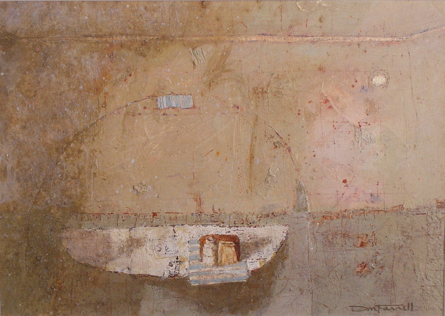
Don Farrell - Box, Bottle and Bag - 1999 - 23 x 32 cm - 9 x 12.5 in - egg tempera on paper

One of my favourite shapes is the oval, which is clearly indicated in this painting.

Let me begin with the shape which may be read as a shelf.   In reality the shelf does not exist and in my mind it is a shape, (half an oval).  I prefer to work from memory or with my mind.

Now let your eye run along the front of the shelf from left to the right.  Your eye movement will connect to that vertical triangle and then to the line which embraces the shelf.  I’m very fond of that line. Do you sense the oval?

Do you see the shape created with the line and feel how it gently holds you?

Now there is a need to have you engage with the rest of the composition, and I have used pulls to accomplish this.   The small white oval, is the primary pull.  The striped rectangle is the other one, which could be considered stronger than the white oval.  I eventually came to like the competition, and felt the rectangle supported the the items on the shelf nicely.

There are other markings which I like to call pauses for your eye, and every one is assessed when orchestrating the the composition.

Integration can be accomplished in many ways.  Take the horizontal line near the top and how it turns upward at the right.  The angle is in harmony (parallel) with the shadows on the shelf.  This is very important as parallels provide movement which energize the painting, and they are meant to be sensed rather than seen.

Permit me mention something other than a pull or integration.

There is one other line, which is to the right of the white pull and pointing to where the horizontal line turns up.  Feel how it contains your eye movement and how it impacts with the rest of the painting.

I hope you can see that I am composing and not following a formula.

The intuitive coupled with knowledge is the key.


Diebenkorn (Shape Motifs and Integration)

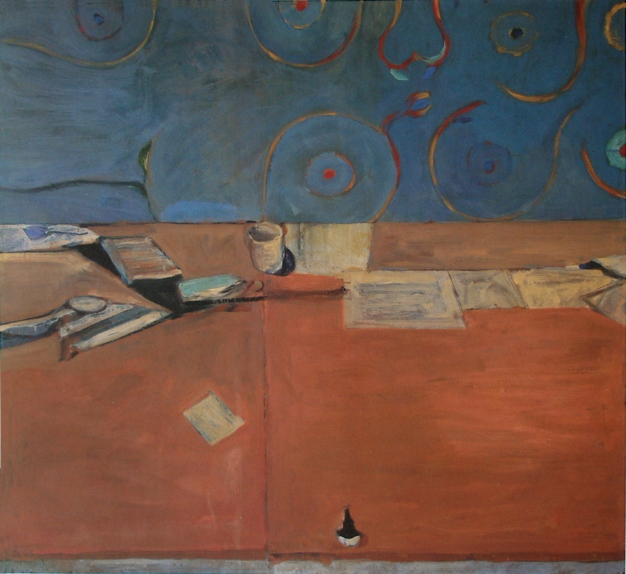
Richard Diebenkorn - Large Still Life - 1966 - 164 x 178 cm - 64 x 70 in - oil on canvas

This painting has a great example of integration.  Diebenkorn provides a very sensitive integration, where the vertical line on the table connects to the circle in the blue area.  Note how the circle also integrates with a white rectangle on the table.  I’m delighted with how he guides me through the composition.

This brings us to shape motifs, which I feel Diebenkorn had mastered.  The primary motif of this composition is the rectangle supported by circular sub motifs.  By using three rectangles he quickly engages the whole area with the viewer.  If you don’t see them you will feel them for we take in shapes before subject matter.

He integrates the circles in the blue rectangle beautifully, with the shapes of the cup’s top and it’s shadow.

I love the pull in this painting, which is the ink bottle.  I feel it’s just right.  The viewer is pulled to the lower part of the painting then returns to the focal area.  I say the area, for he has left for us to decide if the cup, the circle, or the red dot, is the focus.  This level of sophistication is what we artists should strive for.

Remember there are no rules or formula other than knowledge and level of consideration as Diebenkorn has conveyed beautifully.

Influences (Matisse on Diebenkorn)

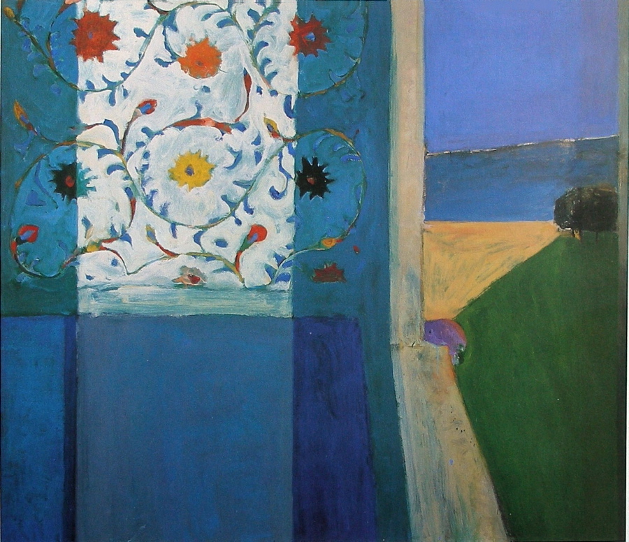
Richard Diebenkorn - Recollections of a Visit to Leningrad - 1965 - 183 x 214 cm - 72 x 84 in - oil on canvas

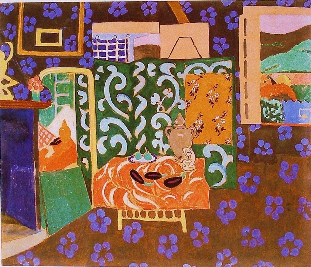
A great example of a notable artist permitting influence in their work.  One could say this is a homage to Matisse.

The influence is obvious, but the painting is a Diebenkorn.  Showing the feel of another artist’s considerations and not losing yourself is very important.

The composition has strong shapes and flatness, which he did so well.  Yet the painting has depth without using perspective.  All that is needed are a couple of obliques which  accomplish this nicely.

Diebenkorn’s superb use of shapes permits colour to come forth and dance!

I must mention the rhythm of blacks taking you across the painting.  They are wonderful notes relieving the strong verticals in the painting.

Henri Matisse - Interior with Eggplants - 1911 - 212 x 246 cm - 84 x 97 in - distemper on canvas


Picasso (Integration)

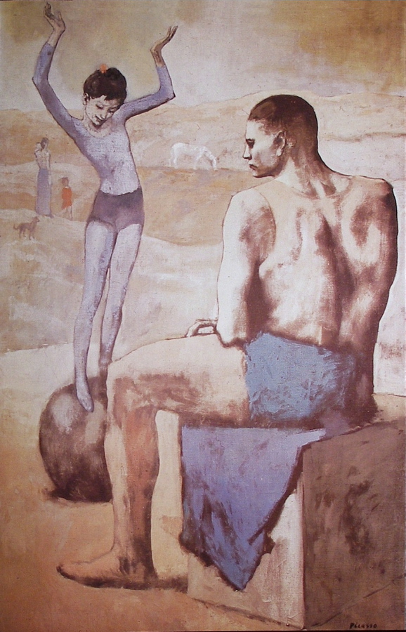
Pablo Picasso - Acrobat with a Ball - 1905 - 147 x 95 cm - 58 x 37 in - oil on canvas

This early painting by Picasso has excellent integration.

I will begin with the most obvious, the left side of the acrobat on the ball, and how she connects to the leg of the other acrobat.  Your eye movement will continue from one to the other.

Now for a beautiful rhythmic integration which begins at the sitting figure’s head.  The movement follows his spine, then your eye connects to the blanket.  This is very impressive when you realize this also integrates (rhythmically) with the other figure’s left side.

Now to the line the white horse is standing on.  I love this connection with the sitting figure’s right shoulder.  I still remember how excited I was when I first noticed it many years ago.

The sight line continues to the left of the painting and now we see how the large figure is integrated with the background.

Other great examples are how the large figure’s right hand connects to the edge of the blanket, and how his left arm integrates with his shorts.

Other ways to integrate are with shapes, colour or values.  Picasso used all three.  The ball and the heads (shape, value and colour) integrate the warmth on the large figure’s left leg with the small red figure.  And that wonderful red dot in the acrobat’s hair.


Bonnard (Integration and Pulls)

Pierre Bonnard - The Red Tablecloth - 1910 - 81 x 84 cm - 32 x33 in - oil on canvas

Integration or “knitting the composition together” is primary in composition and Bonnard was a master.

There are many ways to integrate and one is through shape motifs as I talked about in yesterday’s post.

Another way is by providing connections with sight lines or eye paths.

In this painting the strongest one is the vertical line running from the top down through her hand to the oval in the bowl.  Just to the right is a beautifully done subtle vertical above her right shoulder, which connects to a vertical in her blouse, then runs down the handle of the coffee pot.  It then continues down to the napkin.  Note on the next stripe how the shadow on the napkin permits your eye to continue through the napkin.

There is a superb pull for the dog, the dark shape at the figure’s left shoulder.   I find this exciting as I can feel Bonnard’s consideration, of knowing the dark value of the dog would dominate the composition without that pull.

What is a pull?  A pull is something that takes the viewer away from a strong element or the focus in a composition and Bonnard did it so well.

Also, note how the dog’s neck is integrated with a stripe on the table cloth.

Remember the poetic side of painting, which is, you are not meant to see, but rather to feel these considerations.

A last note.  The red vertical at the right.  Is it in front of the table top?

This shows us the level of sophistication of Bonnard’s work, and the connection to Cezanne and many other painters of the period, such as Matisse, Braque and Picasso.


Bonnard (Shape Motifs)

Pierre Bonnard - The Red Tablecloth -1910 - 81 x 84 cm - 32 x 33 in - oil on canvas

Pierre Bonnard’s sophisticated use of ovals is superb in this painting.

I will begin with the primary oval, the table.  When taking in the table, Bonnard brings us to the oval plate at the bottom right.  The placement of the other articles along the bottom of the painting is wonderful.   They form in essence a partial oval, which begins with the plate and continues up the dog’s back leading us to the woman head, another oval.  The other three items form another oval when connected to the articles along the bottom.

The objects are beautifully and rhythmically integrated into the composition with ovals, which may be felt more than seen.

Can you sense the harmony?

I will continue with more wonderful considerations in the next post.

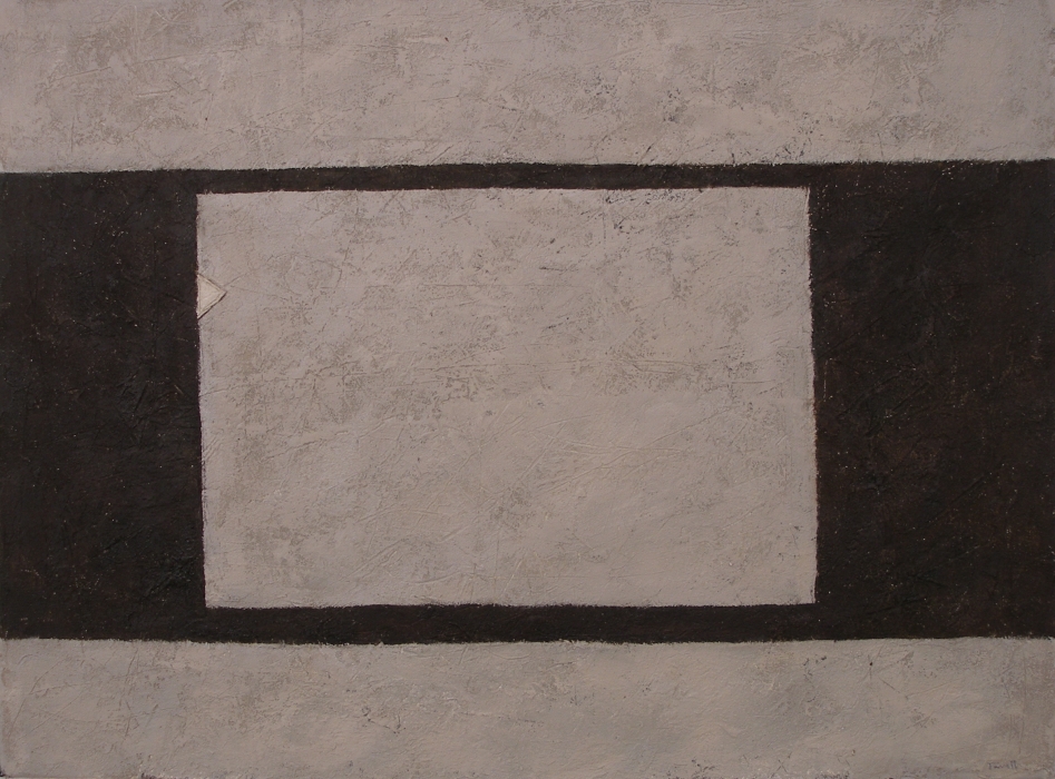
Influences (Giacometti)

Don Farrell - Direction III - 2007 - 53 x 73 cm - 21 x 29 in - mixed media on paper

I was working on a series based on the origins of architecture when another interesting consideration came to me.

As those who actually work on the structures, we all have a deeply felt need to leave our mark, no matter how slight.

That is the reason for the “organic” feel of the structural element in this painting.

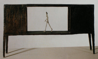
When I introduced direction into the opening, Giacometti’s sculpture, (Woman Walking between Two Houses)  came to mind.

This is a good thing, because the more we study, the greater the chances of recognizing the considerations of notable artists in our work.

Alberto Giacometti - Woman Walking between Two Houses - 1950 - 30 x 54 x 10 cm - 12 x 21 x 4 in