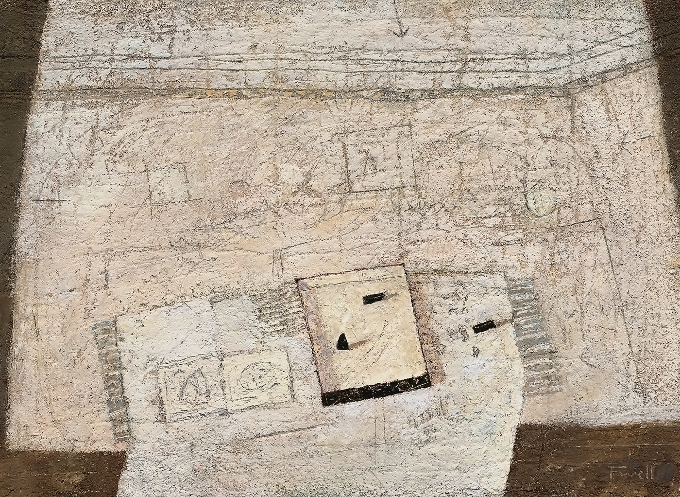
Weights-and-Sketches-9½-x-12¾-in-mixed-on-paper
I began this still life by building up layers of mixed media to establish a textured surface which invites marking and scoring. I then marked in the table top quickly and gouged the heavy line spanning the wall and turning upwards at the right.
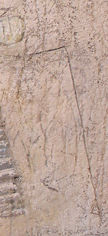
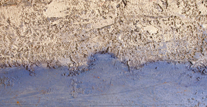
detail one
I next determined the shape of the table cloth to provide an entry from the bottom edge of the painting. Then, once on the table, changing it’s direction to harmonize with both ends of the table top. I decided to have this direction emphasized with a series of parallel edges and lines, and these in turn determined the placement of the sketches and soaking pan. The rhythm continues with a spatial plane (see detail one) to the right of the table finishing with the edge of the wall.
I used the same considerations horizontally as well, but with some “shifting” to convey the feeling of occupying space, especially along the top edge of the table. I’m very pleased with the downward shift of the stripes adjacent to the soaking pan and the angle just above (see detail two). I feel a sense of energy there.
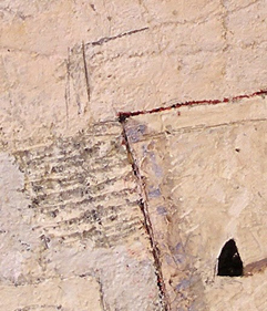
detail two
The wall above invited the two rectangles and the circle. I played with their placements until I was satisfied with how they supported the items on the table. I especially like how the delicate circle offers a gentle place to pause away from the focus of the weights and soaking pan.
The top of the painting felt a little vacant, prompting the arrow, introducing the finishing touch for the rhythmic parallels below.
The black edge of the soaking pan then needed rhythmic support, resulting in the appearance of the black weights. I readjusted their placements until they felt right. The triangular feel of the lower weight in the pan was determined to relate to the shape in the sketch at the left providing the finishing touch for the composition.
I’m always open to where the composition will guide my considerations.


 (48 x 96) mixed -reduced")

reduced")

 (54 x 54)")

