My Work – Shape Motifs, Reduction, Rhythm and Spatial Considerations

Blue Cup VI - 37 x 50 in - mixed media on canvas

This composition with my blue cup is a great example of reducing composition to an arrangement of shapes.  This seemingly basic approach opens the door to wonderful spatial ad rhythmic considerations.  The most important aspect of painting is the viewer’s engagement with how things relate, and one of the best ways to accomplish this is working with shape motifs.

This painting could be described as an arrangement of rectangles supported with a sub motif of ovals and a triangle.  The challenge is orchestrating them, which usually calls for considerable reworking, until I “feel” their relationships.  I become excited when this begins to happen and will stay with it no matter how many adjustments or refinements my sense of rhythm and harmony commands. I never tire of the process.

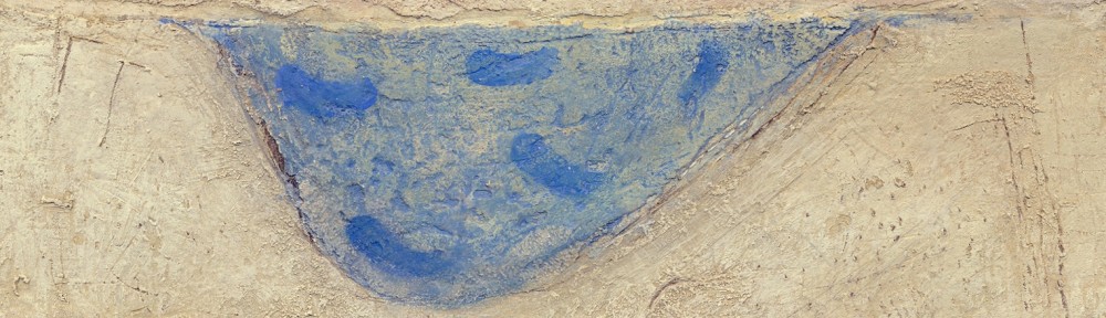
The primary relationship in this painting is between the cup and the rectangular pan.  The distance, or space, between has an energy which is embraced by the table top and supported by the rhythmic arrangement of the small white sketches.

Now to the very important play with lines and markings on the table.  I felt the ovals and half ovals needed rhythmic support.  Can you see the curved lines and feel their influence with the ovals?

The four lines (detail) between the cup and the pan were instinctively placed to support the four sketches. The triangle below was instinctively placed for a counter movement toward the sketches. There is also a small angle (detail) at the right which guides your eye back towards the sketches. 

The balance of the painting supports the rectangle motif with the lines at the top harmonizing with the horizontals of the table, especially the front edge.

A very important connection is a small line on the wall, just above the left edge of the soaking pan.  It carries you upward towards the strong white line carved into the painting.  I spent considerable time determining the placement, weight and length to harmonize its relationship with the cup and pan.  I also used the same consideration with the right edge of the cup and the edge of the white sketch above.

Striving to ensure every mark and shape have harmonious relationships and avoiding competition is the key.

If the shapes were not simple their relationships would not be felt as strongly.


Fernand Léger – (Cubism Evolving, Shifting Integration and Using the Picture Plane)

Fernand Léger - Still Life with a Beer Mug - 1921-22 - 91 x 60 cm - oil on canvas

Cubism has intrigued many artists and Léger is showing a refined approach to this great consideration.  In this painting he uses cubist shifting, which is showing two or more views of an object simultaneously.  We see this at the top edge of the table and at the top of the mug.  Léger broadened the shifting consideration to include integrations, most notably the integration of the vertical in the mug’s opening with the vertical black line above, providing a key connection in the composition.  He has also done this on the mug’s handle and with sensitive restraint where the white line joins the white of the bowl containing the fruit.

Léger’s traditional modelling of thecurtain and the items on the table is perfectly restrained and beautifully balanced with the flattening of the background and floor.  I like how we feel the roundness of the mug even though the shapes on the front are flat.  How he combined cubism with it’s sense of space with the raising of the background and mug to the picture plane is wonderful.  Can you feel the yellow and red shapes trying to come forward to the level of the mug and table top?

I’ll finish with a wonderful example of integration.  Run your eye up the table leg below the fruit bowl.  Do you feel the sense of the leg on the table top?  That is why he painted the two shadowy shapes.

Léger enhanced and refined two great movements in twentieth century painting.


My Work – Movement – (The Reductive Process)

Direction VI - 2008 - 49 x 97 in (124 x 246 cm) - mixed media on canvas

This painting has a special place for me as it represents how wonderful it can be when a composition succeeds through the reductive process.

The seed of the painting is to convey movement as purely as possible without any superfluous markings or information.  This can be very challenging, for it is not simplification just through omission and reduction.  It is striving to have the viewer connect and participate at the primal level.  Arranging and rearranging the markings until I respond is genuinely exhilarating. and It always seems to be a circuitous route..

Those small dancing angles are an invitation to engage and they may represent anything the viewer wishes.  The colours and textures are open as well, and it is my hope the painting invites a different response with every visit.

I should mention a very important structural consideration.  Note how the bottom edge of the light area curves upward at the right.  To support this movement I provided a parallel line just above.  This is very important for the composition and is meant to be felt more than seen.

I would like to share another detail which I feel is the finishing touch to the painting.  When my eye comes to where the blue intrudes slightly into the light texture, gently holding me briefly, I smile. (see detail)   The best notes appear when we are responding to the painting.

We artists put ourselves through a great deal to arrive where we initially intended, and to be truthful that place can be elusive. 


Ben Nicholson – (Influences)

Ben Nicholson - Still Life (Violin) - 1932 - 30 x 24 in - oil and gesso on board

 This painting is an excellent example on how artists allow recent influences to show in their development.  Nicholson engaged with Cubism as a means to refine and personalize his awareness of this major development in contemporary painting, and used it to provide a solid foundation for his journey towards abstraction.  Here, like Picasso and Braque, he uses the picture plane while simultaneously shifting our view to provide the sense of space.

The lines of the grid are both in front and behind the violin, conveying the feeling of space.   I love the repeating rhythm of a series of vertical rectangles and how their dance gently contains my perusal.  Can you feel how the white one is nearer and the others recede? You are meant to sense this dance rather than see the harmony they provide in the composition.  The two verticals patterned with dots is open to interpretation ( I think of the act of playing the instrument and the rhythmic lines at the upper left is the sound of the music.)

The wonderful “shifting of space” in the body of the violin, the positioning of the F-holes and showing us the side view of the neck and scroll not only shows Nicholson’s understanding of cubism, it also shows us his restraint and refinement of this great consideration in twentieth century painting.

My Work – Working with Shapes and Spatial Planes

Blue Table - 2012 - 10 x 12½ in (24.7 x 32 cm) - mixed water soluble media

I find it interesting how restriction can lead to new considerations, such as becoming involved with spatial planes as we see in my painting  “Blue Table”.  Presenting a harmony with planes and shapes can be quite elusive and I love the challenge. They always seem fresh to me because they are not predetermined, except for the primary shapes, which intentionally read as a still life.  I then play with the shapes and planes until I begin to respond to their relationships and I must say they are not meant to be apparent.  I wish the viewer to “feel” rather than see them.

Let me begin with the shapes which provide the lyrical unity of the composition.  To ensure this, I used an arrangement of rectangles and triangles, conveying harmonious relationships.   I actually adjusted their sizes, colours, values and locations several times until my sense of harmony was satisfied.  I enjoy this immensely, and working  and reworking water soluble media permits endless play.

Now to the planes which providing the sense of space.  They are both shapes and edges of shapes which connect or integrate elements in the painting.  For instance. the left side of the table integrating with the edge of a plane above, which then takes your perusal to the cool rectangle above the orange stripe.  You then take in the yellow triangle.  Can you feel the yellow triangle sitting on a vertical plane which seems to come forth?  The feeling of space is also felt where the top edge of the table shifts, merging the table and the wall as well as providing the sense of movement.  The small box is also sitting on a plane, and I love that small angle below the rhythm of black dots and how it comes forth.

I mustn’t finish without pointing out how the blue triangles provide a base for the composition and I’m very pleased with the triangles at the top corners as well.  I then provided a curve within the soaking pan which leads you towards the box through the four dots, which were rearranged a number of times.  There is another relationship providing an important rhythmic support for the prominent black sides of the soaking pan.  It’s the long parallel rectangle adjacent to the blue triangle to the right.  This came forth during the process.  I am grateful for having the patience to allow a composition to evolve, no matter how many revisions are required.

I hope you enjoy finding other subtle notes, such as the little black line at the top of the blue triangle at the left .  Can you feel it’s impact?

Willem de Kooning – (Spatial Planes and Time)

Willem de Kooning - The Glazier - 1940 - 137 x 112 cm - 54 x 44 in - oil on canv

In this painting Willem de Kooning conveys his superb understanding of spatial planes.  The sophistication of his considerations is very impressive, providing a sense of space without the appearance of freezing the subject matter, as we would see with traditional perspective.  If he had used representational detail and modelling, the image would appear frozen in time, in the same way a photo captures the moment. This would be fine if that was the intent, and fortunately de Kooning and many other artists wanted to delve further, and explore the possibilities of planes and time in painting.


Let’s begin with the five vertically arranged planes at the right which include the mirror behind the vase  Their positions are intentionally ambiguous in space, inviting the viewer to determine where they should be.  Note how the plane in the table cloth connects to the upper three and how the bottom right of the painting is a plane as well. We sense flatness and depth simultaneously. We feel time because it is not clear where they are in the space because de Kooning intentionally leaves that for us to determine.

I am very impressed with how de Kooning integrated the figure with the plane (the mirror) with the brown triangle, (which is another plane).  How he integrated the triangle with the figure is masterful.  The top edge connects to the left shoulder and the bottom carries across the figure to another brown triangle.  This is truly sophisticated.

The ambiguity and sense of planes at the left of the figure, from the ear down providing a feeling of movement is magnificent.  His knowledge of the considerations in early twentieth century art is very apparent, and I feel he is truly mastering time and planes in this wonderful painting, especially between the figures legs.  Ask yourself why he painted this the same colour as the pants and then you will sense a plane, emphasized by that wonderful vertical black line.  Also, there is a wonderful curve at the top of the right leg giving us another sense of a plane.

One more beautiful consideration before I leave you to engage further with this wonderful painting. There is a subtle triangular plane overlapping the brown triangle pointing towards the face. Do you feel the plane it provides? Fantastic.

My Work – (Influences and Spatial Planes)

Two Boxes – 2012 – 23 x 33 cm – mixed water soluble media

This recent painting is an excellent example of how I permit influences to show in my paintings.  My first consideration in this composition is the feeling of the space between the orange chair and the blue boxes and the use of spatial planes (Paul Cezanne).  I also refined the composition through reduction (Ben Nicholson), and determined eye movement with Paul Klee’s approach to guiding the viewer’s perusal.  I’m not thinking of these masters when working on the painting, but recognize their influences afterwards.

My own sensibilities are prominent, which have developed over time through studying many wonderful artists.  Their work and knowledge has provided me with a strong foundation.  The key is appreciating the process of the masters.

The spatial planes are very important and fascinating, as they can be quite elusive when developing the sense of space.  They usually require a considerable amount of time to feel or refine, (which suits my temperament), ensuring continuity in my work.

Thank you Cezanne for this beautifully open consideration!


Mondrian – Committing to and refining Spatial Planes

Piet Mondrian - Still Life with Ginger Jar II - 1912 - 91 x 125 cm - oil on canvas

Mondrian’s dedication to refining the consideration of spatial planes as presented by Cezanne is most impressive and it the beginning of his journey towards abstraction.  It is important to note that most abstract art has a figurative base, and I think it is fair to say Mondrian was one of the few who managed to venture beyond the figurative, which will take a few years for him to achieve.

In this painting we see the early steps of his journey by reducing and raising the subject matter towards the picture plane.  He also breaks the space into planes as well which unifies the subject matter and the space it occupies

This wonderful refinement of cubism is truly a great step in art which is still difficult for many to accept, and I think it is much closer to our reality than traditional depiction or perspective.  We don’t live in a world with perspective because we and every thing else are constantly moving through time, and in painting, spatial planes provide the viewer the ability to move around, (in their minds), in the paintings.

Mondrian, Picasso, Braque and other notable artists of the time, understood this, and journeyed through the door Cezanne presented to them, leading the way to the wonderful world of twentieth century painting.

I


Nicholson – Rhythm, Time, Space and Colour

Ben Nicholson - Still Life with Jugs and Mugs -1929 - 38 x 56 cm - oil and pencil on canvas

This, what may seam to be a simple painting is really very sophisticated, and Nicholson was successfully developing his approach to the wonderful spatial considerations being refined in the twentieth century.

He has subtly provided us a sense of movement (our movement) by altering our position in space when we view the mugs from above and from a level position simultaneously.  You are meant to sense it more than to see it, and the sophistication of his elegant simplicity is wonderful.

I love how he also provides us with the sense of space by rendering the mug handles in front of the mugs.  This has stayed with me for years and I hope you can you feel and appreciate it.  The handles also provide a lovely rhythm, integrating the two mugs with the jug at the right.  Nicholson also provided other beautiful rhythms with the vertical bands on lower mug and the horizontal bands of colour on the pictures and the mug in the centre, which obviously brings us to the focus with strong use of colour.  I feel the strong white shape balances with the strong combination of the green and reds and their combined power is on the verge of dominating.  This is a great example of colour ratio, or in other words not having the colour compete or dominate the wonderful subtle considerations in the rest of the composition.

It is a joy to engage with Nicholson’s wonderful journey towards becoming a true master.

Hofmann – (Parallels)

Hans Hofmann - The Artist Version - 1942 - 42 x 39 in - oil on canvas

This painting is a great example of flattening combined with a sense of perspective.  The depth is provided by the oblique lines which do not  lead to a vanishing point.  This is very important because the vanishing point freezes the viewer and Hofmann avoids this with the parallel lines of the table top and the rung in the chair.  We see parallels in the blue area connecting the chair and a line in the rectangle shape in front of the table.  The blue area can read as another table, or a carpet?  What wonderful play!  He has painted a sense of space in which we can wonder.

I love the transparency of things like reading the chair leg through the top of the container and the table through the package or paintings in front.  We also see this in the vase and cups. His sophisticated colours are wonderful and I hope you can feel how their flatness emphasizes the shapes.  He knows the viewer will mentaly supply the space or depth.