Klee – Reduction and Integration

Paul Klee - Forest Bird - 1920 - 14 x 22 cm - watercolour on chalk undercoat over gauze on paper


Klee is one of the great masters of colour and composition, as this gorgeous painting conveys.  I marvel at his sophistication and will do my best to convey his colour temperature ratio and rhythmic integrations.

Colour temperature ratio is the relationship of warm and cool.  We can see it in the influence of the cool blues on the warm orange and red shapes.  The blues poetically energize the warms without competing, creating lyrical variations that are music for the eye.

The black shapes are beautifully balanced and supported by the dark grayish shapes as well as three smaller brown shapes.  Can you feel the relationship of the bird’s gaze with the brown shape at the right edge of the painting and how the other two brown shapes return you to the bird? It’s wonderful.

The sensitive parallels provide a structural rhythm that is more felt than seen. One great example is the relationship of the bird’s front leg, the black line in its eye, the brown line under the orange circle and the black line leading to that magnificent green circle.  The other leg has parallel support as well.

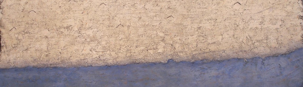
The background shapes run into each other in a number of places, integrating the painting beautifully.   The bottom of the foreground shape of the bird’s neck connects to the edge of the blue shape beautifully.  Klee masterfully provides exceptions to the integrations such as the closed shapes of the circles and where the orange touches the blue just above the bird’s beak.  We sense the variation.

Klee used the consideration of pattern within shapes on the bird.  To hold the viewer just perfectly.

I think how Klee sensitively provides the feeling of the forest is magnificent and I absolutely love that green circle which is beyond explaining.

My Work – (Influences and Spatial Planes)

Two Boxes – 2012 – 23 x 33 cm – mixed water soluble media

This recent painting is an excellent example of how I permit influences to show in my paintings.  My first consideration in this composition is the feeling of the space between the orange chair and the blue boxes and the use of spatial planes (Paul Cezanne).  I also refined the composition through reduction (Ben Nicholson), and determined eye movement with Paul Klee’s approach to guiding the viewer’s perusal.  I’m not thinking of these masters when working on the painting, but recognize their influences afterwards.

My own sensibilities are prominent, which have developed over time through studying many wonderful artists.  Their work and knowledge has provided me with a strong foundation.  The key is appreciating the process of the masters.

The spatial planes are very important and fascinating, as they can be quite elusive when developing the sense of space.  They usually require a considerable amount of time to feel or refine, (which suits my temperament), ensuring continuity in my work.

Thank you Cezanne for this beautifully open consideration!


Klee – (Motif and Rhythm)

Paul Klee - Saint-Germain, near Tunis - 1914 - 22 x 32 cm - watercolour

This lovely watercolour shows us Klee’s wonderful use of the grid, which was the foundation for many of his compositions.  The grid provides an overall motif of squares or rectangles which unifies the composition, and a disciplined artist will not let the subject disrupt the rhythm.  In other words composition before information.

Klee’s grids are organic which provide the poetic feel of his compositions.  The freehand grid with it’s variety of sizes, can also convey the feeling of space, as Klee does so beautifully in this painting, particularly with the large vertical red rectangle near the bottom. Can you feel it being in front?  Klee also provides a sub motif of triangles, which conveys oblique movement and the structural elements.

The strength and rhythm of the blacks is most impressive as they ensure we will move gracefully through the composition.  Note how the black triangle on the right balances the houses.  Truly masterful!

Having the grid throughout the painting integrating the foreground, the background and the sky is works beautifully and I am very impressed with the vertical running from the bottom  to the top, next to the black triangle.  Do you feel it being another plane?

I am sure Klee listened when he painted this lyrical composition.


Klee – (Orchestration)

Paul Klee - Seventeen, irr - 1923 - 23 x 28 cm - watercolour and ink on paper

I love Paul Klee for his independence and his desire for “pushing it”, as he so skillfully does in this composition.  He has released himself from the rules of composition, which is very difficult for all artists.  We all unconsciously seek balance when developing a composition and Klee has as well.  The combination of tension and balance is most impressive in this very interesting painting.

Having arrows pointing out of the painting can be considered a fundamental error in composition, but not in the hands of a very intelligent artist like Klee.  He  knows that composition is orchestrated, like music, and feeling and intuition is more important than rules.  He provided himself with an interesting challenge with the thrust of the arrows and simultaneously returning us to the left beautifully with the blacks notes at the left, particularly the number seventeen. We are now engaged in his poetry.

Klee’s elegance is worth striving for!


Klee – (Shape Motifs)

Paul Klee - Hammamet with Mosque - 1914 - 21 x 28 cm - watercolour

This early watercolour by Paul Klee is a great example of how to provide space and depth with flat shapes and pattern within the shapes.

We automatically read space when we recognize the subject and adding details for the sake of information would only disrupt the freshness of this delightful painting.  Klee’s use of oblique lines, (which form triangles), rhythmically take us through the foreground. The sophistication comes from limiting detail to within a few shapes, and having it read almost as pattern.

The mosque is vertically integrated with the foreground and the sky beautifully.  And having the shapes in the sky continue the motif of the foreground and structures is superb.