I would like to engage further with the wonderful movement Matisse provides, both with colour and with his sophisticated use of pattern within shapes.
Let’s begin with colour. When we focus on a colour we intuitively take in the same colour else-where in the composition. This creates movement which Matisse orchestrates through scale and placement, like musical notes, determining lyrical engagement.
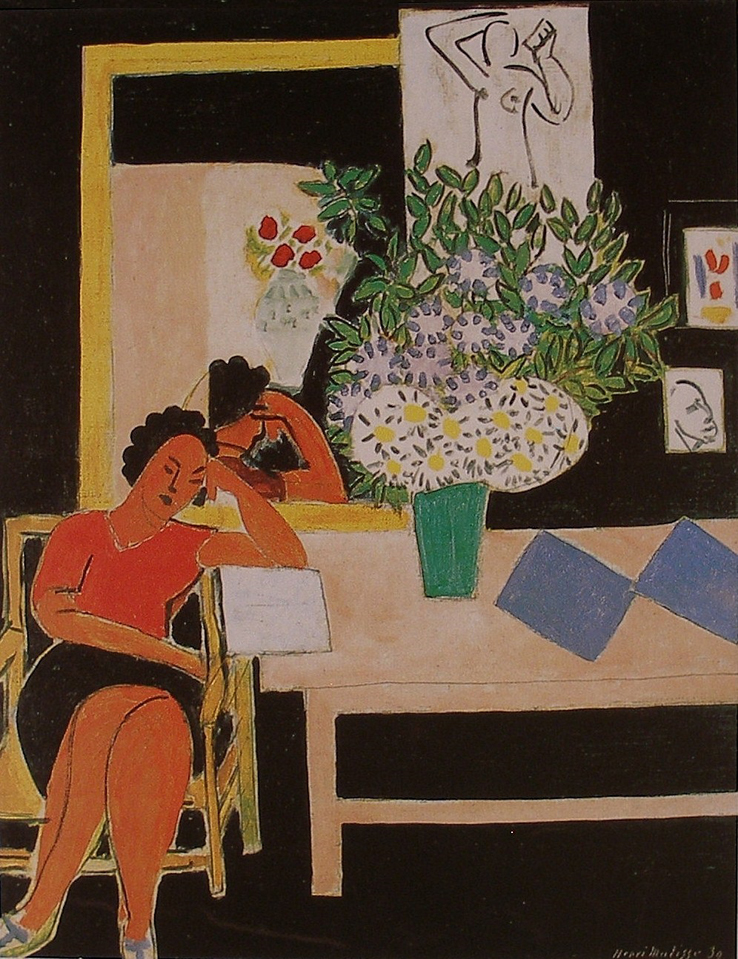
For example, when we look at the blue rectangles, we also sense the blues in the bouquet, as well as the vertical in the white rectangle at the right edge of the painting. Do you feel the circular movement? The little notes of blue on her shoes ensure we are not held in a tight area at the right of the composition, and instead bring us gently to the left, to engage with the wonderful movement through the warms of the figure and the small notes above and to the right. The same goes for the other colours as well. I should note that the temperature of the colours is also a factor in movement as we connect the orange with the red shapes Matisse provides the lyrical harmony through using shape motifs.
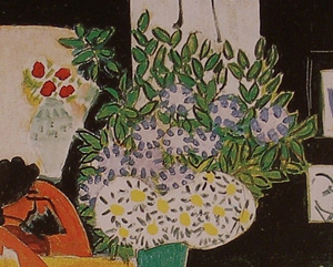
Another great consideration is using patterns within shapes.  In other words, not permitting the complexity of the subject to disrupt the harmonious relationships of the shapes. In the bouquet, Matisse does this beautifully by treating it as an oval containing an arrangement of smaller ovals. The two white oval shapes containing the pattern of yellow ovals and grey markings (which match the line drawings) are a great example of pattern within shapes. Even the light grey areas in the bouquet with the blue markings read as ovals.
These are considerations used by many artists and Matisse did it better than anyone.


