William Scott – Integration with Line and Shapes (Shape Motifs)

William Scott – Still Life – 1955 – 61 x 91 cm (24 x 36 in) – oil on canvas

 William Scott paintings resonate with me and I often visit his work.

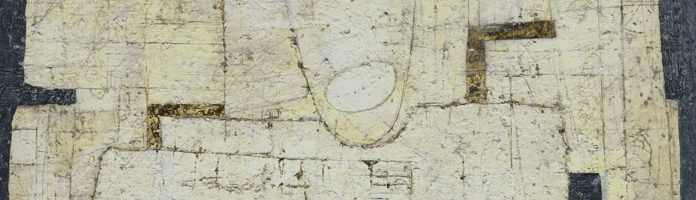
This wonderful still life is a splendid example of how sophisticated the reductive process can be.. Any other markings or additional subject matter would be superfluous.

The composition is an exquisite orchestration of rectangles which provide the rhythmic structure. Their arrangement is splendidly supported by a sub-motif of ovals, which include the pears and the two “Cezanne-like” ovals in the glass.

The rectangles are energized by three slightly leaning vertical lines, as well as the left edge of the warm rectangle at the right, and the right edges of both the plate and glass. These “oblique parallels” rhythmically connect the background with the subject matter. The vertical edges of the table and the warm shape at the left support the upright stems and the glass beautifully.

The connection of the glass with the warm shape above is matched with the integration of the pear at the left with the other warm shape. This is a great example of rhythmic integration

Another beautiful consideration is the relationship of the curved side of the glass with the curved edge of the right most pear. Also note how the horizontal stem at the left provides lateral movement supporting the curves of the plate, the glass and the other pears. The structural impact of the angled edge of the left pear magnificently ensures the connection with the glass.

I feel how Scott avoided overlapping the pears is fantastic, as this would have disrupted the rhythm of their placement, which brings me to another wonderful consideration of not indicating cast shadows on three of the pears. This is a superb example of not permitting literal information to interfere with the composition. Yet another wonderful consideration is the Cezanne-like shifting of the table top, which enhances the feeling of space.

I would like to finish with Scott’s sensitively assessed focus of the painting with the beautiful green oval embracing the stem of the vertical pear at the right. When your perusal arrives, you find yourself gracefully being held, which is a fantastic example of orchestrating composition.

Mark Rothko – Integration with Parallels and Shapes

Mark Rothko – Untitled – 1938 – 50 x 37 in – oil on canvas


The best way to appreciate an artist’s mature work is to be as familiar as possible with their earlier work.   In this painting from 1938 we see not only how varied the journey can be, but also how accomplished Rothko’s command of composition is.

We feel the couple’s relationship very strongly through his marvellous use of distortion. His integration of the couple with shapes and parallels is wonderful.

I’ll begin with how the rectangles of the structure behind are repeated in the woman’s hat and the collar of her dress.  The integration ensures she is well connected with the structure, conveying a feeling of strength and stability.

Next, the couple are beautifully integrated with each other with a series of parallels.  Let’s begin with the angle of the man’s left arm at the shoulder.   If you follow the angle downward, your eye will connect with the angle of the black shadow on the woman.  The under side of his arm also reinforces this angle.  Other parallels appear in his vest and the collar of his jacket.  The parallel positioning of their forward-stepping feet and their shadows bolster the rhythmic connection.

Value is most important for ensuring the importance of the movement.  If you blur your eyes, the strength becomes more apparent.  I should note the small parallels in the structure behind as well.  Rothko was very thorough and these considerations are meant to be more felt than seen.

There is another series of short parallels, leading us in another direction, which provides more subtle integrations of the figures.  They occur from their right feet up to the man’s right shoulder to the angle of the woman’s hat.

I haven’t forgotten the horizontal and vertical integrations and will let you discover how Rothko used them to integrate the couple with the background.

His thoroughness is wonderful.

To finish may I divert your attention to the fabulous spatial plane in the lower portion of the woman’s dress.  Can you feel how the vertical rectangular shape just above her forward step comes forth?   I love it.

Matisse – Colour and Pattern within Shapes

Henri Matisse - Reader on a Black Background - 1939 - 92 x 74 cm

I would like to engage further with the wonderful movement Matisse provides, both with colour and with his sophisticated use of pattern within shapes.

Let’s begin with colour.   When we focus on a colour we intuitively take in the same colour else-where in the composition.   This creates movement which Matisse orchestrates through scale and placement, like musical notes, determining lyrical engagement.

For example, when we look at the blue rectangles, we also sense the blues in the bouquet, as well as the vertical in the white rectangle at the right edge of the painting.  Do you feel the circular movement?   The little notes of blue on her shoes ensure we are not held in a tight area at the right of the composition, and instead bring us gently to the left, to engage with the wonderful movement through the warms of the figure and the small notes above and to the right.   The same goes for the other colours as well.  I should note that the temperature of the colours is also a factor in movement as we connect the orange with the red shapes Matisse provides the lyrical harmony through using shape motifs.

Another great consideration is using patterns within shapes.  In other words, not permitting the complexity of the subject to disrupt the harmonious relationships of the shapes.   In the bouquet, Matisse does this beautifully by treating it as an oval containing an arrangement of smaller ovals.   The two white oval shapes containing the pattern of yellow ovals and grey markings (which match the line drawings) are a great example of pattern within shapes.  Even the light grey areas in the bouquet with the blue markings read as ovals.

These are considerations used by many artists and Matisse did it better than anyone.

Matisse – Shape Motifs, Site Paths and Abstracting

Matisse – Bathers with a Tortoise – 1908 – 179 x 220 cm – oil on canvas

This homage to Cézanne’s magnificent Bather compositions is a beautiful move towards more abstract considerations.

Matisse immediately engages us with the figures and tortoise by simplifying (abstracting) the background.  Their oval motifs and positioning create beautifully considered oval site paths.

If we begin with the tortoise our eye carries up the arm of the crouching figure to the orange of her hair.  We then move to the black oval of the standing figure’s hair which in turn leads to the black in the hair of the seated figure.  The oval feel of the third figure guides us downward along the direction of her feet returning us to the tortoise.  If you follow this path in either direction your finger will be drawing an oval.

There are others. From the tortoise to the angle of the seated feet, connecting to the curve of her back and head taking us to the oval in the standing figure.  We then move towards the orange, bringing us back to the tortoise.  If your eye path takes you from the tortoise to the exaggerated foot of the standing figure up the contour of her back you will continue towards the orange and return to the focus of the tortoise.  They are not intended to be apparent.  You will sense rather than see them.

Reducing the background to three bands was a bold move in 1908, and by doing this Matisse holds our attention on the relationships of the figures and tortoise.  Any detail in the background would only disrupt their rhythmic integration.

He masterfully provides a shift on the bottom edge of the blue band behind the standing figure.  Can you feel the sense of depth this creates?  The edge then moves downward at the right edge of the painting, enhancing the oval motif.

The emphasis of the length of the central figure’s left foot ensures the importance of the tortoise.  The weight of the seated figures feet sensitively anchors the composition by almost touching the bottom edge of the painting.

I must point out the how Matisse supported the seated figure with a simple dark green shape.   I have come to appreciate the sophistication of the reductive process.

This is a great painting, leading the way towards the marvellous considerations in twentieth century art.


Giacometti – Shape Motifs, Spatial Planes and Integration

Alberto Giacometti - The Artist's Mother - 1937 - 24 x 20 in - oil on canvas

Giacometti was a master of composition.  In this painting he demonstrates this with how he merged his mother with her surroundings.  I will do my best to explain some of his superb considerations.

One of the best ways to convey a sense of space is to frame the subject, which Giacometti does beautifully.  We are looking through a large rectangle which seems to be suspended in front of the figure.  Can you feel the space?  We then engage with the arrangement of rectangles which make up the structural elements of the wall behind.

A good entry point to how Giacometti uses these supporting rectangles is with the horizontal black line running across her chest forming the tops of a series of vertical rectangles.  These rectangles relate to another series of verticals on the wall behind.  If you look closely you will also see how they connect or integrate with the figure, especially with the vertical rectangle integrating with the light ones on her shoulder and below.  If you blur your eyes the integration is very strong.

Note how the lines of the wall support the figure, especially at the shoulders and that wonderful angle at the top of her head.  The lines extending from her shoulders, stabilizing her, is magnificent integration.

There are some wonderfully subtle rectangles which are actually spatial planes.  We have the feel of one in front her upper left arm with its top being the line extending from her shoulder (see detail)  It is not initially apparent, but becomes strong when you become aware of it.  There is another just below.  I should also point out the dark vertical rectangle just above and how it provides a very sensitive support for the figure.  Remember the intention is they are meant to be felt more than seen.

                  Her face is very complex with some wonderful cubist planes. (see detail)   The most noticeable are the white shapes in her hair above her forehead with the sensitive lines connecting and extending the planes onto her forehead.  I love the vertical one in front of her neck and mouth leading up to her nostrils, connecting to a thin line leading to the left forming the top of another plane.  The vertical also continues upward connecting to the vertical above, solidifying the figure with the background.  At the risk of over explaining this wonderful integration, reverse the direction from the top.  Your eye will connect to the light vertical leading down to her hands.

I marvel at the quality of the horizontal forming the bottom of her hair behind, then, at the right connecting to vertical shapes which create the feel of planes in front.

I mustn’t neglect how he relieved the strong vertical and horizontal structure with a very sensitive oblique rhythm of parallels.  Let’s return to the white plane in her hair pointing up towards the right. Just below to the right is another small plane paralleling the direction.  When you go to the left of her head you will find other markings echoing the movement.  And a most important light one below her collar.  We may not notice the oblique movement but we will certainly feel it.

Once you train your eye to notice the complexity you come to appreciate the sophistication of his considerations.

Giacometti – Composition (Integration)

Giacometti – Self Portrait – 1921 – 32 x 28 in – oil on canvas

Giacometti’s command of composition is absolutely marvellous in this superb painting.
I will focus on his wonderful integration of the figure with the other elements in the composition.  Let’s begin with how your eye is taken across the painting from the seat of the chair, along the bottom of his jacket, to the bottom of his right leg, then you are guided up to the verticals behind.  Another beautiful integration is how the curve at the bottom of his pant leg rhythmically connects to the curved element to the left, which in turn, guides you up to his hand. I love it!  Also take note how the bottom of his trousers connects to the lower edge of his other leg and how the bottom of his pant leg then integrates with the chair leg.  I was and still am taken with how he integrated the other chair leg (between his legs) with his pant leg.  Can you feel how the angle in the chair runs into his pants creating a small blue triangle?  (see detail)

detail

This very impressive small dark blue triangle provides a sense of overlapping. The top edge of this gorgeous little triangle also parallels a dark line above which in turn integrates with the edge of his palette.  Can you feel the movement and shapes?  There is also another sense of an angle at the bottom of the dark line (creating another plane) which parallels the angle in the chair leg.  There is more.  That dark line also connects to a subtle purple line which carries downward into his leg, creating another wonderfully subtle triangle.

Note the line just to the left of his pocket and how this guides you up to the front of his neck and how his chin and his collar connect to the horizontals behind.  Just one more, it’s how he leads you upwards through his arm from the opening in his jacket.

There is more for you to engage with, and I hope you enjoy this wonderful early composition by this twentieth century master.  I am impressed with how Giacometti permitted to show Cézanne’s influence.


Klimt (Shapes, Rhythm and Structure)

Gustav Klimt -Apple Tree II - 1916 - 80 x 80 cm - oil on canvas

Gustav Klimt was a master of shapes and structure and as we see in this late painting, he was a great master of the reductive process.

We see this is his late painting Apple Tree II, a wonderful example of the power of shapes.  We respond to the beautiful shape of the tree, then we take in the dance of the circles , particularly the wonderful pauses of the red circles, in fact, note how one red circle is actually the focus.  The rhythm of the trees on the horizon is wonderful and I hope you feel the dance.

Appreciating that information for the sake of information can disrupt a composition is very important. Shape and pattern within the shape, works much better, as we see in the tree and the triangle shape of the foreground.

There is very sophisticated structural consideration in this painting, which I feel is one of the finest I have ever had the pleasure of engaging with.

It’s the vertical at the bottom right, which not only provides a lovely visual support for the trunk, but also provides one of the best spatial planes I have ever seen!  Do you see the horizontal at the top of the vertical line, forming a right angle and how the feeling of a spatial plane comes forth?  Magnificent!


Van Gogh (Shape Motifs, Integration and Rhythm)

Vincent Van Gogh - Still Life of Oranges and Lemons with Blue Gloves - 1889 - 48 x 62 cm -oil on canvas

One of the primary considerations in composition is shapes, and the awareness of not  disrupting  the shapes with detail and modelling.  This can be quite elusive as most painters want to convey their attention to detail, which unfortunately can muddle the foundation of a composition.  And when artists put information before harmony and rhythm, they may sense disappointment with the results.  Van Gogh has shown us how beautifully this can be avoided in this wonderful still life.

The composition is comprised of four “oval” shapes on two flat horizontal shapes.  He did not clutter the foreground and background with superfluous detail.

How Van Gogh harmonized the fruit with the shape of the basket is masterfully painted.  If you blur your eyes you can feel the shape!  He was also very careful with the darker shapes as well, not only with their shapes, but also with very sophisticated integration.

We see this with the branch connecting with the left of the basket, the finger of the glove, and branches at the right.  Note how the branch at the right pointing upword integrates with the dark oval at the top left, and how the gloves connect to the the one at the right.  Your eye follows the top glove then rhythmically connects to the bottom of the branch at the right.

There is an integrating rhythm in this painting that always excites me for it’s sophistication.  The three stripes on the glove not only integrate with the basket with colour but also with a beautiful note in the basket, the small dark lines connecting an orange and a lemon. (see detail)

This is very sophisticated!  And there is more for you to discover. Enjoy!


Matisse – (Motifs, Rhythm and The Reductive Process)

Henri Matisse - Zorah on the Terrace - 1912 - 116 x 100 cm - oil on canvas

In this painting Matisse shows us the importance of shape motifs and how the reductive process brings forth sophistication.

Let me begin with the rhythm we sense from his wonderful motif of ovals. The harmony of the three ovals of the fish bowl integrating with the oval forming the lower portion of the kneeling figure is truly elegant.  Another rhythm of shapes is the  arrangement of, may I term, pointed ovals.  The fish, her slippers and that wonderful orange one just below her belt.  There are more within the slippers and of course colour temperature comes into play with the warms harmonizing with her face.

This brings me to another question which I think shows us Matisse’s level of sophistication.  Why doesn’t the white and blue design of her garment continue up to her shoulders?  The reason, I feel, is if the strong pattern continued it would be competing with her face which is the focus of the composition.  Having reduced the contrast by almost blending the pattern with the background is superb.

How Matisse reduced the architecture and light to simple lines and shapes is revolutionary, and will greatly influence twentieth century art.  We respond to the colours and interpret with our senses!

Matisse has provided artists the opportunity of refining, by reducing information, (removing the superfluous), which is a fascinating pursuit.

I would also like to mention another very refined use of integration.  Go to the top right of the carpet. Can you feel a connection running through her arm to the dark rectangle shape?  Can you feel a plane coming forth?  I hope you can.

Klee – (Motif and Rhythm)

Paul Klee - Saint-Germain, near Tunis - 1914 - 22 x 32 cm - watercolour

This lovely watercolour shows us Klee’s wonderful use of the grid, which was the foundation for many of his compositions.  The grid provides an overall motif of squares or rectangles which unifies the composition, and a disciplined artist will not let the subject disrupt the rhythm.  In other words composition before information.

Klee’s grids are organic which provide the poetic feel of his compositions.  The freehand grid with it’s variety of sizes, can also convey the feeling of space, as Klee does so beautifully in this painting, particularly with the large vertical red rectangle near the bottom. Can you feel it being in front?  Klee also provides a sub motif of triangles, which conveys oblique movement and the structural elements.

The strength and rhythm of the blacks is most impressive as they ensure we will move gracefully through the composition.  Note how the black triangle on the right balances the houses.  Truly masterful!

Having the grid throughout the painting integrating the foreground, the background and the sky is works beautifully and I am very impressed with the vertical running from the bottom  to the top, next to the black triangle.  Do you feel it being another plane?

I am sure Klee listened when he painted this lyrical composition.