Van Gogh – (Time)

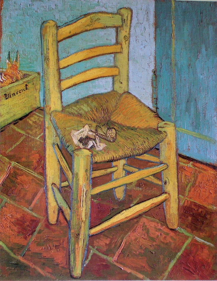
Vincent Van Gogh - Van Gogh's Chair - 1888 - 93 x 73 cm - oil on canvas

This great painting was truly ahead of it’s time because Van Gogh provided us with the sense of moving.  The subject is not but we are, be it consciously or subconsciously!

We see this in the chair, which may appear twisted at first glance, but Van Gogh actually has provided us with multiple views of the chair.  We see this most clearly at the right of the where the seat is at a different angle than the rungs.  We are viewing them from different places, in other words we would need to move.

We feel this very strongly in the floor which seems to drop down.  What Van Gogh has actually done is painted it as we would view it in reality.  When we view an actual chair we will drop our head or gaze downward to view the floor.  Brilliant!

This is closer to reality because he has provided the sense or time.


Van Gogh (Shape Motifs, Integration and Rhythm)

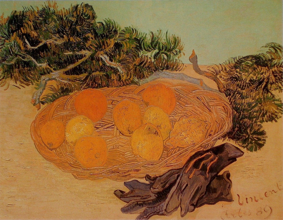
Vincent Van Gogh - Still Life of Oranges and Lemons with Blue Gloves - 1889 - 48 x 62 cm -oil on canvas

One of the primary considerations in composition is shapes, and the awareness of not  disrupting  the shapes with detail and modelling.  This can be quite elusive as most painters want to convey their attention to detail, which unfortunately can muddle the foundation of a composition.  And when artists put information before harmony and rhythm, they may sense disappointment with the results.  Van Gogh has shown us how beautifully this can be avoided in this wonderful still life.

The composition is comprised of four “oval” shapes on two flat horizontal shapes.  He did not clutter the foreground and background with superfluous detail.

How Van Gogh harmonized the fruit with the shape of the basket is masterfully painted.  If you blur your eyes you can feel the shape!  He was also very careful with the darker shapes as well, not only with their shapes, but also with very sophisticated integration.

We see this with the branch connecting with the left of the basket, the finger of the glove, and branches at the right.  Note how the branch at the right pointing upword integrates with the dark oval at the top left, and how the gloves connect to the the one at the right.  Your eye follows the top glove then rhythmically connects to the bottom of the branch at the right.

There is an integrating rhythm in this painting that always excites me for it’s sophistication.  The three stripes on the glove not only integrate with the basket with colour but also with a beautiful note in the basket, the small dark lines connecting an orange and a lemon. (see detail)
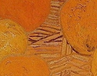
This is very sophisticated!  And there is more for you to discover. Enjoy!


Van Gogh – (Parallels, Rhythm and Integration)

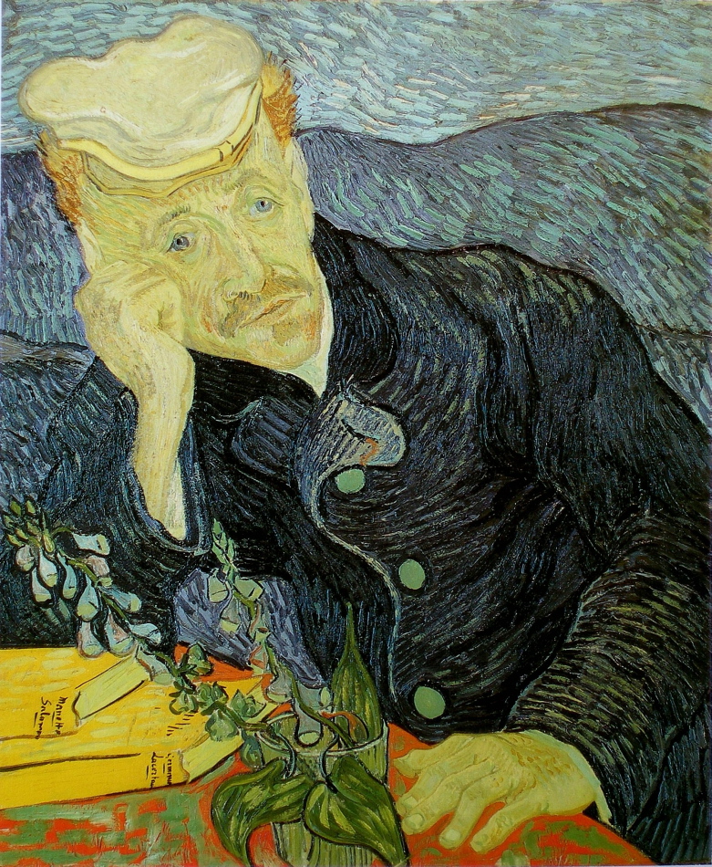
Vincent van Gogh - Portrait of Doctor Paul Gachet - 1890 - 66 x 57 cm - 26 x 22.5 in - oil on canvas

Continuing from the last post, I would now like to turn your attention to Van Gogh’s wonderful brushstrokes and how they provide rhythmic movement for your eye, as well as very sensitive integration.  The strokes connect the background and Paul Gashet’s coat with harmonious movement as well as form.  How Van Gogh integrated the blues to read as one shape at first glance is masterful.

Those books are fantastic!  The yellow provides a fantastic pull and the pages are part of a rhythm of parallels which provide an oblique movement.  Subconsciously, or not, your eye will move in the direction of the pages and the lower left arm.  Also note how the plant is parallel to the upper left arm, another movement.

Two more impressive considerations are the vertical leaf projecting from the glass, providing subtle structure for the composition.  And those wonderful yellow strokes just above the line, running towards his ear, pull me briefly and gently from his Gashet’s gaze.  Does your perusal pause there briefly?

These considerations are all the more impressive as Van Gogh worked quickly, he was truly a great painter!


Van Gogh – (Harmony)

Vincent van Gogh - Portrait of Doctor Paul Gachet - 1890 - 66 x 57 cm - 26 x 22.5 in - oil on canvas

There is so much to appreciate in the wonderful painting by Van Gogh.  And I would like to talk about some of his very sophisticated considerations, such as temperature ratio, integration, parallels, and his superb value assessment.

Lets begin with temperature ratio, or if you prefer, harmonizing warm and cool colours.  An artist is always presented with this is very interesting consideration.  When are the colours in harmony or when do they compete?  And painters have to rely on their senses to determine the difference.

In this painting the ratio between cool and warm is beautifully balanced.  Having the background and his coat very similar in temperature, is very sophisticated, and permit the warm colours to sing!

I love how sensitive the values are in the face and hands  Van Gogh took great care with not permitting the details the disrupt the shapes and their temperature.  Superb visual poetry!.

I will continue in the next posting

Van Gogh – (Pulls, Harmony and Integration)

Vincent van Gogh - The Street Menders - 1889 - 71 x 93 cm - 28 x 37 in - oil on canvas

Van Gogh’s considerations for the viewer are absolutely superb.  He orchestrates your eye movement across the composition beautifully.

Lets begin with a question.  Why is the lower portion of the tree at the right a darker value the the rest of the tree?  The answer is Van Gogh has provided a pull for the focus.  In other words when you look at the primary figure you eye wants move to the dark trunk because it is in harmony with the figure.

The two dark figures are also pulls and provide a second pause in the harmony of the three dak values.

Another harmony is three red notes.  The window, the red beside the dark tree trunk and the worker’s hat.

I love how Van Gogh used doorways and the red window to integrate the figures.  Can you feel the vertical connections?

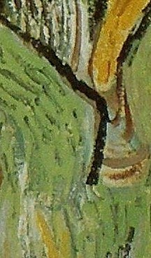
There is an integration which excited me which I hope you will appreciate.  There is a angled black line in the tree to the right of the two workers at the centre of the painting (see detail below)

The Street Menders - detail

The line is in harmony with the right side of the figure at the left.  This excites me because I can feel Van Gogh assessing the composition.  And I think this is a exceptional integration.

The title is interesting because the street workers are barely noticeable.  Why?  Because Van Gogh did not want information to disrupt his chosen harmony.