Giacometti (Creating Space with Planes)


Alberto Giacomatti - Self Portrait - 1923 - 55 x 32 cm - 22 x 13 in - oil on canvas

This wonderful painting is a superb example of creating the feeling of depth or space with a plane.

In this painting Giacometti provided a plane, or shape, appearing in front of the face.  This is an consideration coming directly from the influence of Cezanne.

Now carefully peruse the right side (his right) of his head.  Do you see a straight line at the edge of his hair, running down through his ear to the edge of his neck down to the collar?  It then takes a right angle turn to the bottom to his chin, creating the bottom edge of the plane.  Now go back the where we began in his hair and note the angle which defines the top of the plane.  It’s subtle until we notice that wonderful vertical line in his hair on the other side of his face.

Keeping in mind that the shape is meant to be felt, rather than seen, do you see the plane in front of his face?

You may feel his face projecting through the plane, which is fine, as it is meant to be open for interpretation, as there is no right or wrong way of seeing these considerations.


Cezanne (Supporting your subject)

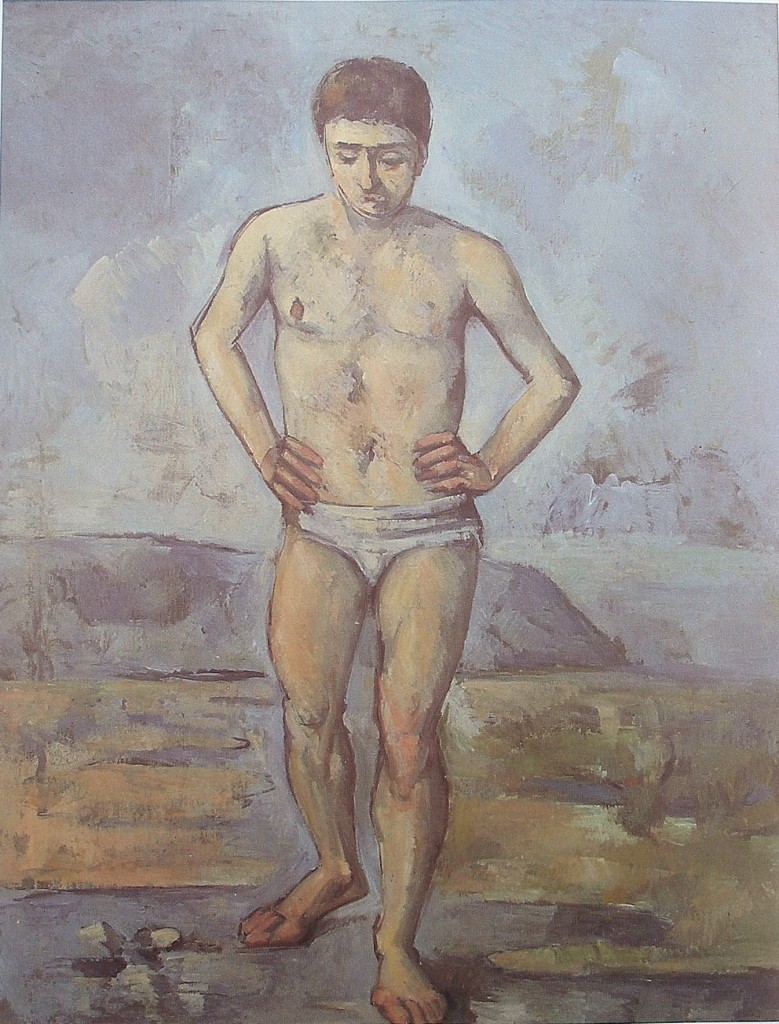
Paul Cezanne - Man Standing, Hands on Hips - 1885 - 127 x 97 cm - 50 x 38 in - oil on canvas

This painting shows us how important providing support for your subject and how subtle it can be.

Now support is “integrating” the subject with the rest of the painting.  This is not easy  as it can take many forms in a composition and it may take analysing many images to fully appreciate how necessary it is.

I will restrict myself to three examples.

I will first note how Cezanne has rhythmically supported (integrated) the figure with the background by providing two sensitive verticals at the left of the painting.

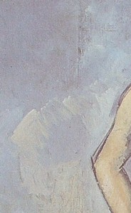
Do you see the line at head level? (see detail)  The other vertical is  near the edge of the painting, say at leg level. These sensitive lines or edges integrate the figure with the rest of the painting.

Another example is a white shape in the background which echoes the angle of right arm.  (see detail)

detail showing vertical at head level and the shape supporting the arm

Do you feel the connection?

There is also an interesting “pull” in this painting, the right nipple.  When you look at the head you are pulled to the nipple.  This is very important and would not work if he had emphasized both nipples.  That would have created competition for the head as well as making the painting static.

Integration and pulls are not meant to be noticed when enjoying the subject matter.  An exceptional artist like Cezanne was very aware of their importance, and used them beautifully when creating his compositions

Rhythm

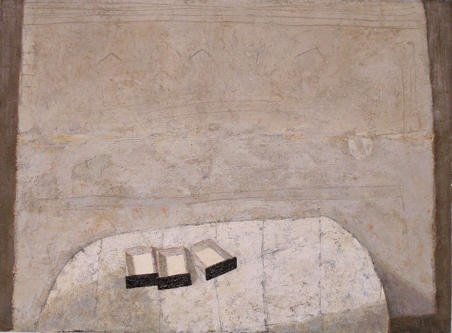
Don Farrell - Black Drawers - 2006 - 53 x 73 cm - 21 x 29 in - mixed media on paper

Providing rhythm in a painting.  Now that is a very open consideration, very subjective and without limits.  Now having said that, I should say, spatial considerations are at the forefront in my work.  Therefore the reductive process becomes very important.

In this painting, the primary rhythm is based on three.  The three drawers and the supporting three inverted “V” marks on the wall.  The lines on the table and a series of horizontal lines on the wall are rhythmic as well.

I brought up pulls the other day and this painting has a great one, the white circle shape on the wall.  Do you feel being pulled from the drawers to the circle?

I should also point out the vertical line in front of the wall just right of the table. This is a continuation of the rhythm of the lines on the table.  Do you sense a plane in front?

Thank you Cezanne!

Influences (Cezanne on Matisse)

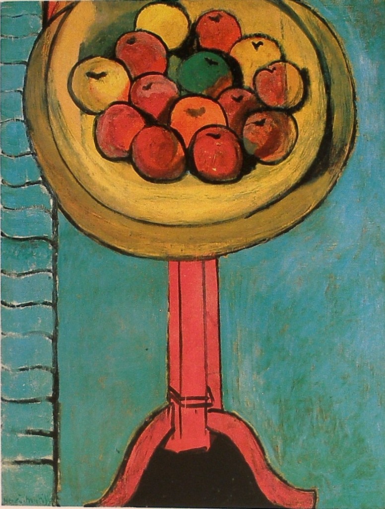
Henri Matisse - Apples on a table against a Green Background - 1916 - 115 x 90 cm - 42 x 35 in


In this wonderful tribute to Cezanne.  Matisse shows us what appears to be simple is actually very sophisticated.

There is a great deal going on in this painting , but I will limit my comments to Cezanne’s revolutionary consideration of including time in painting.  He was addressing the problems with perspective and may not be actually thinking in terms of including time, but his solution of allowing the viewer to move is precisely that, as the following generations of artists certainly have embraced.

Now to the painting.  Note how he painted the pedestal as if you are at it’s level.  Now look at the table top, you are now looking down at the fruit.  This would not be possible, unless you move, as we do in our reality, in other words the painting has time!

The viewer is invited to move!

You may also ask yourself is the background a wall or the floor, or both?  Why the vertical lines through the fruit?  Matisse leaves questions open for the viewer’s interpretation, as a master should.

I know, I went beyond limiting my comments to time.

Motifs and Submotifs

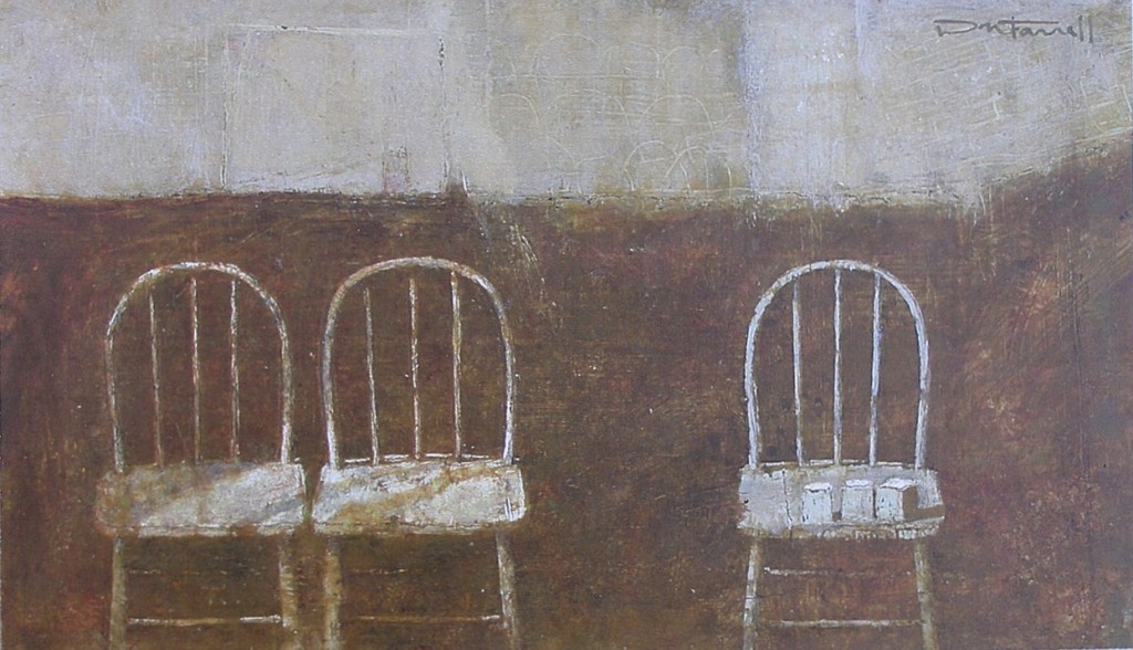
Don Farrell - Three Blocks - 1998 - 15 x 25 cm - 6 x 10 in - egg tempera

This small painting is an excellent example for showing the importance of shape motifs. The composition has a rectangle motif, supported by a sub motif of rhythmic loops.

Let me take you to the top area first.  Note how the area is made up from a series of subtle rectangles.  They must be subtle in order not to compete with the focus of the painting.

The chair seats and the three blocks are other notes in the rectangle motif.  The blocks, being the focus, are supported by slightly emphasizing the two rungs just below, (another rectangle.)

There is a very important small rectangle above the middle chair, which echoes the blocks.  In compositional terms this pulls your gaze gently from the blocks.  Pulls are wonderful compositional elements, if they are in tune. They musn’t disrupt the viewer’s gaze or compete.

I will be mentioning and showing more pulls and pauses in the works of many notable artists in upcoming posts.

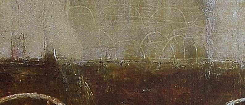
The sub motif (the loops) which are the shapes of the chair backs, are repeated in the top area as shown in this detail.

These Integrate the chairs with the background, which is very important.

Another important note is how each chair is painted as if you are directly in front.  Very important, as this frees the viewer’s movement as mentioned in the post on Cezanne’s painting “Receptacles, Fruit and Biscuits on a Sideboard”


Cezanne

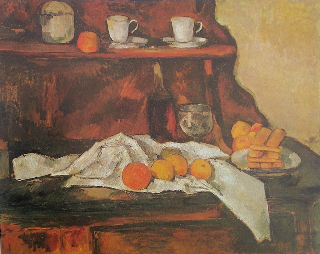
Paul Cezanne - Receptacles, Fruit and Biscuits on a Sideboard - 1873 - 65 x 81 cm - oil on canvas

This still life shows us one way Cezanne was moving away from perspective and allowing “movement” to find its place in his paintings.

What is intriguing is that this movement is not in the inanimate painting, it is the viewer that senses movement.

We see this in the wine glass and the cups above.  Note how they are painted as if they are on the same level.  In reality, this would not be possible unless the viewer is moving!

Cezanne has freed the viewer by removing the fixed horizon line, which permits the viewer to move, not physically, but imaginatively or subconsciously!

Can less be more?

Don Farrell - Commerce - 2007 - 53 x 71 cm - 21 x 28 in - mixed media on paper

Can less be more?  I have been wrestling with this consideration for years, and I think the answer is yes, if the artist is sincere!

A good example is the painting “Commerce” which was a response to watching the  touring boats in Paris, and the regimentation of passing at the midway point of their scheduled routines.

I was very concerned with loosing the reason for the painting for the sake of detail.  I want to show the act of passing more than what is passing.

I’m sure this process of reducing is as interesting for the viewer as well and there is a very fine line between success or failure.

Cezanne

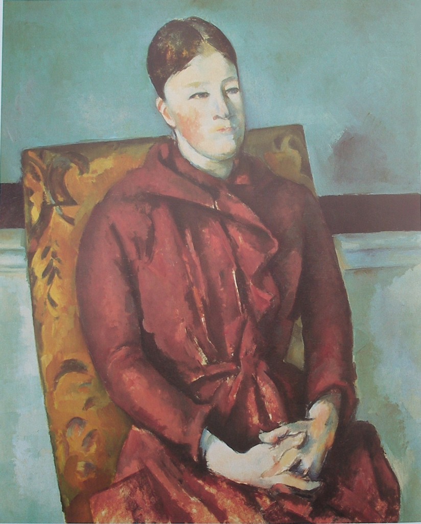
Paul Cezanne - Madame Cezanne in a Yellow Chair - 1893 - 81 x 65 cm -32 x 26 in - oil on canvas

What a great painting!  As in yesterday’s post the subject is leaning.

I would like to point out as before how he provides the feeling of space with shapes, which is very evident at the bottom of this painting.  There is a wonderful shape which I have isolated in the detail below.

Can you feel the shape being in front?  (blurring your vision may help).  Now return to the shape in the painting.  Do  you sense the shape connecting to the edge of her dress at the bottom right of the painting?  When we make the connection, we feel a larger shape spanning across in front of her, supporting her hands.

This is far from depiction, what we are viewing is what eventually be termed cubism.

There are other wonderful considerations in this composition.  Cezanne provided a very sensitive pull, a terrific shift and masterful integration as well as other masterful strokes.

Cezanne

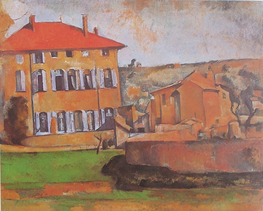
Paul Cezanne - House and Farm at Jas de Bouffan - 1885 - 60 x 73 cm - 24 x 29 in - oil on canvas


Cezanne is considered by many as the father of modern art. I certainly agree.

One of the main reasons why he is so highly regarded is how he resolved what was being considered “the problem with perspective”.  Perspective freezes the viewer and the subject matter.  An an alternative was elusive for progressive artists of the time. .

How does an artist show depth or space and permit the viewer movement?

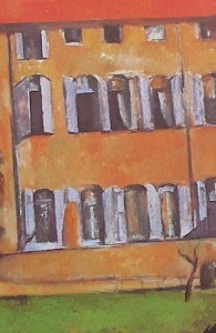
Cezanne resolved this with what is termed planes of space, as I will explain in this detail

:

We sense planes (or shapes) before information.  I realize it can take time to consciously see them and an artist should not force them onto the viewer.

Note the dark vertical lines and how the one one the right connects to the tree. The bottom of the left line also has a angle which compliments the angle of the tree.

Starting at the top note how your eye travels down between the lines and then moves to the left as directed by the tree.  Can you sense the space between the lines being in front of the building?  If you can it is because you know the tree is in front of the house.

When you begin to see these planes you become more engaged with the artist.

Also, ask yourself why are the buildings leaning?  There is a great deal to appreciate in a Cezanne painting.  The leaning energizes the painting, if they were straight up and down as they are in reality, the painting would have a static feel, which he did not want!  .


Influences (Giorgio Morandi)

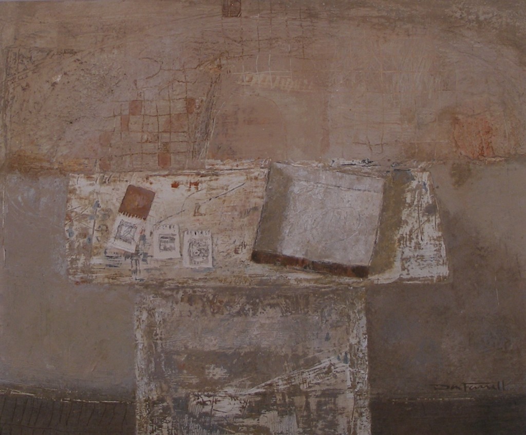
Don Farrell - Soaking Pan - 1999 - 25 x 30 cm - 10 x 12 in - egg tempera

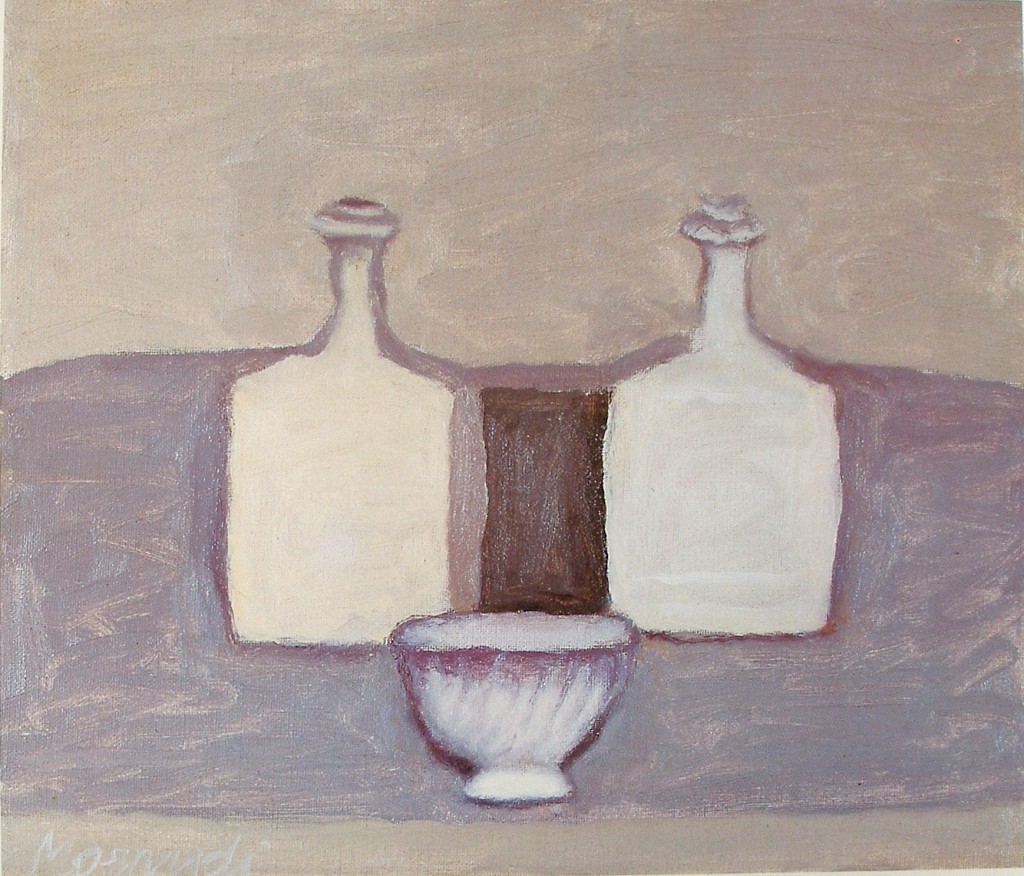
I had the pleasure of seeing a retrospective of Morandi’s work in London a few years ago and he has stayed with me ever since. In particular, I was impressed with his spatial considerations and how he expressed them in his still lifes.

I was thinking of my response to his considerations when I made the above painting of my soaking pan. My goal was to create a harmonious spacial feeling through the arrangement of rectangles.

Now, using an influence doesn’t make things easy. For example, with Soaking Pan, which has a rectangular motif, I had difficulty keeping the painting from feeling static.

I had started by supporting the soaking pan with a similar shape above it on the wall. This supporting shape then takes the eye to the small dark square at the top, ensuring the viewer takes in all of the painting. The colour value of this square then takes your eye to the sketch pad before returning you to the front of the soaking pan. (The three sketches also harmonize with the front of the soaking pan, but are more supportive.)

So many rectangles leave the image static if left completely on their own. There is the wonderful little angle on the table which appeared accidentally and stayed, but this was still straight, and I needed more.

To refine and resolve this composition, I added the white line at the bottom right which takes you across the front of the table to the right edge of the soaking pan. This provides an integrating movement for the painting, which works well, but the painting still felt unresolved.

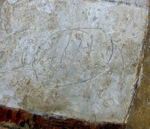
Soaking Pan – detail

I fussed and fumbled for a few days, and then one morning, I scratched an oval in the soaking pan and got that special feeling you get when you know you’ve finally succeeded. Even though the mark is subtle, it was enough, and the composition was complete.

Giorgio Morandi - Still Life - 1959 - 30 x 35 cm - 12 x 14 in - oil on canvas