de Kooning – (Integration with Line and Indicating Time)

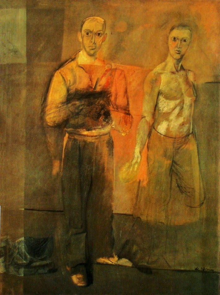
Willem de Kooning - Two Men Standing - 1938 -155 x 122 cm - 61 x 48 in - oil on canvas

De Kooning’s use of line for emphasizing the structure of the composition is very impressive. The horizontal line at the right edge of the painting, near the figure’s shoulder superbly balances the composition. Without that line we would have difficulty moving away from the dominant figure.  It provides not only a pull, it also completes a wonderful horizontal integrating division of the composition.

Another beauty is the line under the shoe which not only supports the figure it is also provides rhythmic support for the line above at knee level.  There is another which shows us how sensitive and the thoroughness of de Kooning’s considerations.  It’s the faint line in the orange area, connecting the men at their elbows.

De kooning was also working at conveying time in this painting as we see in the right arms of both figures.  We see two positions of the arm in the dominant figure and at the hand of the other man.  And I think this explains the dark rectangle in front of the indistinguishable hands of the dominant figure.  There are basically two methods for conveying time.  One by inviting the viewer to move (not physically, but in their mind) and the other is to indicate the movement of the subject which de Kooning used here.  Both are very challenging.

I also would like to mention how the shoes are actually a pull, bringing us to the bottom.  And a fantastic pause.  The light mark at the left end of the line at knee level.  It’s influence on  the composition is superb!

I think his choice of not completing the legs of the man at the right is interesting and leaves us with an open consideration for discussion.


Willem de Kooning – (Integration with Spatial Planes)

Willem de Kooning - Two Men Standing - 1938 - 155 x 122 cm - 61 x 48 in - oil on canvas

There are some fascinating spatial considerations in this interesting painting by de Kooning.  Not only has he integrated the painting with a motif of rectangles, de Kooning also uses them as spatial planes, providing us with the feeling of space. (which is meant to be felt before seen)

I will begin with the vertical rectangle at the left which has a feeling of being in front of the objects on the floor.  And when you take in the adjacent rectangles they seem to be behind the figure.  I hope you can feel it.

Now to the wonderful warm rectangle connecting the figures. (Or maybe I should say the orange has a feeling of a rectangle)  Do you sense the orange being both in front and behind the figures?  The feeling is emphasized  by the horizontal line which runs behind the left figure’s legs, then turning upwards, connecting to another line at the other figures elbow.  Yes we have another plane.  One more, which I feel is the most exquisite.  The sense of the left figure’s head being within a spatial plane.  Do you feel the rectangle simultaneously in front and behind his head?

This is a very sophisticated painting and I will continue in the next posting.

Matisse – (Integration with lines and shapes)

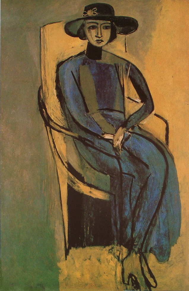
Henri Matisse - Portrait of Greta Prozer - 147 x 93 cm - oil on canvas

In this delightfully reduced and and rhythmically distorted painting, Matisse has integrated the subject with line and shapes elegantly.

I love the rhythm of lines and how they integrate with the figure.  Lets begin with the line at the top of the chair taking your eye across the rim of her hat, which then loops down to a  vertical black line indicating the chair back at her left.  Which then connects to a faint line that attaches to the left arm of the chair.  The vertical front of the chair arm then integrates beautifully with her leg, taking us to the bottom of her dress.  Matisse then provides us with lines leading us back to the top of the chair.  This is just one of a few rhythmic paths for us to engage with.

There are a number of very interesting considerations in this painting.  One that stands out is her shoes.  Why do they blend with the background?  The reason is Matisse wants your eye to move along the bottom of her dress or under the black shape.  If he hadn’t blended them, they would be competing with these rhythmic lines, returning you to her eyes, and she is now gracefully floating.

Rhythm needs harmonious structure and Matisse has balanced them masterfully with a motif of rectangles holding the composition together beautifully.  We first have the strong black one at the bottom under the chair, then another on her chest and a fantastic one under her chin. (They just need to have the sense of being rectangles.)    How they hold the composition together is most impressive and I often think of this painting when I am working.

Two other great considerations in this painting are distortion and reduction, which comes to the forefront when an artist is thinking composition before information.

Ask yourself why?  I will talk about this in future posts,


Bonnard – (Temperature)

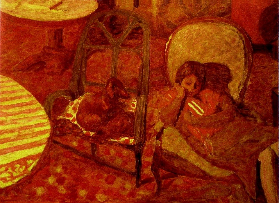
Pierre Bonnard - The Vigil - 1921 - 96 x 125 cm - 38 x 51 in - oil on canvas

One terrific way to provide unity and harmony is to restrict your palette, so your composition will have either a cool or warm feeling.

Bonnard does this in this delightful warm painting, and the viewer immediately responds to the temperature.  We are then directed through the painting by very interesting considerations and I’m sure Bonnard is intentionally pushing our sense of harmony.

The strength of the striped half oval at the left is dominating almost to the point of disharmony and his solutions are very impressive. The two yellow stripes on the baby’s blanket. (she seems to be comforting a baby)   We can’t help moving from the semi circle to the yellow cushion on the chair, and then to those two marvelous stripes.  Do you feel their strength and how they balance the composition?  They also direct us to the yellow partial oval at the upper left, which has a wonderful dark line taking us back to the striped tablecloth.  Brilliant!

I should also point out the dark shapes at the left which hold us in the composition as well as the wonderful oval motif.  Also note the the darkish shape with subtle stripes (very important) between the chairs, connecting the dog’s gaze with the mother and her baby.

We stay with the dog’s vigil, which of course is what Bonnard wants the us to enjoy.  The sophistication of the composition permits this.


My Work – Rhythm and Harmony

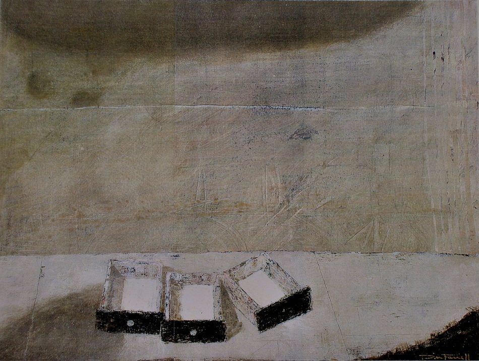
Don Farrell - Three Drawers - 1999 - 33 x 45 cm - 13 x 17.5 in - water soluble media

The arrangement of the drawers is the key for the rest of the composition.  I decided to supported the sweeping movement of the drawer faces with a curve in the table front at the bottom right, which felt very rhythmic.  And to complete the harmony I provided a shadow at the top, echoing the movement of the drawers.  Do you feel the rhythm?

I was pleased, but there was a problem with the viewers eye leaving the composition at the right.  The stripes provided a solution, not only for containment but also a lovely pause (the small black marks in the stripes) appeared.

I was now pleased with the movement to the right, and instinctively knew the need to return the viewer to the left.  After several attempts I finally arrived at a solution that not only balanced the composition, but also rhythmically integrated the drawers and the background.  I added those two dark circular shadows at the upper left and then provided a harmony by painting knobs on just two of the drawers.

I should also mention that the angle of the drawer, at the right, determined the location of the two shadows.  Do you feel the connection?

I then painted the horizontal white line to support the table and a cast shadow at the bottom left which provides a lead into the painting.

I also assessed all the smudges, scratches and markings throughout the composition for indications of disharmony, which usually requires a few visits.

I find it is much more interesting to permit the composition to lead me rather than to force the preconceived detail to dictate.

Mondrian – (Integration and Rhythm)

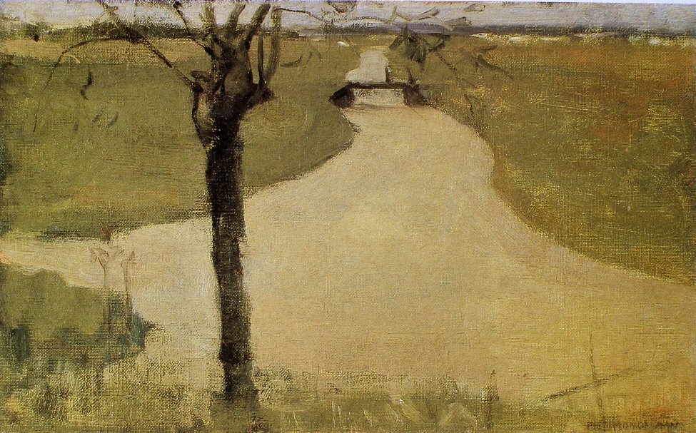
Piet Mondrian - Tree on the Kalfje - 1902 - 23 5 x 37.5 cm - oil on canvas

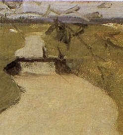
This small painting by Mondrian shows us how an excellent artist considers the composition even when quickly done.  Can you feel the connection between the tree and the bridge?  This is superb integration.  Another very sensitive integration is provided when your eye follows the river bank from the right of the painting, then connecting to a delicate branch which embraces the bridge, (see detail).

This painting also has a consideration which has stayed with me for years, that wonderful cross at the bottom right.  Why is it there?  It actually is a structural element, providing an oblique movement when you sense the parallel with the pruned branch.  It also completes the integrating eye paths by directing your eye back up to the river bank.  And on top of that the vertical of the cross is part of a rhythm of the tree trunk and the two sensitive verticals to the left.

The painting was probably done quickly, which is all the more impressive.  A composition does not have to be complex to be great, and this is a fantastic composition.

May I also mention another branch at the left which bends down, providing containment.


Miro – (Rhythm and Structure)

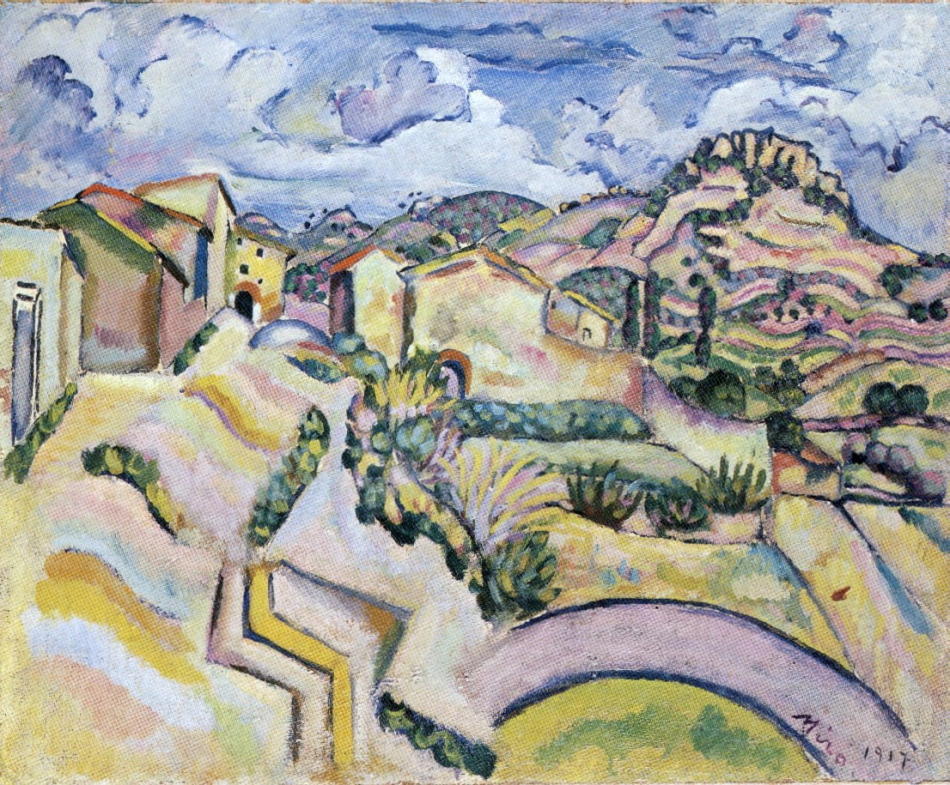
Joan Miro - Landscape - 1917 - oil on canvas

I’m sure Miro was thinking of Cezanne in this rhythmic landscape.  I love Miro’s wonderful rhythms and how sensitively he balanced movement with sophisticated structural support.

The rhythm of arches is primary, beginning with the large one, we then find them continuing up through the composition.  There are several, and I would like to focus on a few which integrate the sky with the foreground.

My favourite is the movement provided by the arch in the sky and the arch of the hill below.  Another two beauties are just below the yellow building with the black windows and the one at the right which connects to a wonderfully sensitive vertical which continues down through a wall.

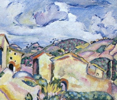
Staying with the detail, l would Iike to mention the integration of the roofs at the right with the hill above, which brings us to another rhythm, those wonderful black dots just above the hills.  They are in harmony with the little black windows in the yellow house, which is the focus of the composition.

Let us return to the full composition and the sensitive structural support for the rythmic movement of the arches, the two zig-zags at the bottom.  Miro uses them to vertically take us towards the focus.  The strong right angle next to the yellow zig-zag  is the most important structural element, beautifully stabilizing the composition.  And I hope you can feel how important the sensitive vertical I mentioned is to the composition.

Miro has invited us to partake in a visual poem!


Van Gogh – (Parallels, Rhythm and Integration)

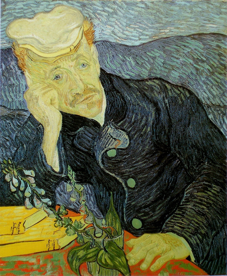
Vincent van Gogh - Portrait of Doctor Paul Gachet - 1890 - 66 x 57 cm - 26 x 22.5 in - oil on canvas

Continuing from the last post, I would now like to turn your attention to Van Gogh’s wonderful brushstrokes and how they provide rhythmic movement for your eye, as well as very sensitive integration.  The strokes connect the background and Paul Gashet’s coat with harmonious movement as well as form.  How Van Gogh integrated the blues to read as one shape at first glance is masterful.

Those books are fantastic!  The yellow provides a fantastic pull and the pages are part of a rhythm of parallels which provide an oblique movement.  Subconsciously, or not, your eye will move in the direction of the pages and the lower left arm.  Also note how the plant is parallel to the upper left arm, another movement.

Two more impressive considerations are the vertical leaf projecting from the glass, providing subtle structure for the composition.  And those wonderful yellow strokes just above the line, running towards his ear, pull me briefly and gently from his Gashet’s gaze.  Does your perusal pause there briefly?

These considerations are all the more impressive as Van Gogh worked quickly, he was truly a great painter!


Van Gogh – (Harmony)

Vincent van Gogh - Portrait of Doctor Paul Gachet - 1890 - 66 x 57 cm - 26 x 22.5 in - oil on canvas

There is so much to appreciate in the wonderful painting by Van Gogh.  And I would like to talk about some of his very sophisticated considerations, such as temperature ratio, integration, parallels, and his superb value assessment.

Lets begin with temperature ratio, or if you prefer, harmonizing warm and cool colours.  An artist is always presented with this is very interesting consideration.  When are the colours in harmony or when do they compete?  And painters have to rely on their senses to determine the difference.

In this painting the ratio between cool and warm is beautifully balanced.  Having the background and his coat very similar in temperature, is very sophisticated, and permit the warm colours to sing!

I love how sensitive the values are in the face and hands  Van Gogh took great care with not permitting the details the disrupt the shapes and their temperature.  Superb visual poetry!.

I will continue in the next posting

Influences – (Cezanne on Gorky)

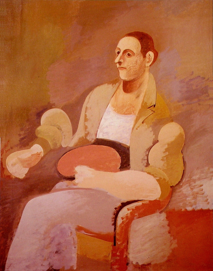
Arshile Gorky - Portrait of Master Bill - 1937 - 132 x 102 cm - 52 x 40 in -oil on canvas

Cezanne had a major influence on Gorky’s development as we see with the consideration of spatial planes in this painting.  Gorky is not emulating Cezanne, he is applying his consideration of planes in space, as we saw in the post of Matisse’s painting The Italian Woman.

Here we can see the consideration at the figure`s left shoulder.  Note how the background feels like it is cutting into the shoulder.  Or a better way to put it is the figure is in the space.  We can see it in the other arm as well .  The lower arm feels to be in front of the figure.  The background coloured shape between the forearm and the shoulder reads as the space.  Do you feel it?

There is a grey rectangle in front of the chair.  What is it?  It is not an identifiable thing, rather it is a plane in front, which is far better than showing the back leg of the chair.  That evidence of perspective would be in conflict.  Very impressive.