My Work – Spatial Planes and Rhythm

Don Farrell - Pink - 2011 - 23 x 31 cm - mixed water soluble media

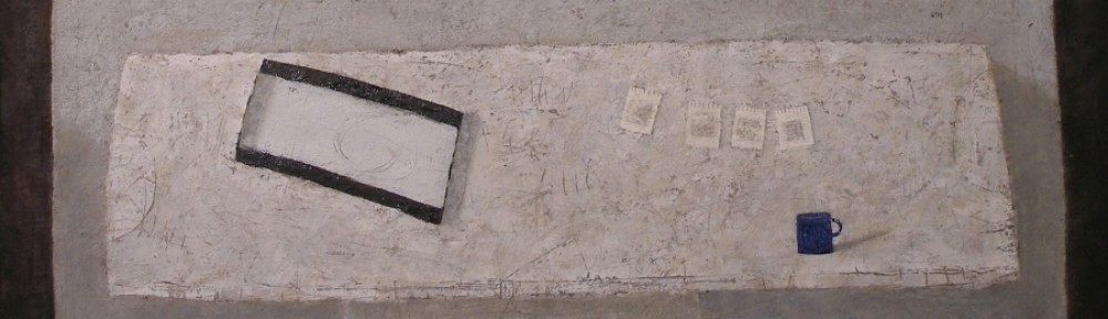
This painting has the wonderful consideration of raising the table to the picture plane.  And I focused on spatial planes as well, which is very challenging.  I want the viewer to feel the space the planes present.  And I am pleased with the receding plane of the table which also could be termed as a spatial shift.  The shift represents movement (the viewer’s movement), which is more sensed than seen and provides time.  Thank you Cezanne!

Permitting these to appear while painting is important, allowing intuition to come into play.   I began with a table and wall and then let the play begins.  Thinking of shapes, rhythm and movement, rather than objects.  And of course my favourite things usually find their way into the painting, which ensures continuity in my work.

The soaking pan anchors the composition and from there we move along the bottom edge connecting to the rhythm of the black weights, leading you to the oval on the wall.  I then provided marks on the wall to return you to the pan.  Do you feel the curved movement in the pan?

I permit myself time to assess and after much scratching and repainting found myself painting a small, very satisfying pink circle, which became the final note.

There are other lyrical markings, such as arrows and what I like to call loops which are in the pan and on the wall.  There is also a very fine rhythm within the oval on the wall, echoing the arrangement of the weights.  I strive for every mark to be in harmony.

I must also mention the angle attached to the soaking pan. Can you feel it’s importance?


My Work – Rhythm and Harmony

Don Farrell - Three Drawers - 1999 - 33 x 45 cm - 13 x 17.5 in - water soluble media

The arrangement of the drawers is the key for the rest of the composition.  I decided to supported the sweeping movement of the drawer faces with a curve in the table front at the bottom right, which felt very rhythmic.  And to complete the harmony I provided a shadow at the top, echoing the movement of the drawers.  Do you feel the rhythm?

I was pleased, but there was a problem with the viewers eye leaving the composition at the right.  The stripes provided a solution, not only for containment but also a lovely pause (the small black marks in the stripes) appeared.

I was now pleased with the movement to the right, and instinctively knew the need to return the viewer to the left.  After several attempts I finally arrived at a solution that not only balanced the composition, but also rhythmically integrated the drawers and the background.  I added those two dark circular shadows at the upper left and then provided a harmony by painting knobs on just two of the drawers.

I should also mention that the angle of the drawer, at the right, determined the location of the two shadows.  Do you feel the connection?

I then painted the horizontal white line to support the table and a cast shadow at the bottom left which provides a lead into the painting.

I also assessed all the smudges, scratches and markings throughout the composition for indications of disharmony, which usually requires a few visits.

I find it is much more interesting to permit the composition to lead me rather than to force the preconceived detail to dictate.

Integration and pulls

Don Farrell - Box, Bottle and Bag - 1999 - 23 x 32 cm - 9 x 12.5 in - egg tempera on paper

One of my favourite shapes is the oval, which is clearly indicated in this painting.

Let me begin with the shape which may be read as a shelf.   In reality the shelf does not exist and in my mind it is a shape, (half an oval).  I prefer to work from memory or with my mind.

Now let your eye run along the front of the shelf from left to the right.  Your eye movement will connect to that vertical triangle and then to the line which embraces the shelf.  I’m very fond of that line. Do you sense the oval?

Do you see the shape created with the line and feel how it gently holds you?

Now there is a need to have you engage with the rest of the composition, and I have used pulls to accomplish this.   The small white oval, is the primary pull.  The striped rectangle is the other one, which could be considered stronger than the white oval.  I eventually came to like the competition, and felt the rectangle supported the the items on the shelf nicely.

There are other markings which I like to call pauses for your eye, and every one is assessed when orchestrating the the composition.

Integration can be accomplished in many ways.  Take the horizontal line near the top and how it turns upward at the right.  The angle is in harmony (parallel) with the shadows on the shelf.  This is very important as parallels provide movement which energize the painting, and they are meant to be sensed rather than seen.

Permit me mention something other than a pull or integration.

There is one other line, which is to the right of the white pull and pointing to where the horizontal line turns up.  Feel how it contains your eye movement and how it impacts with the rest of the painting.

I hope you can see that I am composing and not following a formula.

The intuitive coupled with knowledge is the key.


Influences (Giacometti)

Don Farrell - Direction III - 2007 - 53 x 73 cm - 21 x 29 in - mixed media on paper

I was working on a series based on the origins of architecture when another interesting consideration came to me.

As those who actually work on the structures, we all have a deeply felt need to leave our mark, no matter how slight.

That is the reason for the “organic” feel of the structural element in this painting.

When I introduced direction into the opening, Giacometti’s sculpture, (Woman Walking between Two Houses)  came to mind.

This is a good thing, because the more we study, the greater the chances of recognizing the considerations of notable artists in our work.

Alberto Giacometti - Woman Walking between Two Houses - 1950 - 30 x 54 x 10 cm - 12 x 21 x 4 in


Rhythm

Don Farrell - Black Drawers - 2006 - 53 x 73 cm - 21 x 29 in - mixed media on paper

Providing rhythm in a painting.  Now that is a very open consideration, very subjective and without limits.  Now having said that, I should say, spatial considerations are at the forefront in my work.  Therefore the reductive process becomes very important.

In this painting, the primary rhythm is based on three.  The three drawers and the supporting three inverted “V” marks on the wall.  The lines on the table and a series of horizontal lines on the wall are rhythmic as well.

I brought up pulls the other day and this painting has a great one, the white circle shape on the wall.  Do you feel being pulled from the drawers to the circle?

I should also point out the vertical line in front of the wall just right of the table. This is a continuation of the rhythm of the lines on the table.  Do you sense a plane in front?

Thank you Cezanne!

Motifs and Submotifs

Don Farrell - Three Blocks - 1998 - 15 x 25 cm - 6 x 10 in - egg tempera

This small painting is an excellent example for showing the importance of shape motifs. The composition has a rectangle motif, supported by a sub motif of rhythmic loops.

Let me take you to the top area first.  Note how the area is made up from a series of subtle rectangles.  They must be subtle in order not to compete with the focus of the painting.

The chair seats and the three blocks are other notes in the rectangle motif.  The blocks, being the focus, are supported by slightly emphasizing the two rungs just below, (another rectangle.)

There is a very important small rectangle above the middle chair, which echoes the blocks.  In compositional terms this pulls your gaze gently from the blocks.  Pulls are wonderful compositional elements, if they are in tune. They musn’t disrupt the viewer’s gaze or compete.

I will be mentioning and showing more pulls and pauses in the works of many notable artists in upcoming posts.

The sub motif (the loops) which are the shapes of the chair backs, are repeated in the top area as shown in this detail.

These Integrate the chairs with the background, which is very important.

Another important note is how each chair is painted as if you are directly in front.  Very important, as this frees the viewer’s movement as mentioned in the post on Cezanne’s painting “Receptacles, Fruit and Biscuits on a Sideboard”


Can less be more?

Don Farrell - Commerce - 2007 - 53 x 71 cm - 21 x 28 in - mixed media on paper

Can less be more?  I have been wrestling with this consideration for years, and I think the answer is yes, if the artist is sincere!

A good example is the painting “Commerce” which was a response to watching the  touring boats in Paris, and the regimentation of passing at the midway point of their scheduled routines.

I was very concerned with loosing the reason for the painting for the sake of detail.  I want to show the act of passing more than what is passing.

I’m sure this process of reducing is as interesting for the viewer as well and there is a very fine line between success or failure.

Influences (Giorgio Morandi)

Don Farrell - Soaking Pan - 1999 - 25 x 30 cm - 10 x 12 in - egg tempera

I had the pleasure of seeing a retrospective of Morandi’s work in London a few years ago and he has stayed with me ever since. In particular, I was impressed with his spatial considerations and how he expressed them in his still lifes.

I was thinking of my response to his considerations when I made the above painting of my soaking pan. My goal was to create a harmonious spacial feeling through the arrangement of rectangles.

Now, using an influence doesn’t make things easy. For example, with Soaking Pan, which has a rectangular motif, I had difficulty keeping the painting from feeling static.

I had started by supporting the soaking pan with a similar shape above it on the wall. This supporting shape then takes the eye to the small dark square at the top, ensuring the viewer takes in all of the painting. The colour value of this square then takes your eye to the sketch pad before returning you to the front of the soaking pan. (The three sketches also harmonize with the front of the soaking pan, but are more supportive.)

So many rectangles leave the image static if left completely on their own. There is the wonderful little angle on the table which appeared accidentally and stayed, but this was still straight, and I needed more.

To refine and resolve this composition, I added the white line at the bottom right which takes you across the front of the table to the right edge of the soaking pan. This provides an integrating movement for the painting, which works well, but the painting still felt unresolved.

Soaking Pan – detail

I fussed and fumbled for a few days, and then one morning, I scratched an oval in the soaking pan and got that special feeling you get when you know you’ve finally succeeded. Even though the mark is subtle, it was enough, and the composition was complete.

Giorgio Morandi - Still Life - 1959 - 30 x 35 cm - 12 x 14 in - oil on canvas


Influences (Andrew Wyeth)

Don Farrell - Margaret's Basket - 1983 - 23 x 33 cm - 9 x 13 in - watercolour

Margaret’s Basket is one of the first paintings in which I consciously allowed myself to be influenced by another artist.

Around 1980, I was still mostly concerned with representation and accuracy in my work.  I was studying the wonderful details of Andrew Wyeth when it suddenly occurred to me – Wyeth’s strength is in the shapes he chooses!  This insight changed my approach forever.  Realizing that the viewer responds to shapes before detail, my new focus was trying to achieve a harmony of shapes.  This harmony is not something that the viewer needs to be aware of, in fact I expect it to be mostly subconscious.  The artist, however, uses shapes to direct the viewer and inform the details.

Margaret’s Basket is an arrangement of triangles. There are three prominent ones that hold the painting together, as well as other supporting triangles.   Another way of putting it is this painting has a triangle motif.

Of course, shapes aren’t the only considerations for a painting, and I would quickly like to introduce one other because of how easy it is to see in this painting.  I call it “integration”.  Notice how the left handle of the basket is in line with a fold in the drapery below it?  I used this to keep the viewer’s eye from straying out of the left side of the painting.

The beautiful pursuit of art is not in just knowing these things, but in being able to use them poetically.

Andrew Wyeth - Wolf Rivers - 1959 - 34 x 33 cm - 13 1/2 x 13 in - tempera


Influences (Giacometti)


Don Farrell - Creases - 27 x 31 cm - 10 1/2 x 12 1/4 in - mixed water soluble media on paper

I feel Giacometti was a master of composition. The more I peruse his work the more I have come to appreciate the thoroughness of his considerations. My painting “Creases” is an example of permitting Giacometti to influence my work.

By permitting myself to be influenced has nothing to do with emulating. It is appreciating, as in his painting “Still Life with an Apple”, the level of his compositional sophistication and trying to reach his thoroughness.

I will limit comparisons to a couple areas – integration and parallels.

In my painting note how the seam in the pot is in line with a line in the drawer below. Giacometti did a similar integration with lines which run from the bottom of the painting up through the apple to dark horizontals which will eventually return you back to the bottom and back to the apple. I used the creases in the white cloth and stronger values to bring you to the pot. I also used the drawer handle as a visual pull for the pot as Giacometti did for a pull from the apple.

Giacometti masterfully limited his use of perspective, in fact he disrupted perspective with a masterful use of cubism, I could go on and on. I decided to provide the illusion of depth by using the parallels of the creases and the shadows of the pot and two parallel cast shadows with no vanishing point.

I could write at length on this wonderful painting by Giacometti, I think I may one day…

Alberto Giacometti - Still Life with an Apple - 1937 - 72 x 75 cm - 28 x 29 in - oil on canvas