Max Beckmann – (Integration and Structure)

Max Beckmann - Quappi with White Fur - 1937 - 109 x 64 cm - oil on canvas

Max Beckman’s paintings are very strong in many ways and in this painting we will look at his superbly considered compositional structure.

I am first drawn to the two wonderful half ovals.  The table, which has been raised to the picture plane, and the other behind the figure at the left of the painting.  I love how they support the figure and am very impressed with his integration of the black line entering the composition at the bottom left, with the table and how we are guided to the little Pekingese, which in turn integrates with the bottom edge of the larger half oval.

Now to his wonderful integration of the figure, her bouquet and the flowers above her left shoulder.  Can you feel your eye moving up from her right leg to her bouquet and then to the the left edge of the flowers and how this unites the figure and the background?  There is another sophisticated one leading from the dog to the bottom of the bouquet to a line taking you to the flowers above her shoulder.  It really is superb and it also supports her embrace of the dog.

There are other connections to find and enjoy especially how he supported her head with the two vertical lines above.  Note how they curl towards her, supprting the curve of her cheek. They are a very important compositional consideration because she is now beautifully connected to the top of the painting!


My Work – Shape Motifs, Parallels and Rhythm

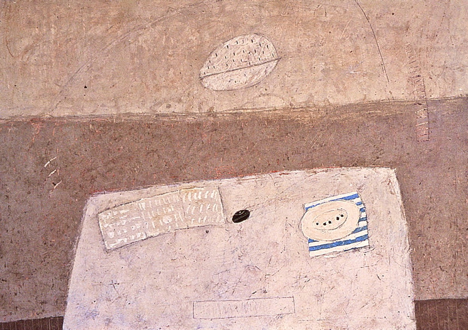
Don Farrell - Blue Stripes IV - 2004 - 21 x 29 in - mixed water soluble media

This is a composition which I will continue to revisit as I feel it has endless possibilities for refinement.  I think it is very important to establish a personal and recognizable feel for my paintings.  I have learned this from painters such as Morandi, Mondrian, Matisse and many others.

I am intrigued with the possibilities presented through reduction, and I usually find myself focusing on spatial considerations. This requires removing the superfluous and bringing the composition to the forefront.

Using shape motifs is a great way to establish the foundation of a composition.  In this painting I provided a rectangle motif supported by an oval sub motif.  And I rearranged their sizes and spacing a number of times before I was satisfied.  The white oval above the table appeared late in the painting and I felt it provided both balance, and a little competition, for the shapes and colour on the table.

The three small white lines just above the left edge of the table provide rhythmic movement and keep you in the composition.  There is a vertical at the right directs your eye movement, connecting to a subtle line which loops over the white oval, returning you to the three white lines and then to the shapes on the table.

I must mention the line in the white oval which parallels the blue stripes.  This provides a very important rhythmic integration.

In composition all of the above should be “sensed” rather than seen.

Bonnard – (Providing Structure, Rhythm and Harmony)

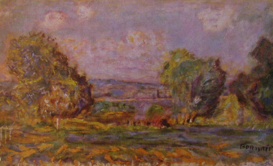
Pierre Bonnard - Landscape Near Vernon - 1915 - 38 x 56 cm - oil

This landscape by Bonnard is a superb example of how a master, whether instinctively or intentionally, provides structure when developing a composition. I say this because a good artists will not permit their formulas to overrule their intuition.

There is a wonderful horizontal rectangle formed by a small white vertical at it’s left and a small bright green tree providing the right vertical,  the top is formed by a roadway running behind the tree.  When you see it and feel it’s impact on the composition, I hope you will appreciate the sophistication.  And remember the viewer does not have to see it, a master is very aware of the power of suggestion and knows we connect to shapes subconsiously.

The tree shapes are magnificent.  Try to feel the movement provided by the parallels of their shapes, particularly that wonderful squarish shape at the right edge and how it supports the other two trees.

I must also mention the harmonious movement in the sky.  There is a square like indentation in the tree at the right edge, which provides the sense of a parallel movement with the other trees and the placement of the cloud above creates the same movement in the blue sky.  I hope you can feel it as well as the wonderful integration of the other clouds with the trees.

There is another beautifully assessed rhythm leading us into the composition from the left.  The harmonious relationship of the three white verticals and the white vertical which forms the left edge of that marvelous rectangle.

Bonnard was a great master painter.


Cezanne – (Rhythm, Parallels and Integration)

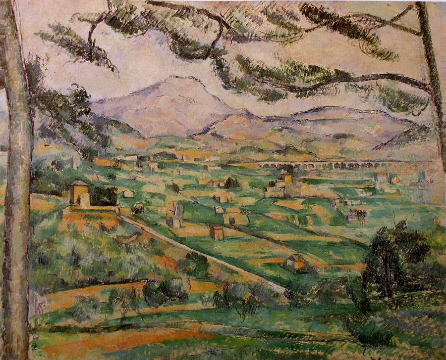
Paul Cezanne - The Great Pine (Mont Sainte-Victoire) - 1886 - 60 x 73 - oil on canvas

Cezanne did a number of paintings of Mont Sainte – Victoire which is fortunate for us as we can see the consistencies in his compositions.  These paintings show us that repeating and refining is a strength in art.

We see the same considerations in this composition as the last post.  It takes time and a great deal of effort to develop a masterful composition and good artists will continue to refine the endless possibilities.  I think the first composition in a series, whether figurative or abstract, is an opening to infinite refinements   We see this in the work of most masters, no matter what their discipline.

I don’t know which of these paintings was first, no matter, what is important is we see the same rhythms and integrations.  What matters is each painting required its own refinements which are assessed differently to suit each composition.  In other words has it’s own voice.  One key difference are the angles we see in the branches, paralleling the road and other lines in the fields.  Wonderful integration providing oblique movement leading into the composition from the bottom right and great structure.  I also love the sophistication of how that black rectangle provides the focus.  Also, note the green line coming up from the tree towards the black rectangle is fantastic!  Do you see the triangle it creates reinforcing the importance of the rectangle?

There is also a harmonious rhythmic line running across the bottom, supporting the rhythm of the branches. I must also point out the parallel lines in the mountain directing us towards the black rectangle.

What a painter!


Cezanne – (Rhythm and Integration)

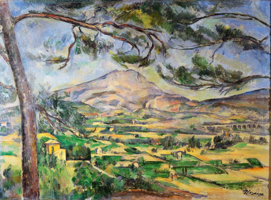
Paul Cezanne - Mountain Sainte-Victoire - 1886 - 67 x 92 cm - oil on canvas

We can see the care given to rhythm in this painting by Cezanne with the beautiful relationship of the mountain and the branches above.  The sweep of the lower branch at the right matching the curve of the mountain is superb.  I love the one at the top right and how it’s curve connects to the left side of the mountain.  Do you sense the movement running across the painting in the branches?  What a painter!

There is a very sophisticated integration beginning with parallel lines which bring you into the painting from the bottom right and connecting your eye movement to the lower branch at the left.  I hope you can feel it, as it is very impressive.  Can you also feel how this movement is in harmony with the mountain and the branches above?  His thoroughness is outstanding.  What a painter!


Wyeth – (Integration)

Andrew Wyeth - Glass House - 1991 - 20 x 27.5 in - watercolour and drybrush

This gorgeous high key painting is wonderful, Wyeth was truly a master of light as well many other considerations.  And I will confine this post to his elegant integrations.

Lets begin with how her head integrates with the vertical elements behind her, particularly the verticals connecting to her forehead and to the back of her collar.  Can you feel how the structure supports her confident posture?  Another connection is how the vertical mullion connects with her knee and how the front of her leg parallels the window sill. Fantastic!

There are two more examples which show us how sophisticated integration can be.  The first is how the shadow behind continues across her body and then on to the bottom right of the painting.  Oh how lyrical integration can be in the hands of a master.  The other brilliant integration is how the birds connect to the trees in front and behind her resulting in a harmony for her dress.

I should mention how the shadow running down the bottom right is supported with a parallel shadow at the left and how the horizontal mullions integrate with her eyes.  There are more for you to discover and I hope you can see why Wyeth is considered to be a great visual poet!

Matisse – (Motifs, Rhythm and The Reductive Process)

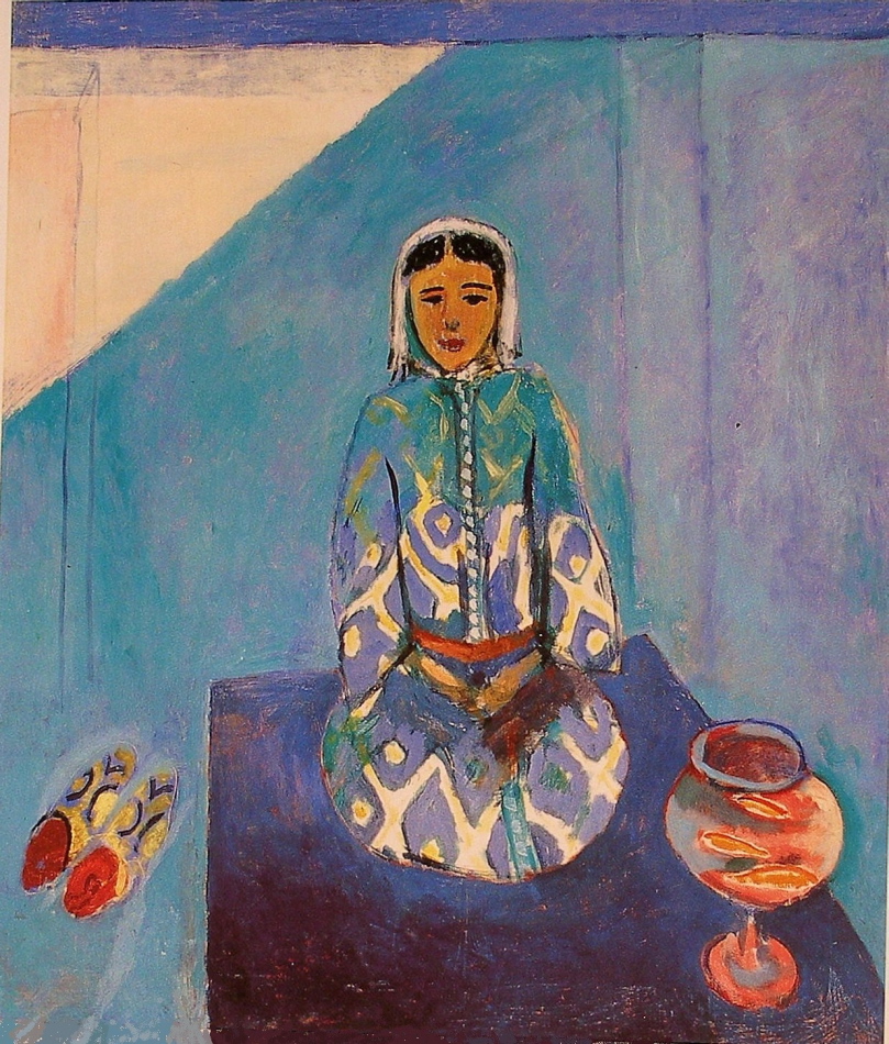
Henri Matisse - Zorah on the Terrace - 1912 - 116 x 100 cm - oil on canvas

In this painting Matisse shows us the importance of shape motifs and how the reductive process brings forth sophistication.

Let me begin with the rhythm we sense from his wonderful motif of ovals. The harmony of the three ovals of the fish bowl integrating with the oval forming the lower portion of the kneeling figure is truly elegant.  Another rhythm of shapes is the  arrangement of, may I term, pointed ovals.  The fish, her slippers and that wonderful orange one just below her belt.  There are more within the slippers and of course colour temperature comes into play with the warms harmonizing with her face.

This brings me to another question which I think shows us Matisse’s level of sophistication.  Why doesn’t the white and blue design of her garment continue up to her shoulders?  The reason, I feel, is if the strong pattern continued it would be competing with her face which is the focus of the composition.  Having reduced the contrast by almost blending the pattern with the background is superb.

How Matisse reduced the architecture and light to simple lines and shapes is revolutionary, and will greatly influence twentieth century art.  We respond to the colours and interpret with our senses!

Matisse has provided artists the opportunity of refining, by reducing information, (removing the superfluous), which is a fascinating pursuit.

I would also like to mention another very refined use of integration.  Go to the top right of the carpet. Can you feel a connection running through her arm to the dark rectangle shape?  Can you feel a plane coming forth?  I hope you can.

Influences – (Matisse on Hofmann)

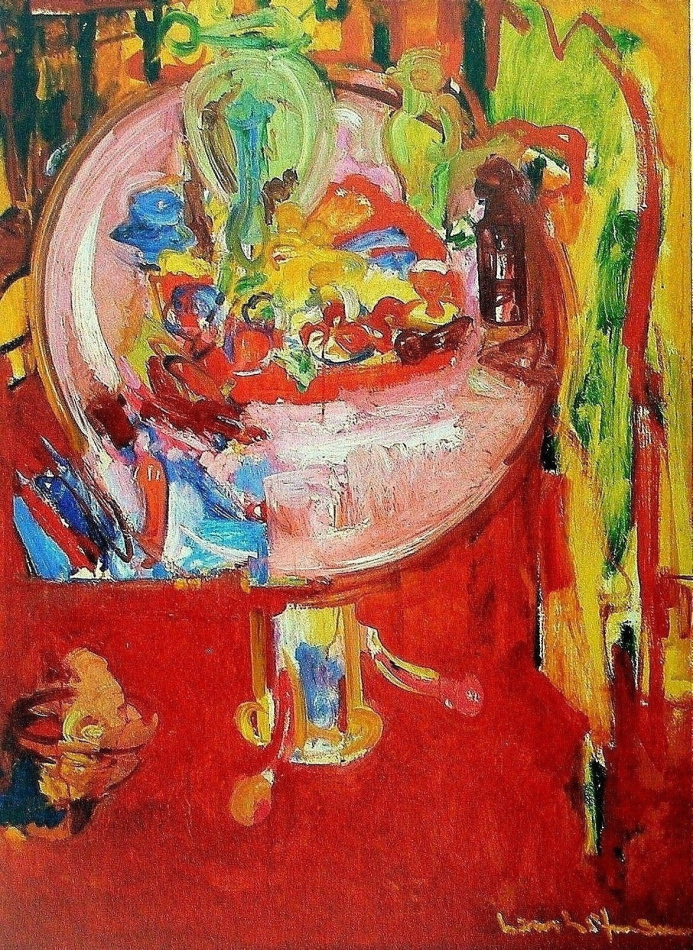
Hans Hofmann - Pink Table with Still Life and Palette - 1936 - 132 x 96 cm - oil on panel

As in my post of September 1st. on Cezanne influencing Matisse, we see the influence on Hofmann.  We should be aware of and participate in the continuity of art, which opens doors for new considerations for those who follow.

Hofmann has used the tilting up of the table top very interestingly by adding another bold  consideration, the rhythmic shape at the bottom left of the table top, which seems to be both on and in front of the table.  This is a wonderful spatial plane, and he integrated it beautifully with a vertical just below at the right of the shape, and upwards with the curve of the table top.  Another spatial plane on the table top, the pink rectangle at the bottom which seems to come forth, very impressive!  There are some planes in the red just below the table top at the right as well.  Can you feel their connection with the table?  The combination of his free gestural stokes with his structural considerations are very impressive and I love the transparency of the green vase at the right.

Hofmann was a very knowledgeable painter and a superb teacher, who was influential in the development of the Abstract Impressionist movement in New York, which was wonderfully convoluted in the 30’s.

I will be posting more on Hofmann’s development of spatial planes with colour.

Miro- (Integration and Pauses)

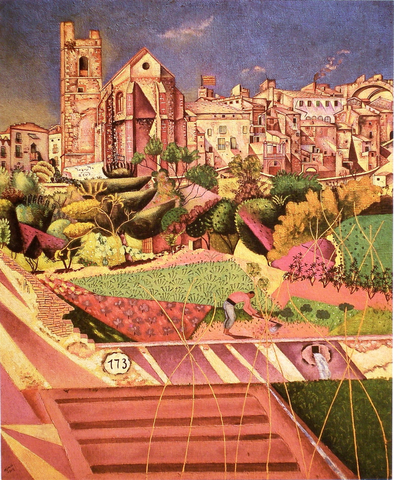
Joan Miro-Montroig,Village and Church-1919-73 x 61 cm-oil on canvas

A very complex subject and Miro shows an impressive level of sophistication.  His journey from here, towards conveying the prime in his mature work is fascinating.

I would like to focus on integration and pauses in this posting which hopefully guide you to many other delights in this impressive composition.

Lets begin with the green and red triangles near the the figure, and how the curve of the figure’s back rhythmically integrates with the red triangle. Now, permit your eye to run upward along the bottom curved edge of the red triangle, to the edge of the black tree above, continuing to the left edge of the building above.

There is another strong integrating movement just above the figure, see detail:

The strong contrast between the pink and dark green catches your eye and then takes you up to the pink straight edge leading you toward and connecting to the right edge of the church.  There are more, and remember they are not meant to be obvious.

Miro’s orchestration of pauses is also very impressive and there are several.  I’ll begin with the two ovals, the drain and the one numbered 173.  My eye then pauses on the white shape at the base of the tower.  From there I note the black windows above, particularly the circle, and because of the light value the shape  the circle occupies my eye moves and pauses on the wonderfully considered small square at the right of the painting.  As with the integration, the pauses are not meant to hold you, and compete.  They are lyrical notes as in music.

There is considerably more to the dance Miro has invited us to enjoy, like the clouds and the vines, your invited!

de Kooning – (Integration with Line and Indicating Time)

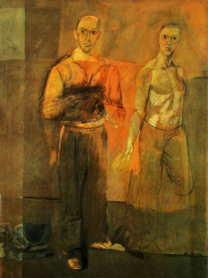
Willem de Kooning - Two Men Standing - 1938 -155 x 122 cm - 61 x 48 in - oil on canvas

De Kooning’s use of line for emphasizing the structure of the composition is very impressive. The horizontal line at the right edge of the painting, near the figure’s shoulder superbly balances the composition. Without that line we would have difficulty moving away from the dominant figure.  It provides not only a pull, it also completes a wonderful horizontal integrating division of the composition.

Another beauty is the line under the shoe which not only supports the figure it is also provides rhythmic support for the line above at knee level.  There is another which shows us how sensitive and the thoroughness of de Kooning’s considerations.  It’s the faint line in the orange area, connecting the men at their elbows.

De kooning was also working at conveying time in this painting as we see in the right arms of both figures.  We see two positions of the arm in the dominant figure and at the hand of the other man.  And I think this explains the dark rectangle in front of the indistinguishable hands of the dominant figure.  There are basically two methods for conveying time.  One by inviting the viewer to move (not physically, but in their mind) and the other is to indicate the movement of the subject which de Kooning used here.  Both are very challenging.

I also would like to mention how the shoes are actually a pull, bringing us to the bottom.  And a fantastic pause.  The light mark at the left end of the line at knee level.  It’s influence on  the composition is superb!

I think his choice of not completing the legs of the man at the right is interesting and leaves us with an open consideration for discussion.